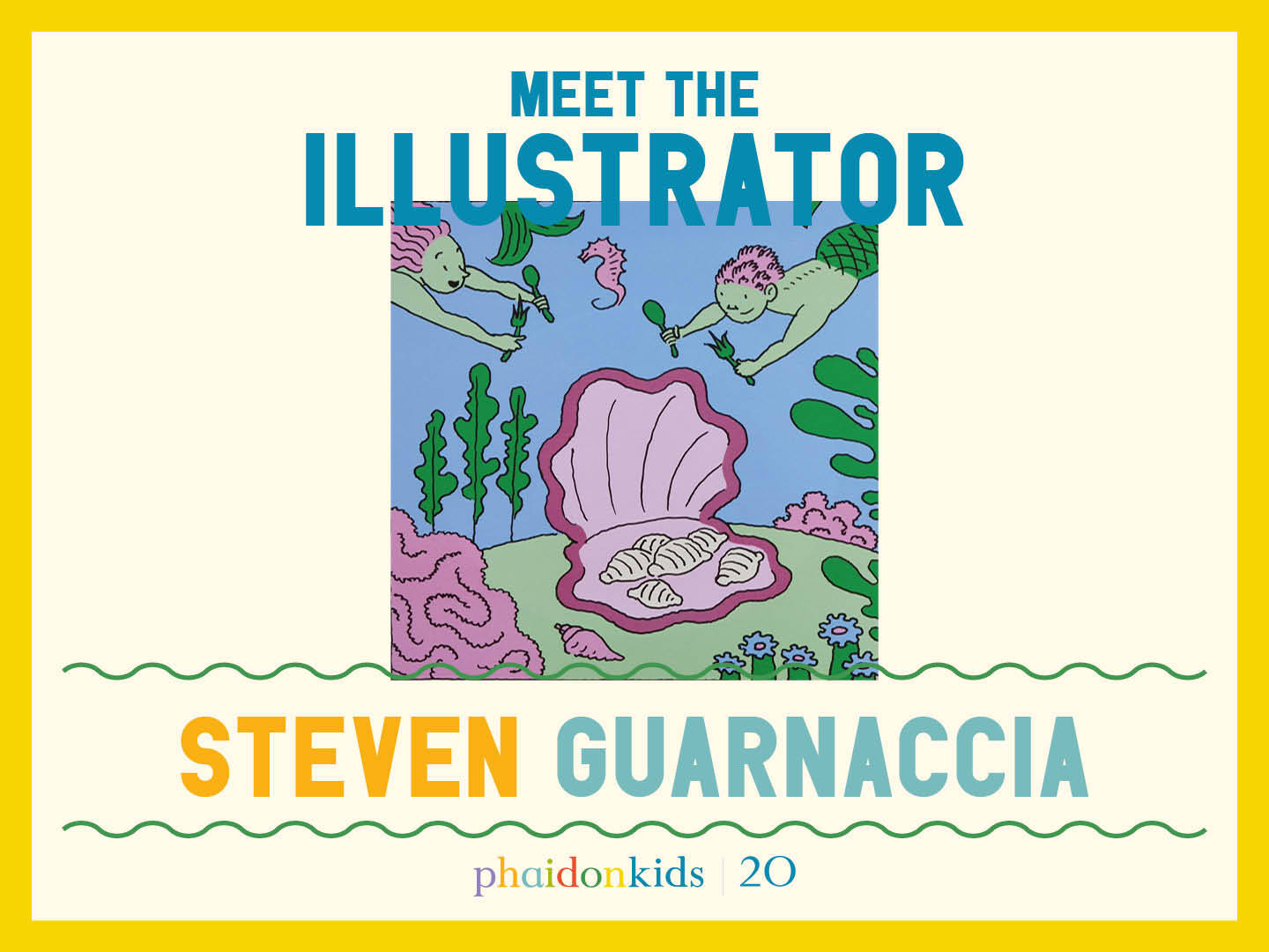
Meet The Phaidon Kids illustrator - Steven Guarnaccia
This legendary designer has created impactful work for Swatch, MoMA, and The New York Times, to name just a few, but when our kids book The Story of Pasta beckoned, he just couldn’t resist.
Known for his witty, intellectual style and playful aesthetic, acclaimed American illustrator, designer, and author Steven Guarnaccia's work is often anchored in tradition but is always looking forward.
Guarnaaccia's career spans decades and bridges the worlds of editorial illustration, children’s books, and design commentary.
His illustrations have appeared in publications such as The New York Times, The New Yorker, and Rolling Stone, and he has collaborated with prestigious clients across editorial, advertising, and publishing platforms.
He's created a watch for Swatch, murals for Disney Cruise Lines, and an exhibition of drawings for a show of Achille Castiglioni’s furniture design at the Museum of Modern Art.
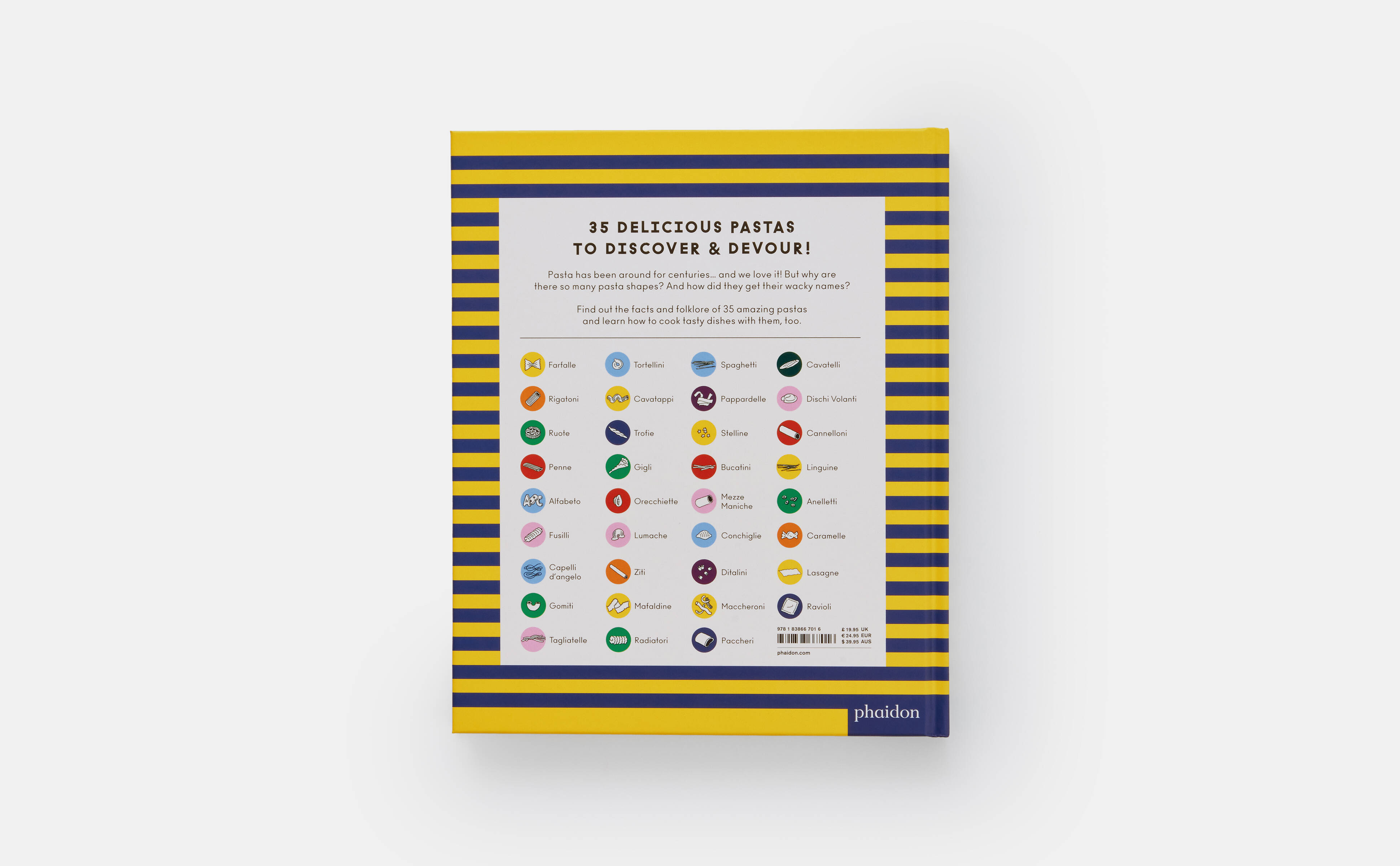
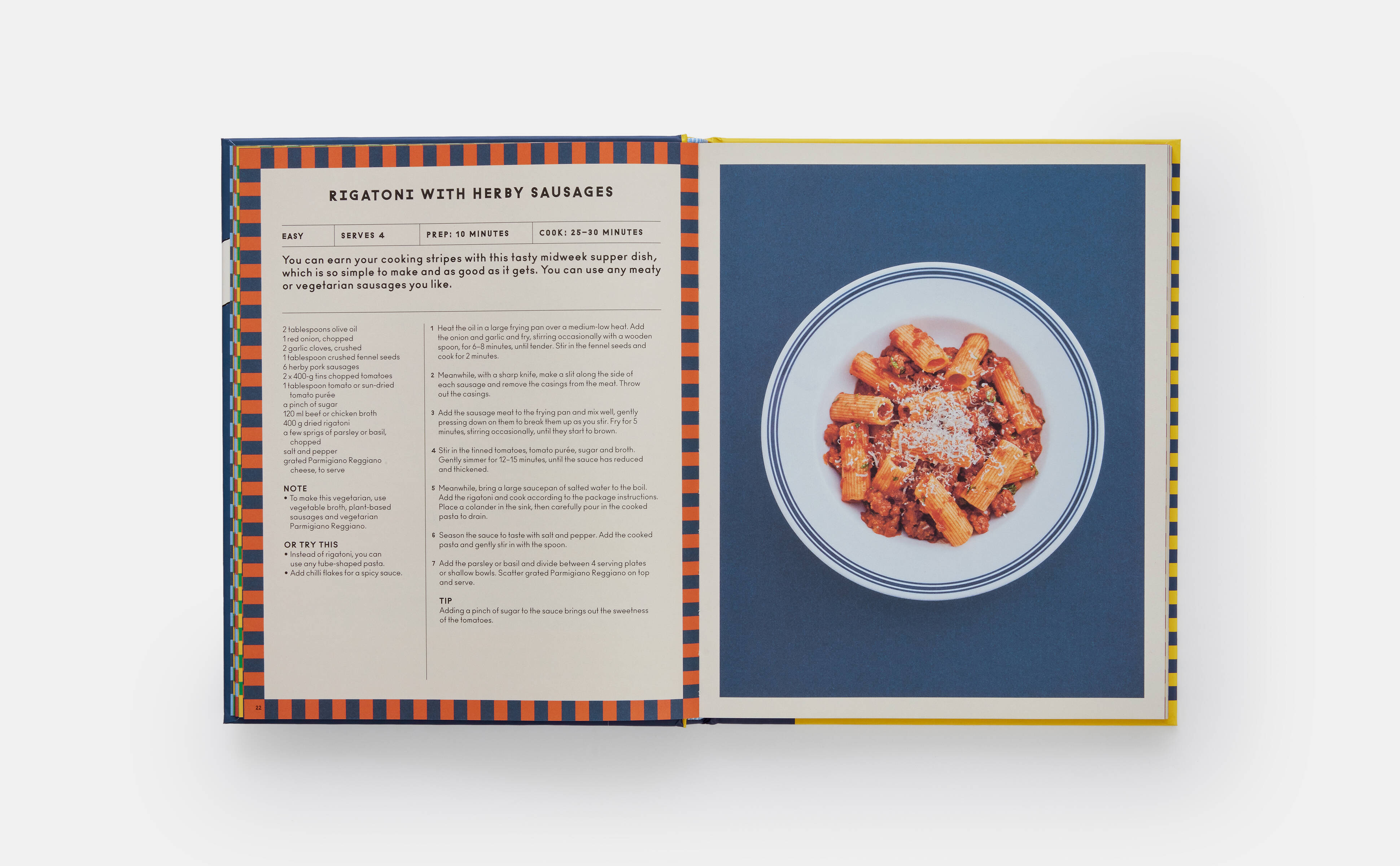
Closer to our hearts, this father of two is the illustrator and co-author of Phaidon's Children's book The Story of Pasta and How to Cook It!
In addition to his work as an illustrator, Guarnaccia has had a significant academic career. He served as the chair of the Illustration Program at Parsons School of Design and has been a visiting artist and lecturer at institutions worldwide. His commitment to design education is matched by his curatorial projects, which explore the intersection of illustration and culture.
His acclaimed artistic style blends line-driven clarity with an architectural sensibility. He is known for using limited palettes, strong compositions, and a sense of irony that infuses even the most straightforward subjects with deeper meaning, seamlessly combining artistic sophistication with a deep cultural awareness.
To celebrate 20 years of Phaidon Kids, we’re talking to a number of the illustrators and authors behind our brilliant children’s books. Once you've read our interview with Steven, take a look in the Phaidon Kids store and check out more of his great work at StevenGuarnaccia.com.
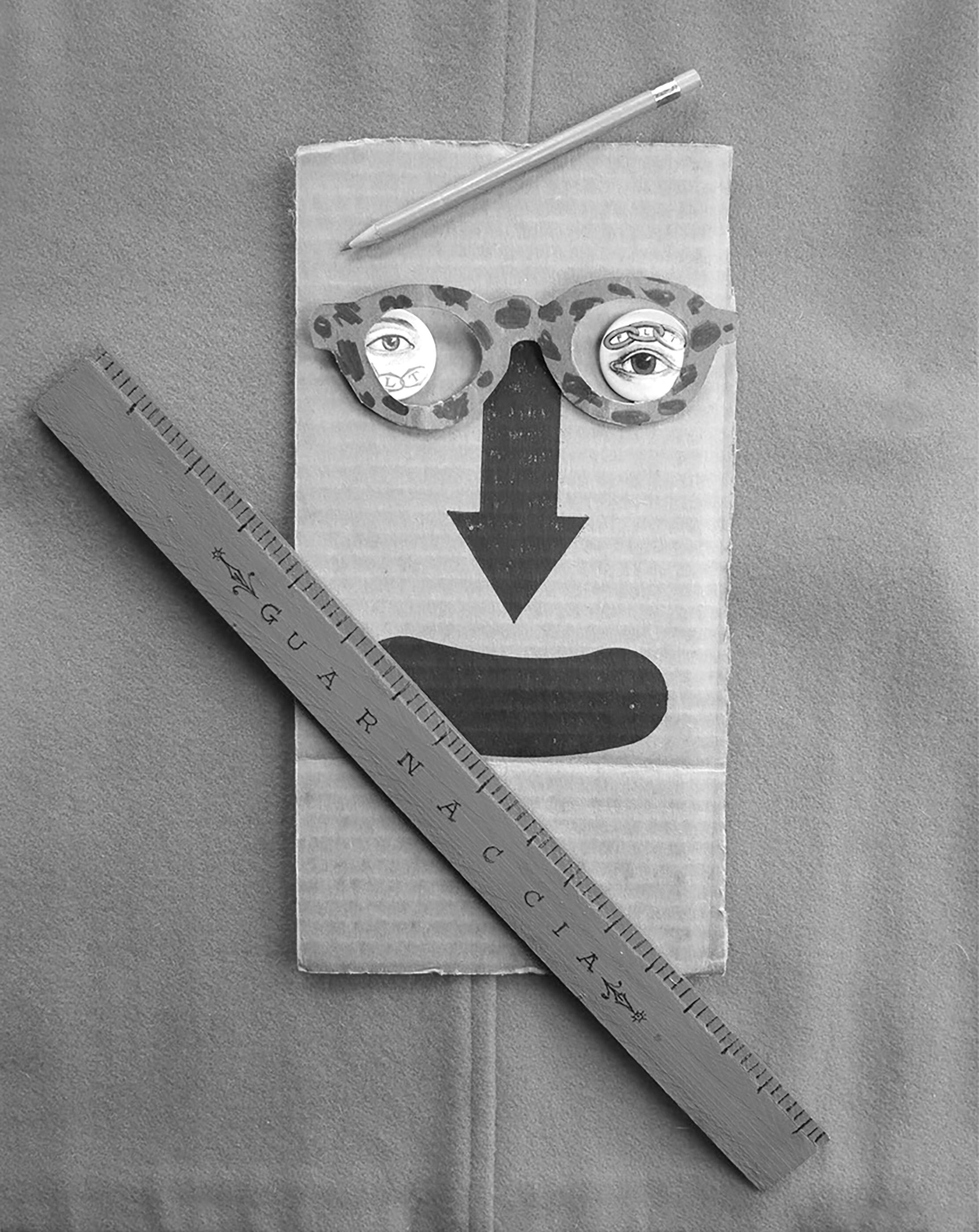
Can you draw us a self portrait of yourself? Sure! Here are two.

Are artists essentially grown-up kids? I don't mean to elevate artists or writers above the common hordes, but I do think that one thing that unites those people who become artists is that they kind of never lost that way of seeing as children. It can be a defence mechanism, a way of coping, in a way.
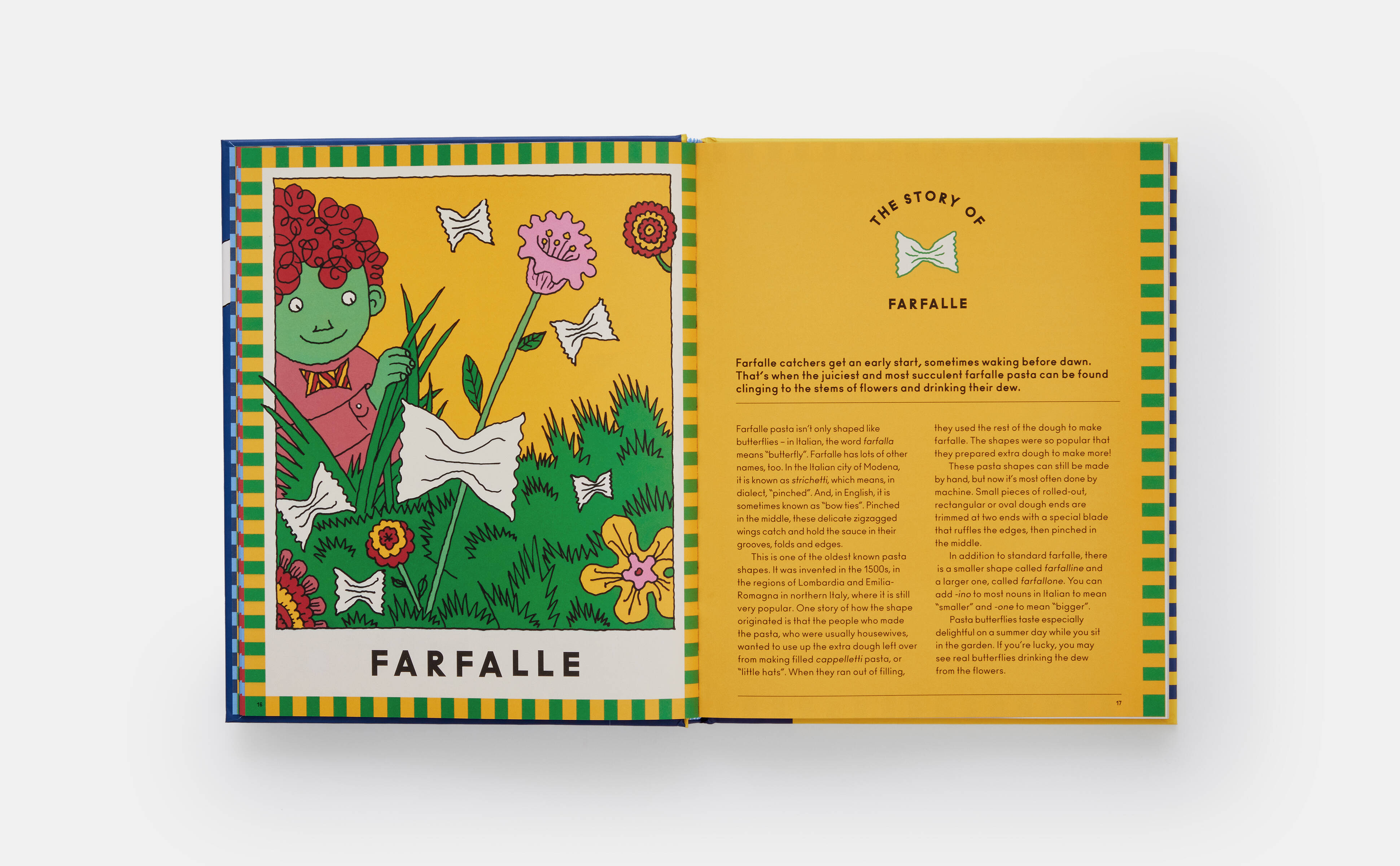
What did you draw as a kid? Comics characters. Mickey Mouse, I didn't draw Donald Duck. I didn't like Superman, but I liked Batman and so I drew him. My brother liked Superman. We divided up the superhero world! I drew constantly. I loved to draw monsters. I was in fifth grade when there was a big monster craze; magazines and posters. I also loved to draw visual lists. I would draw every kind of hat on a page or every kind of monster. That kind of relates to The Story of Pasta and How to Cook It! I guess.
How would you describe your style? In terms of style, it depends on what you grew up with. I was very influenced by a studio called Pushpin who were prominent in the 60s and 70s. Milton Glaser and Seymour Chwast. They grew up looking at 1930s comics because they were kids in the 30s. Even though they helped create what we think of as the psychedelic style – flat colour and swirling shapes – their work was very rooted in comics. As I came into my creative maturity, I really loved W. Heath Robinson for his precise line, flat colour, and deadpan humour rooted in the everyday. You can wander far and still feel like you're tethered to some kind of reality.
What’s the one thing you always try and sneak into an illustration? That's interesting. In an abstract way, I try to sneak in a deep part of myself. Even if it's a mundane assignment where I really have to stick to a brief and I don't have a lot of room. When I used to work for magazines likeSports Illustrated, I was not particularly sports interested, so I would always try to avoid drawing the sport and draw some personal reference. I wanted to satisfy the brief, but I didn't want to do it directly.
Do you have a kid in mind when illustrating? I have my nine-year-old in mind and her sense of humour when I'm writing these things, but I also probably first have me as a nine-year-old in mind and what I found funny and what I would be engaged by. There’s a kind of British “functionality” I also keep in mind. I’m a huge fan of Lewis Carroll and P.G. Wodehouse. I love British humour because it always seems grounded in the everyday. Even Alice in Wonderland, which…the surrealist used as inspiration, has got so much just dailiness about it, it’s an everyday experience.
What are the things that kids tend to notice in illustrations that adults don’t? I think children have fewer filters, fewer layers to see through if we're talking specifically about seeing and if seeing means really understanding. I think children really do look differently. I think they often, to their detriment, don't have the ability to focus, because they don't have the incentive. We have to focus to get our job done. We have to focus to get through the day. Children obviously learn all those things, but I do think that they’re able to wander better and their minds wander more. A good book is a good wander.

Why are books for kids important? I've often wrestled with the question: why has the book, especially for kids, not really been supplanted? The e-book was tried repeatedly but they never quite got their hooks into kid readers in the same way that a simple print and paper book does. And I think that’s because it communicates very differently and very directly. It may be the form of the book, its portability, the fact that it creates an intimate relationship one on-one. The child interacts with it as he or she turns the page, reads the words, decodes the image, or chooses not to decode the image. Until then, it is inert, but it has a tremendous amount of potential.
Digital media, in contrast, is continually prodding you to swipe or scroll. A good book cues you gently to what's next without revealing it, so that you're prompted to move. The smell of each book, the way the type is arranged on the page, the weight and tactility of the paper, are important, too. I know people who the first thing they do when they open a book is bury their face in the gutter and inhale for that whiff of whatever they're getting, whether musty or new.
Maurice Sendak, the great kid's book illustrator, really believed in the “object-ness” of the book to the extent that he was concerned with the mouthfeel of a book, because he knew – especially for the youngest readers – one of the things they do is they put it in their mouth. There was a book he worked with the publisher in terms of the thickness of the pages. What the cover material felt like when you put it in your mouth. That's dedication. That's what I like.

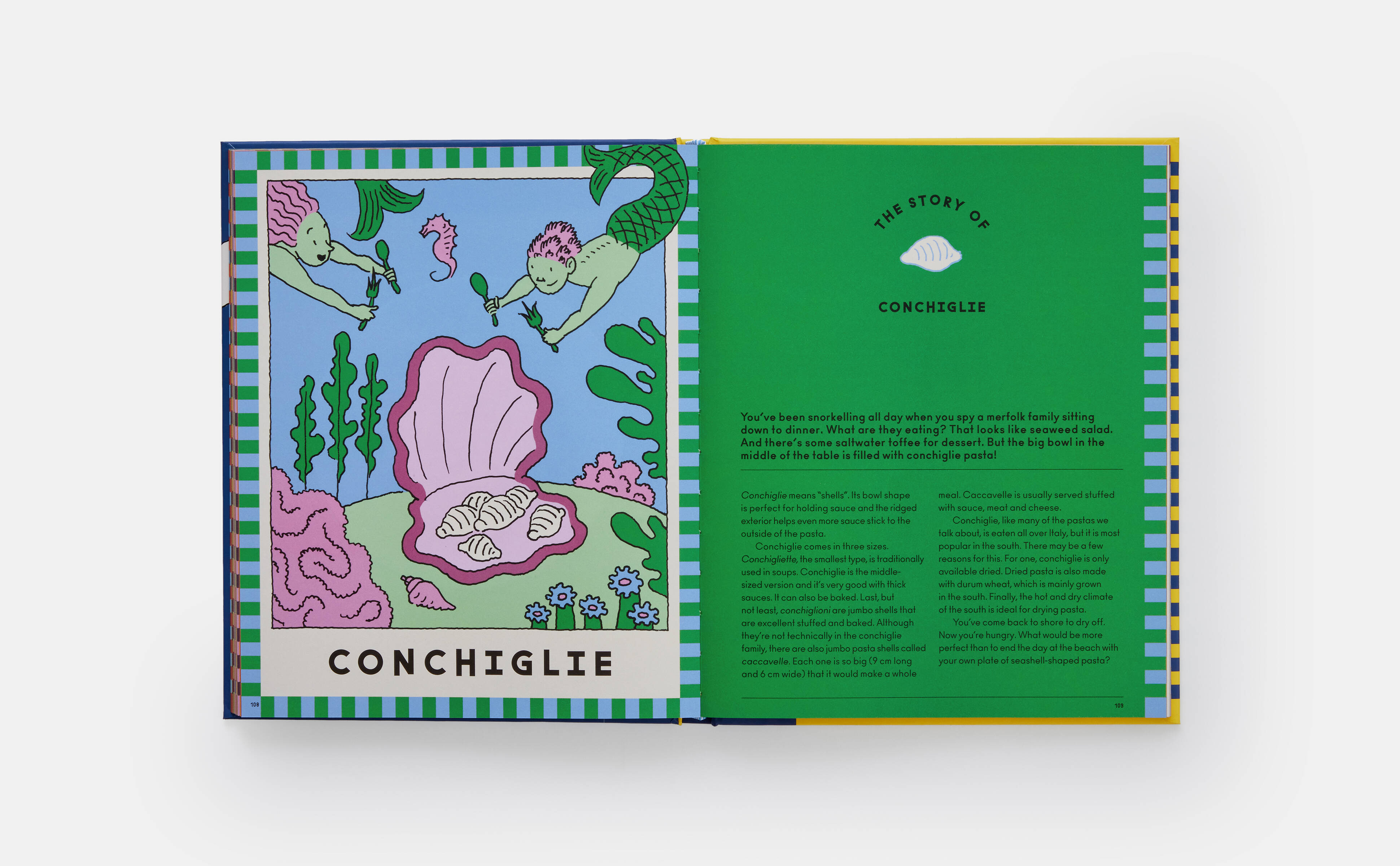
In The Story of Pasta, the reader gets the feel of a lot of things being communicated: the food, playfulness, motion, Italy. What role does colour play in this mix? I like to work with a limited palette to choose three colours, five colours. Even eight colours is a limited palette, if you stick to those eight colours and put them through all their paces and maybe don’t use every one of them in every image. What we had for The Story of Pasta and How to Cook It!, it's not full colour, and it wasn't meant to be what I call local colour – colour that is an accurate representation of the external world.
It allows you to play with abstraction in a way where the reader will go with you if you make something that everyone knows is red, or everyone knows is blue. Another thing about kids seeing images is that they have a much easier time with abstraction, with inaccuracy. All these things that I think of as playful elements are opportunities to bring something where you go outside of a representational version of reality. So, some of the colours in the pasta book were quite off, but having some neutral colours allowed me to bring in these other odd colours.
Did you start with a particular visual goal to achieve with The Story of Pasta? The goal was to make it a storybook. Visual books are so great because you've got all these tools: You've got images, you've got words, you've got colour. The Pasta book images weren't really story or narrative images; they were more, at least to my mind, idea images. The idea was to take a visual metaphor, to bring two unlike things together, and set off a little flash in the reader's mind.
Do you work analogue or digital? My work is almost entirely analogue. When I make a full-colour illustration from scratch, I use watercolour pen and ink. I tend to love line, and I love to fill the line with flat colour. To me that's almost the imagery of childhood, probably because of the Rupert books, W. Heath Robinson, old Punch cartoons, old New Yorker cartoons. It's also partly rooted in the history of image making. A contained line printed and communicated much better than something that was tonal without a contour around it. My style really is trying to take these past influences and trying to make something that looks like it was made today for a contemporary audience.
How do you start? Does it take you a long time to work up to something, or are you quite instinctive? I'm totally instinctive. I have no problem working. I carry a sketchbook with me always. I’ll draw on every piece of paper that's within reach. I've been drawing while we've been talking. It's a bit of a tic, but it's also how I come up with ideas for new projects. I keep these sketch and doodle pads around. What’s in them often doesn't look anything like my professional work, but if I like it, I'll rip it out, and I'll paste it into a scrapbook. One does tend to return to certain tropes and ways of working. And if I really feel tired of that, I'll go back to these drawings that don't look like me, but obviously I made them so there must be something of me in them, just as an inspiration to myself.
You teach at Parsons, but were you formally trained? I wrote and read as much as I drew. I came from a very academically inclined family. I went to Brown University, which had a relationship with the Rhode Island School of Design. I’m a college dropout, though. I went to Italy for a year in college, took a leave, came back, and started working as an assistant to an illustrator and I never really looked back. When I became chair of the Illustration Program at Parsons, I had to reveal that I didn't have a degree.