How the Obama Progress/ Hope graphic design was created
Our new book Graphic Classics reveals the back stories to some of the most momentous designs in history
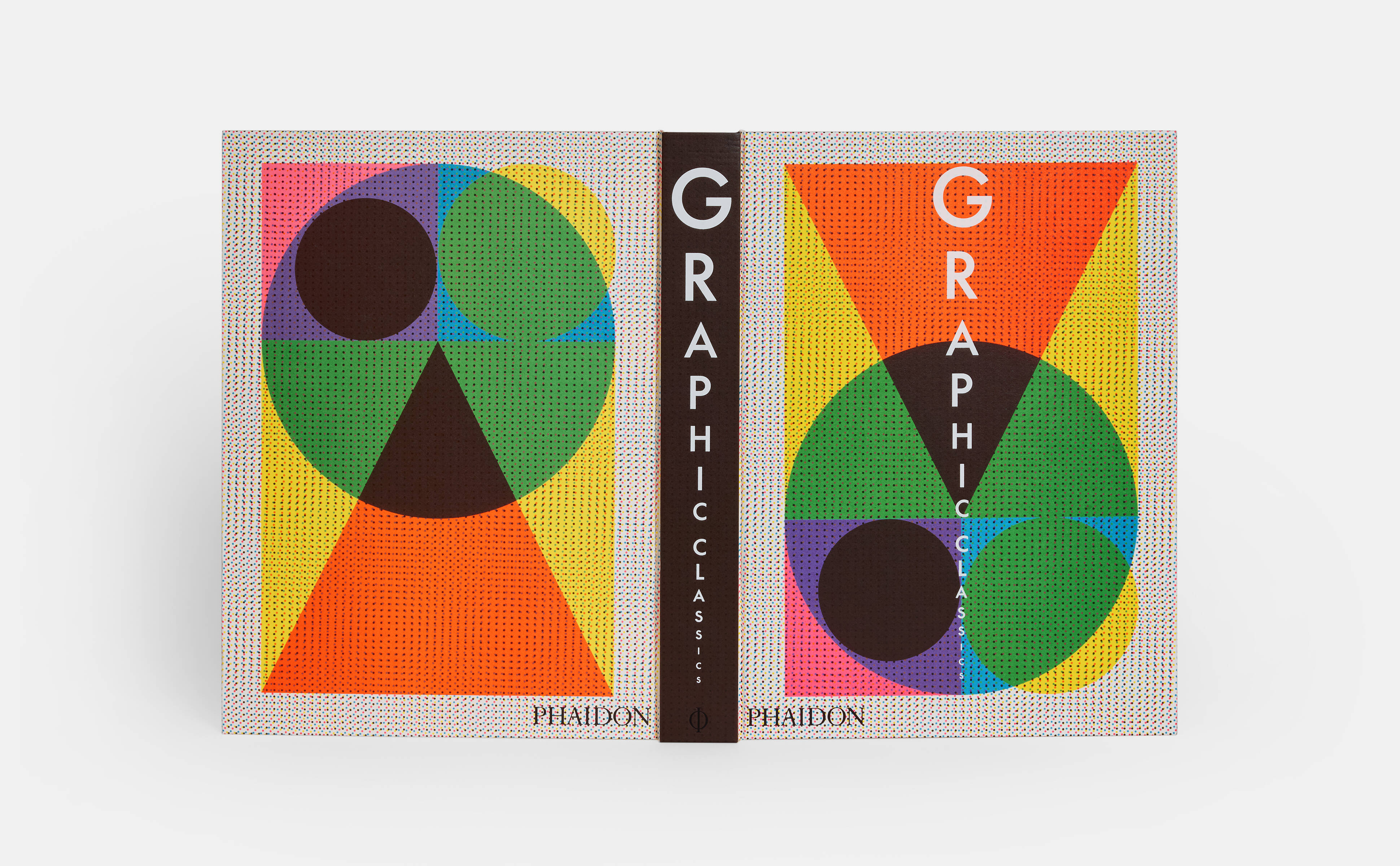
Graphic Classics, our new deep dive into graphic design history, presents the work of more than 400 designers across 33 countries and 5 continents, with work dating back to the 14th century.
The book’s dizzying array of designs ranges from the Gutenberg Bible to Joy Division album art, with work by both anonymous creators and industry icons such as Aleksandr Rodchenko, Paul Rand, Paula Scher, Ahn Sang-soo, and Julia Born along the way. It’s the perfect reference guide for design and art lovers, enthusiasts, and professionals at any stage of their careers, as well as all those interested in and impacted by visual communication.
But more than that it is a look at the designs that shaped the contemporary world around us. In this election year we’ve chosen to focus on some of the iconic and groundbreaking campaigning social and political designs in the book. This story reveals the background to Shepard Fairey's 2008 poster design Progress/Hope featuring Barack Obama
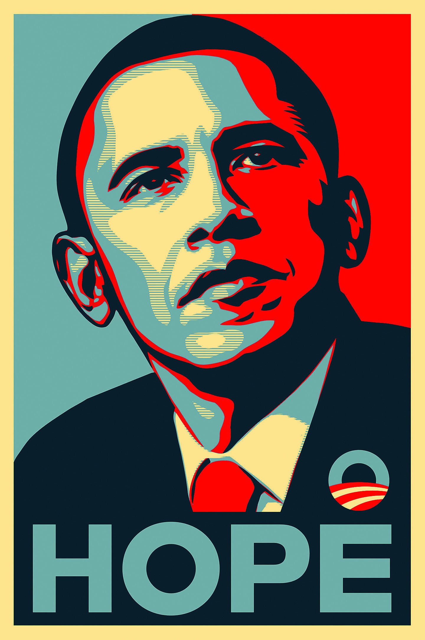
In a very short period of time Shepard Fairey’s Obama poster, produced to demonstrate his allegiance to Barack Obama’s 2008 presidential election campaign, has become an icon of twenty-first-century graphic design. Displaying a stylized illustration of the presidential candidate (based on a found image), coupled with the one-word text, the poster can be compared with the Pop art portraits of Andy Warhol or the conceptual works of Barbara Kruger. Allying a powerful simplicity to an optimistic message, the poster achieves a perfect synthesis of image and text to communicate the essence of the Obama vision.
Fairey is best known for his stenciled “Obey the Giant” posters and stickers, based on a photograph of a French wrestler, and other street-art and guerrilla-marketing techniques he originated in 1989. For this poster, Fairey began by selecting a suitable news photograph of Obama, looking, as the artist states, “wise but not intimidating.” The image was then cropped and simplified by eliminating facial lines and background details, and red, white, and blue colors were added to emphasize its patriotic nature.
The original edition, bearing the word “Progress,” depicts Obama wearing one of Fairey’s “Obey Giant” logos on his lapel. It was produced at Fairey’s own expense and pasted up around Los Angeles, where he lived, and on his website.
The response to the image was immense. Although wary of Fairey’s notoriety as a street artist, the Obama campaign team asked for a new version carrying the word “Hope” to tie in with their campaign slogan, of which around three-hundred thousand copies were ultimately printed. Fairey later donated two more portraits of Obama to the campaign, bearing the words “Change” and “Vote.”
Such was the popularity of the Obama poster that the National Portrait Gallery in Washington D.C. acquired a large (4 feet 11 inches [1.5 m] high) mixed-media stenciled collage version, and Time magazine commissioned Fairey to produce a portrait of the president-to-be for the cover of its 2008 “Person of the Year” issue.