How the Black Lives Matter graphic design was created
Our new book Graphic Classics reveals the back stories to some of the most momentous designs in history
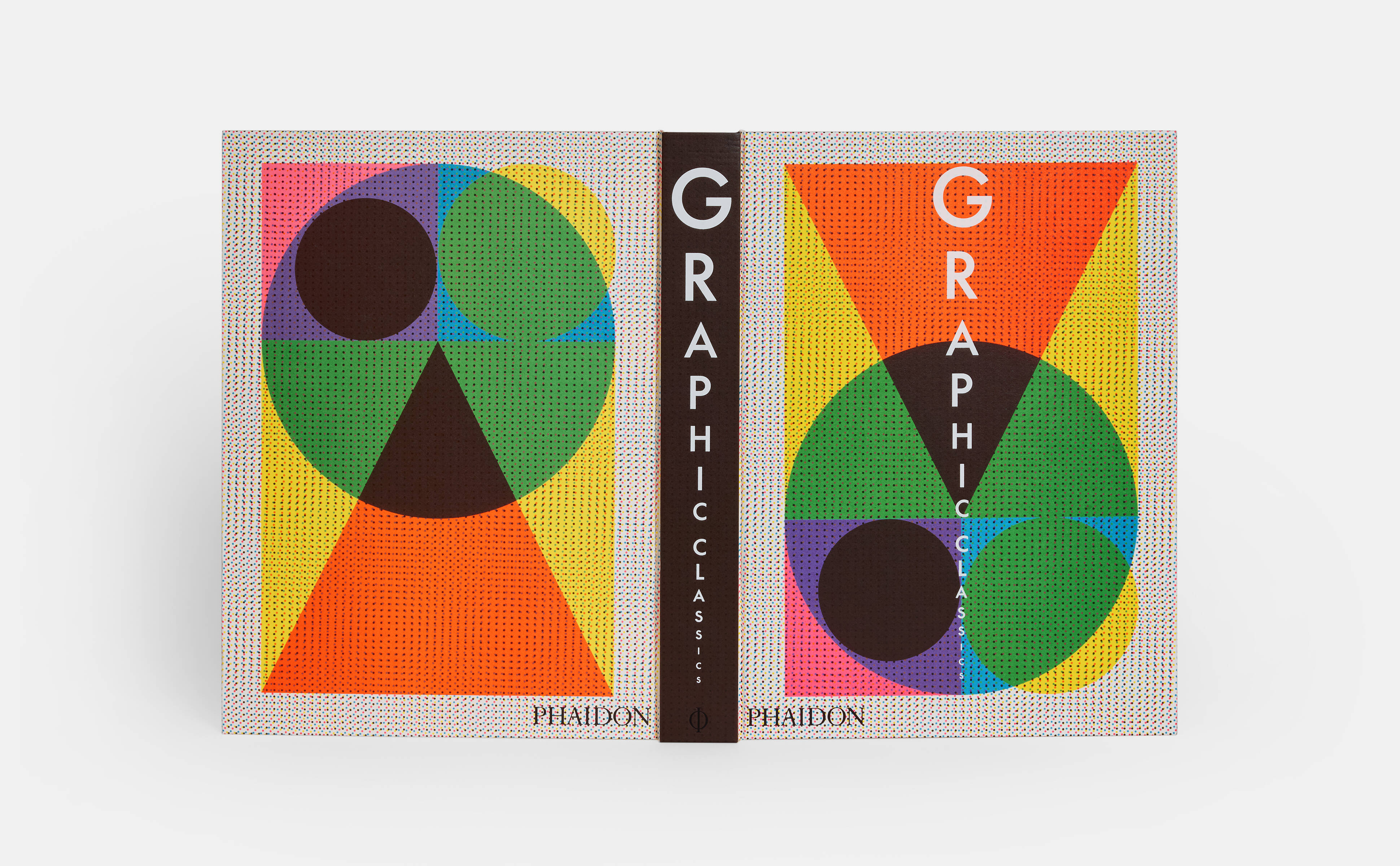
Graphic Classics, our new deep dive into graphic design history, presents the work of more than 400 designers across 33 countries and 5 continents, with work dating back to the 14th century.
The book’s dizzying array of designs ranges from the Gutenberg Bible to Joy Division album art, with work by both anonymous creators and industry icons such as Aleksandr Rodchenko, Paul Rand, Paula Scher, Ahn Sang-soo, and Julia Born along the way. It’s the perfect reference guide for design and art lovers, enthusiasts, and professionals at any stage of their careers, as well as all those interested in and impacted by visual communication.
But more than that it is a look at the designs that shaped the contemporary world around us. In this election year we’ve chosen to focus on some of the iconic and groundbreaking campaigning social and political designs in the book. This story reveals the background to Logo Design Action Collective and Alicia Garza's 2013 design, Black Lives Matter.
Black Lives Matter (BLM), a slogan now synonymous with worldwide calls for racial and social justice, and an end to police brutality, originates from the movement of the same name, which began in 2013 after a neighborhood-watch coordinator, George Zimmerman, fatally shot an unarmed Black teenager, Trayvon Martin.
The founders of the movement, Alicia Garza, Patrisse Cullors, and Opal Tometi, initially set up BLM as a hashtag and call to action, but over the following three years—as incidents of racial profiling and police violence against Black people increased— they expanded the premise to form a nationwide network of more than thirty local chapters. As with many other social movements, the visual manifestation of BLM is rooted in protest imagery and signage.
The original branding for the movement was created by a California-based design studio, Design Action Collective, which partners with socially minded groups and organizations. Asked to come up with an identity in just three days, the team devised a straightforward logo that was legible, instantly identifiable, and easily reproduced. Their main concern was creating something that people within the movement could also paint or draw by hand, to apply it to ephemera, such as placards, leaflets, and other protest signage.
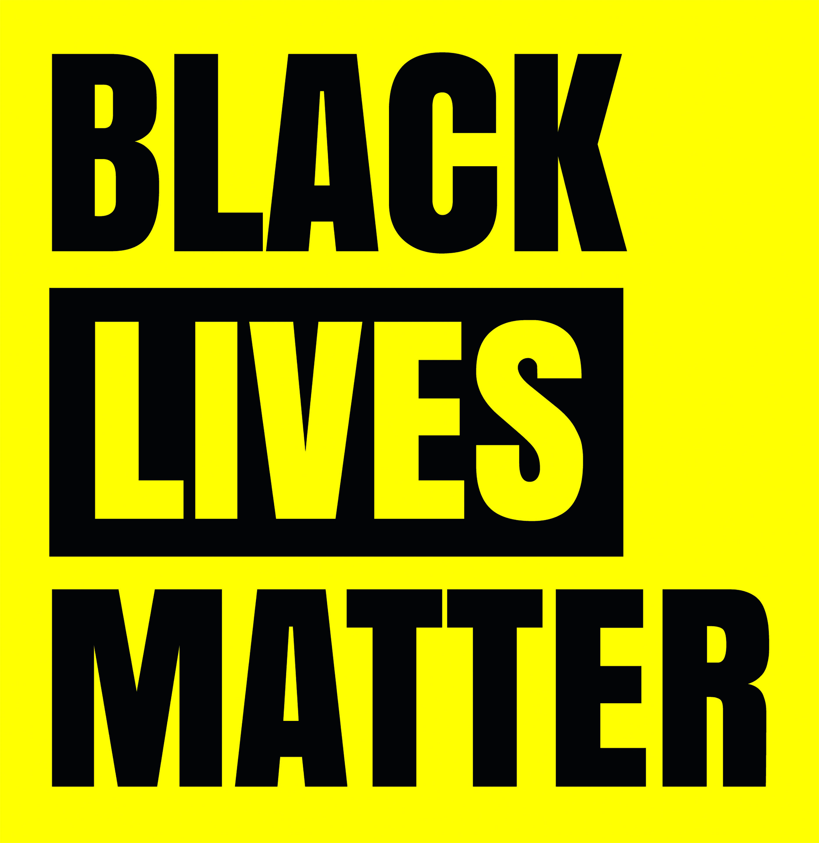
The simple wordmark uses Anton—a new take on a traditional advertising sans-serif typeface—and renders all letters uppercase. Although the wordmark is often seen in black and white, the original version features black letters against a yellow background, creating what team designer Josh Warren-White has referred to as a “bold, strong, and militant” impression.
The very first iteration of the logo also included an illustration of a person holding a dandelion seed head, with blown seeds symbolizing the origins of a movement. More than a decade later, as the movement has moved from grassroots to mainstream, there is still significant work to be done. For BLM’s founders, the slogan and symbol—adopted by individuals and corporations alike—must not ring hollow; it necessitates decisive action and a commitment to change at all levels. As cofounder Garza explains, “If we don’t say what we mean and mean what we say, what are we actually fighting for."