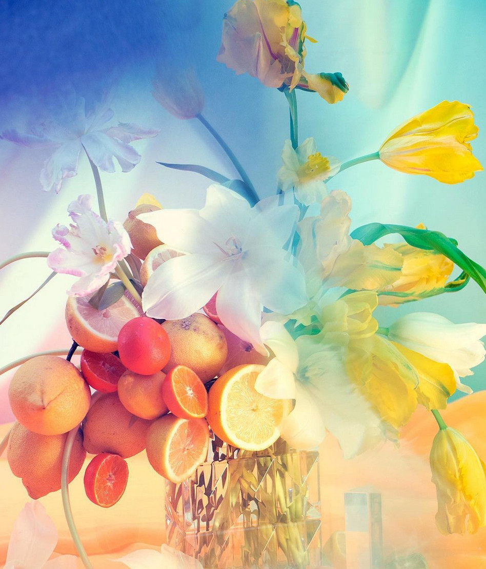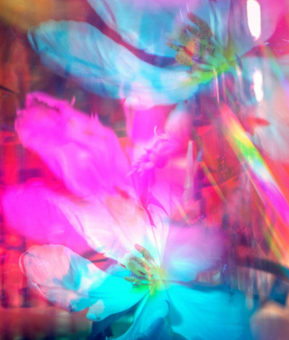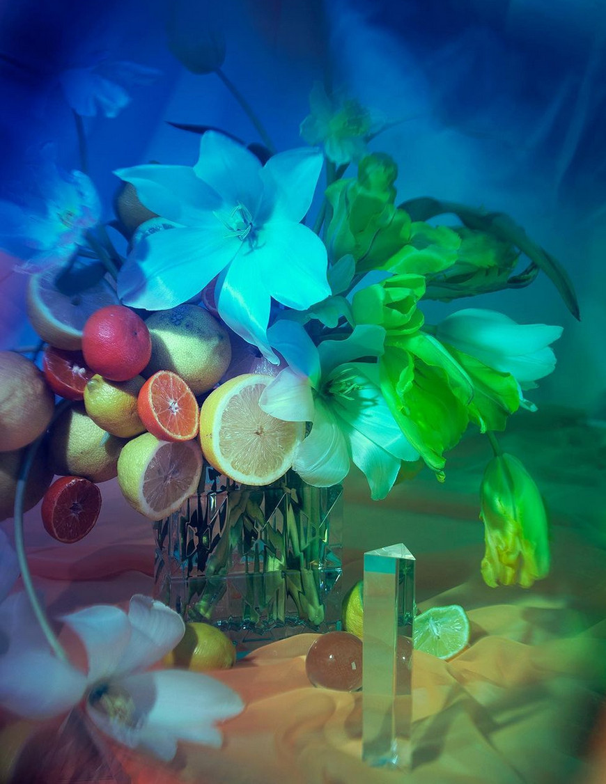
Michael and Darroch Putnam set the floral colors spinning in these new pictures
The Flower Color Theory authors push the boundaries of floral photography with some striking new images
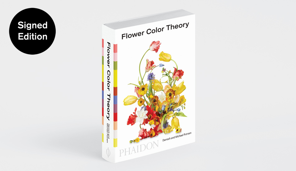
The line between art and nature is pretty blurred for Michael and Darroch Putnam. The founders of the world’s most sought-after floral design agency, Putnam & Putnam, often draw on great artworks when coming up with their work, as they explain in their new Phaidon title, Flower Color Theory.

“While we were creating the arrangements for this book, we frequently visited museums for inspiration,” they explain in the introduction. “We went to the Guggenheim Museum and the Museum of Modern Art in New York City and the Clark Art Institute in Williamstown, Massachusetts. We wanted to see how the artists we admired used color. If you squint when you look at a work, the noise is canceled out a little bit and you’re able to see color as a block, as a field. In cases when we thought that we could do a really cool arrangement with a block of color, we’d take a photograph of the painting. Michael would do a quick visual sketch, and from there, we would come up with the color swatches that we would use when we went to the flower market.”

That new book shows the myriad ways to combine flowers of different hues, all built around color schemes. Now, in a new series of arrangement photographs posted on Instagram, Darroch and Michael have turned the tables, making some pretty stunning imagery themselves. These new pictures of fruit, flowers and Baccarat crystalware under slightly unnatural lighting bring to mind the floral imagery of Fischli and Weiss, the dreamy videos of Pipilotti Rist, or maybe, even, if you squint, the blurry canvases of Helen Frankenthaler.

For more on how Darroch and Michael work their floral magic, order a copy of Flower Color Theory here. Meanwhile, for more ravishing petals, get Flower.