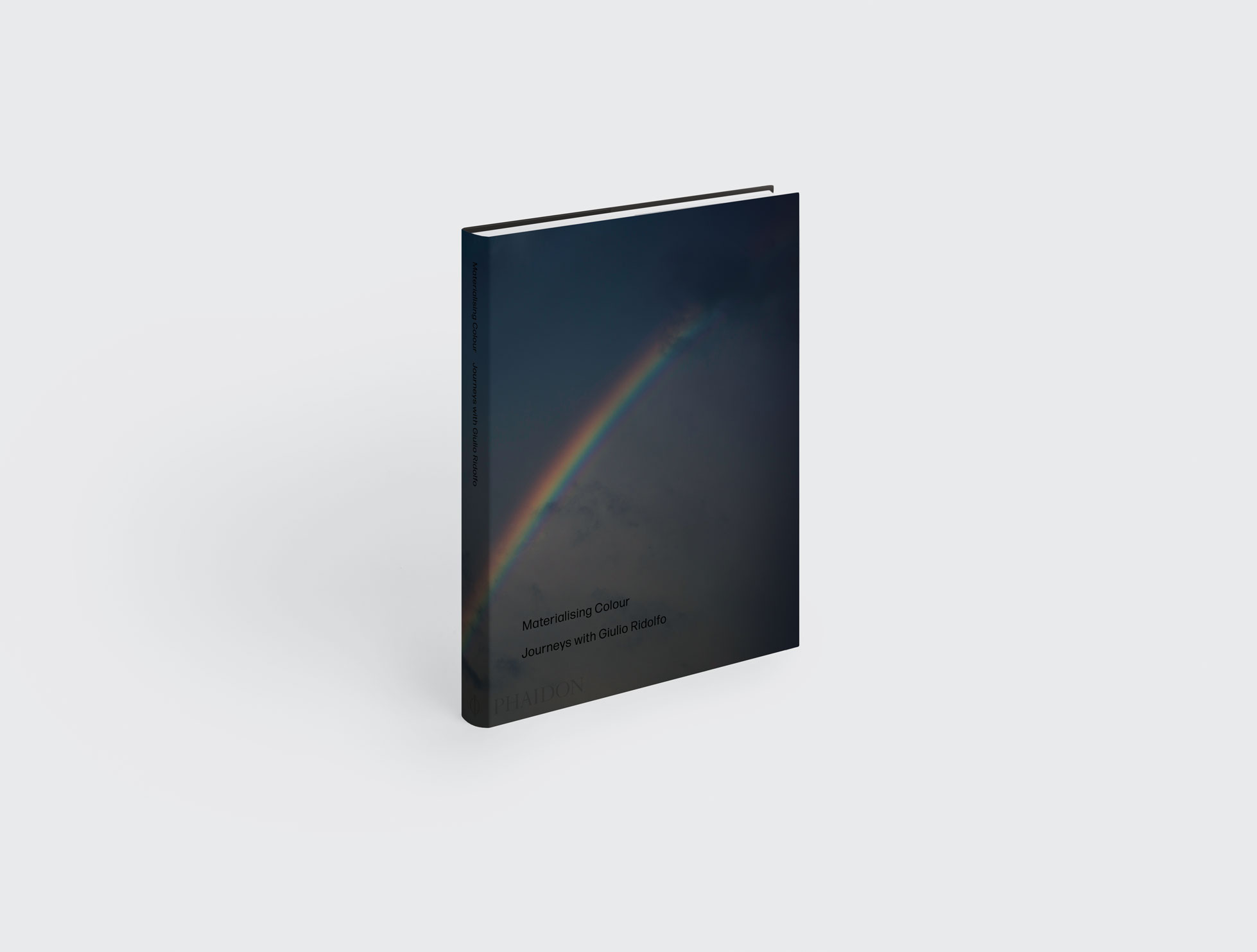
All you need to know about Materialising Colour
Our new book reveals how Giulio Ridolfo takes inspiration from nature, pop culture and traditional craft to help Kvadrat find the colours for its collections
Henri Matisse said that ‘With colour one obtains an energy that seems to stem from witchcraft.’ But Matisse could obviously never have predicted how the availability and accessibility of colour would increase so exponentially in the years to follow, could never have envisaged a moment when a phone could become a sophisticated colour machine capable of reproducing trillions of shades. In actual fact, colour is still in a transformative phase in its long history.
Liberated from constraints such as material or cost, synthetic colour can be applied to more or less anything. But with this liberation comes overfamiliarity.
Now that we can have colour everywhere, colour has become untethered from its cultural context; it has lost its roots and its meanings and often much of its emotional power. Mastery of colour, the kind that Wassily Kandinsky described ‘as a power which directly influences the soul’, has become elusive. What actually dictates the colour of the designed world? Who chooses the colours of a building, a sofa or a pair of shoes for instance?
In a designed environment – superimposed with branded schemes and dominated by the standardised chemical shades of industrialised production – are there alternative approaches to colouring our surroundings? How can colour be more sensitively attuned to the complexities of culture in a global context, and demonstrate an intrinsic connection to where we live – to community, ecology or climate?
The role of the colourist is little known outside the design world, and yet colour is one of the most emotionally resonant ways in which we connect to our surroundings and the objects that furnish our lives.
Our new book, Materialising Colour aims to give insight into the approach of one of the most influential colourists in the design world, and to illuminate his quest to develop a more resonant and nuanced chromatic sensibility.
Giulio Ridolfo works as a colour adviser to many of the world’s leading textile companies. He gathers images, patterns, and textures and combines these different elements in myriad ways until he creates something new.

The book came into being when Anders Byriel from Kvadrat, the pioneering Nordic textile company with which Ridolfo has collaborated for over a decade, suggested there was a place for a book focusing on this most important aspect of contemporary design. At that time, literature on colour was limited: there were the modern classics, such as those by Johannes Itten and Josef Albers, but little more recent exploration of the meaning of colour in design.
Ridolfo takes a subjective, alchemical road. Tellingly, he describes his approach as ‘homeopathic’, perhaps intentionally setting it against the scientific basis of more conventional colour theory.
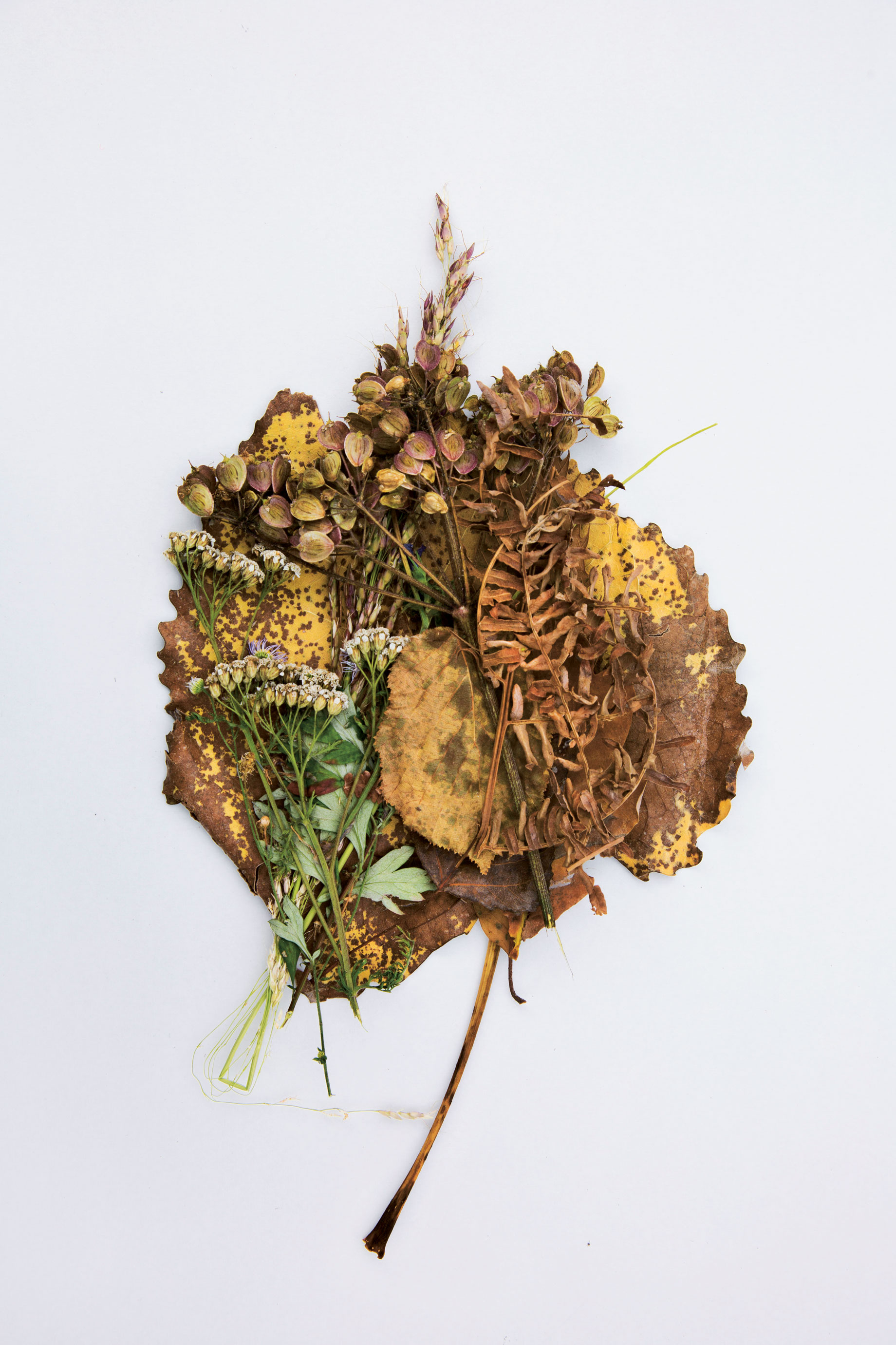
If scientific theories on colour can seem dry and ‘colour-less’, Ridolfo uses colour and textiles to stimulate sensibilities and provoke moods, to evoke and celebrate a sense of place. His work is deeply rooted in observation, intuition, materiality and the mutability of the natural world. One of his favourite sayings is ‘You can’t mix colour in theory’.
In keeping with his view, our new book is structured around a series of visual essays that aim to illuminate Ridolfo’s idiosyncratic preoccupations and investigations into colour.
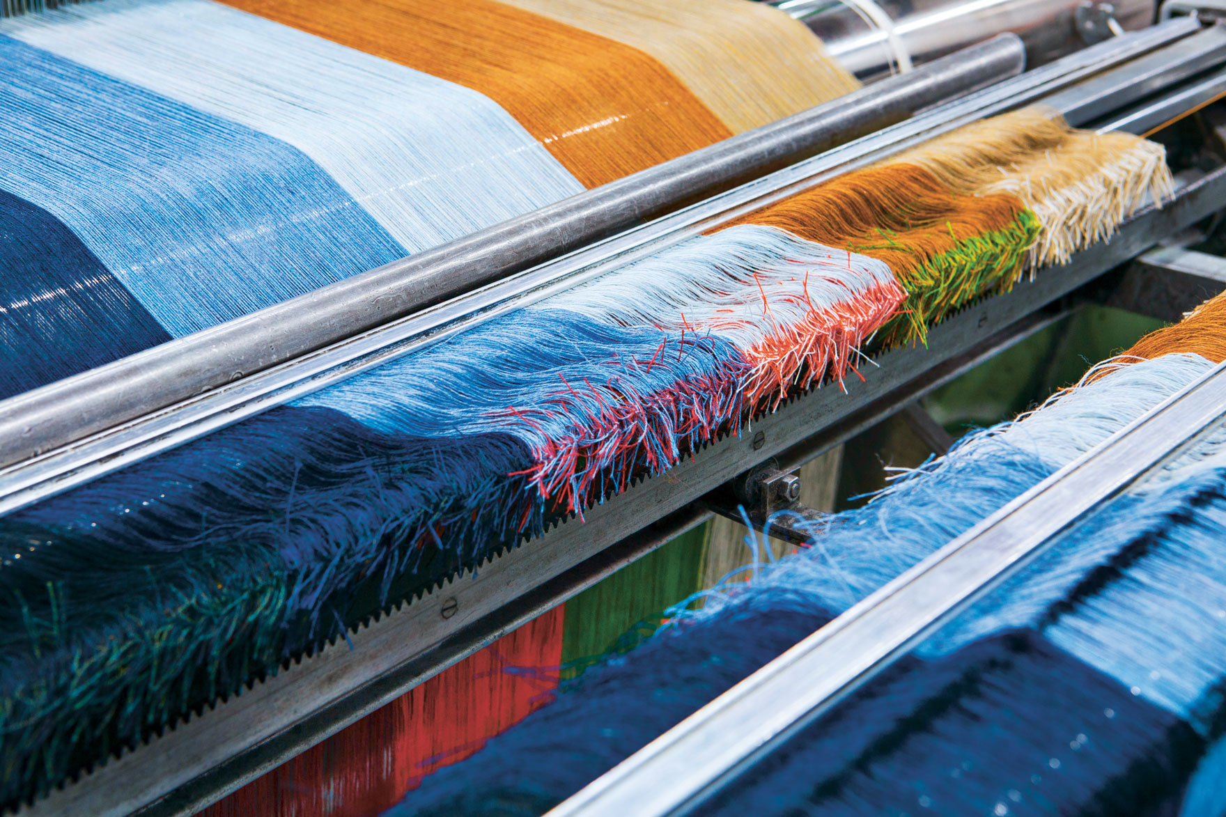
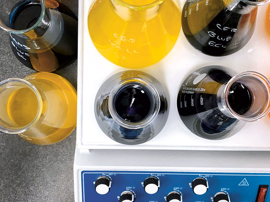
Each one focuses on a particular design assignment, revealing how Ridolfo is attuned to the particular challenge and its cultural context. Instead of working in the studio, he often takes these assignments outdoors or ‘on the road’ – researching colour in its cultural context, and constructing a narrative: a deep sense of meaning and place. One essay records his close collaboration with Kvadrat and exploration of the Danish coast in the quest to bring a more nuanced colour sensibility to design textiles.
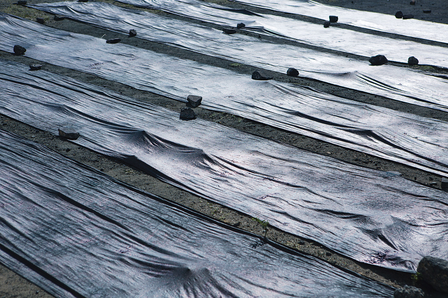
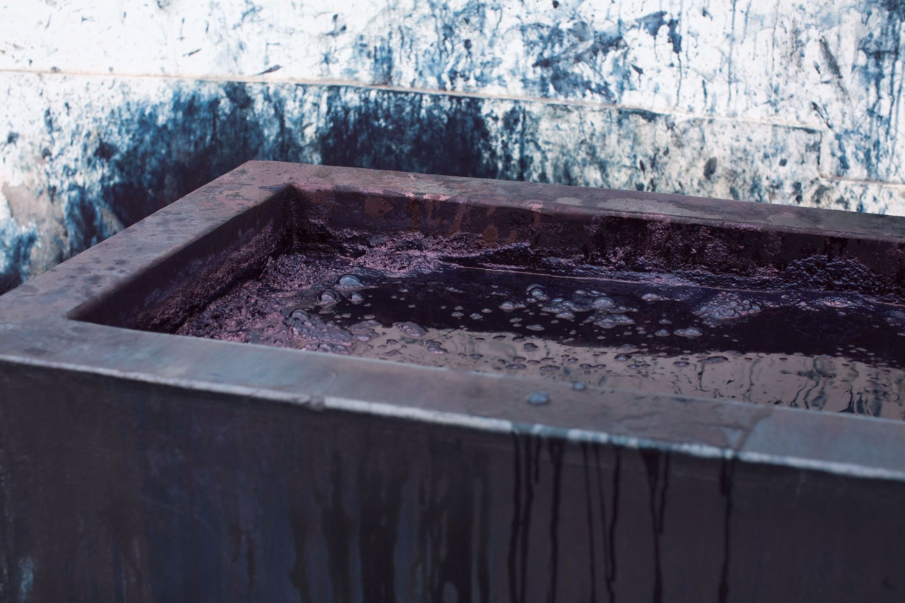
Another documents his research into traditional dyeing practices in Gujarat, western India, and then follows the exacting process of translating this ancient craft to industrial manufacture by mixing colour in the structure of the yarn itself. Another follows Ridolfo’s pilgrimages in his native Friuli, and his deep immersion in this cultural terroir and the people – past and present – who cultivate it. Yet another illuminates his close working relationship with designer Patricia Urquiola and their shared interest in stretching the parameters of textiles beyond living spaces.
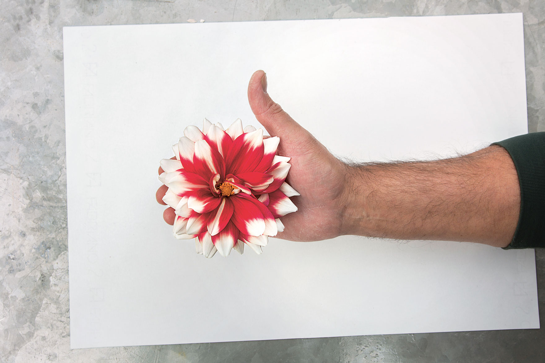
Ridolfo was accompanied on these travels by the photographer Howard Sooley, like Ridolfo, Sooley is a keen plantsman and gardener. Ridolfo first encountered his work through Sooley's collaboration with artist and filmmaker Derek Jarman on the book Derek Jarman’s Garden, which records the evolution of Jarman’s garden at Prospect Cottage, Dungeness, in the southeast of England. Sooley has also documented the changing seasons at Great Dixter – the atmospheric garden of flamboyant horticultural writer Christopher Lloyd and Fergus Garrett in East Sussex, and one of Ridolfo’s favourite gardens.
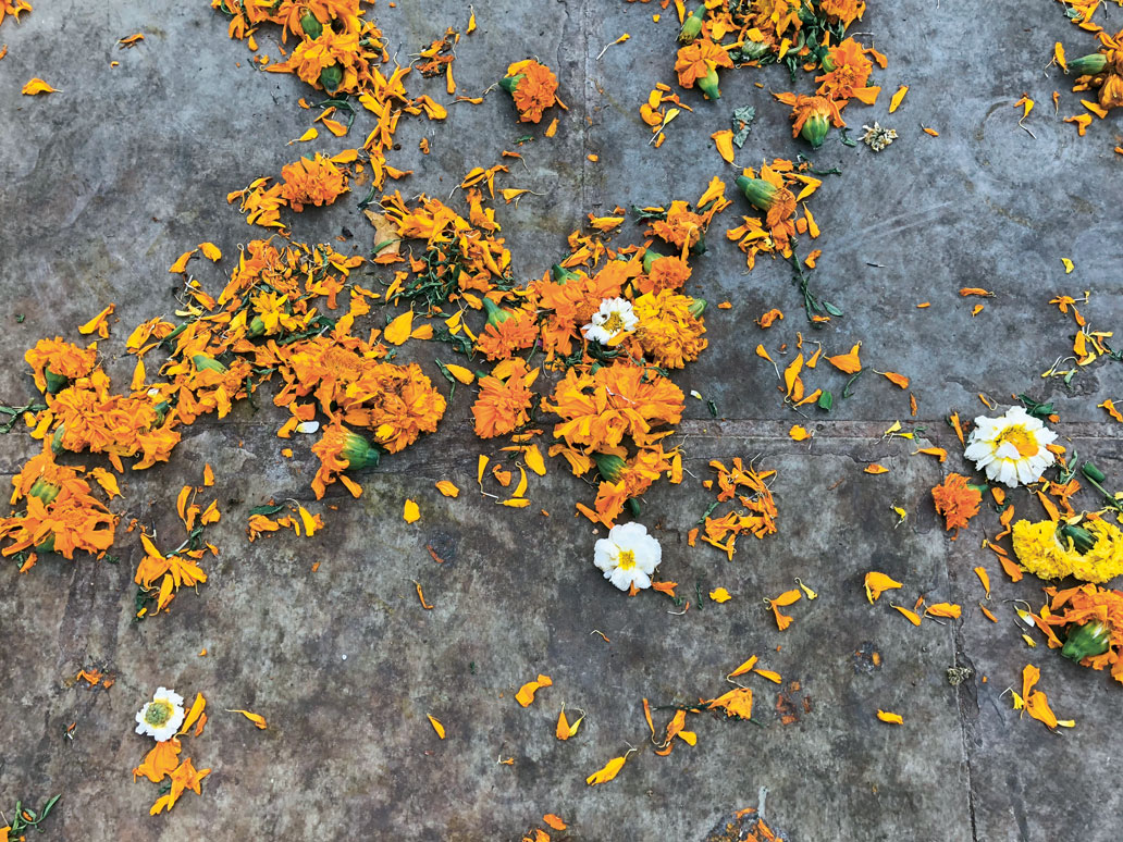
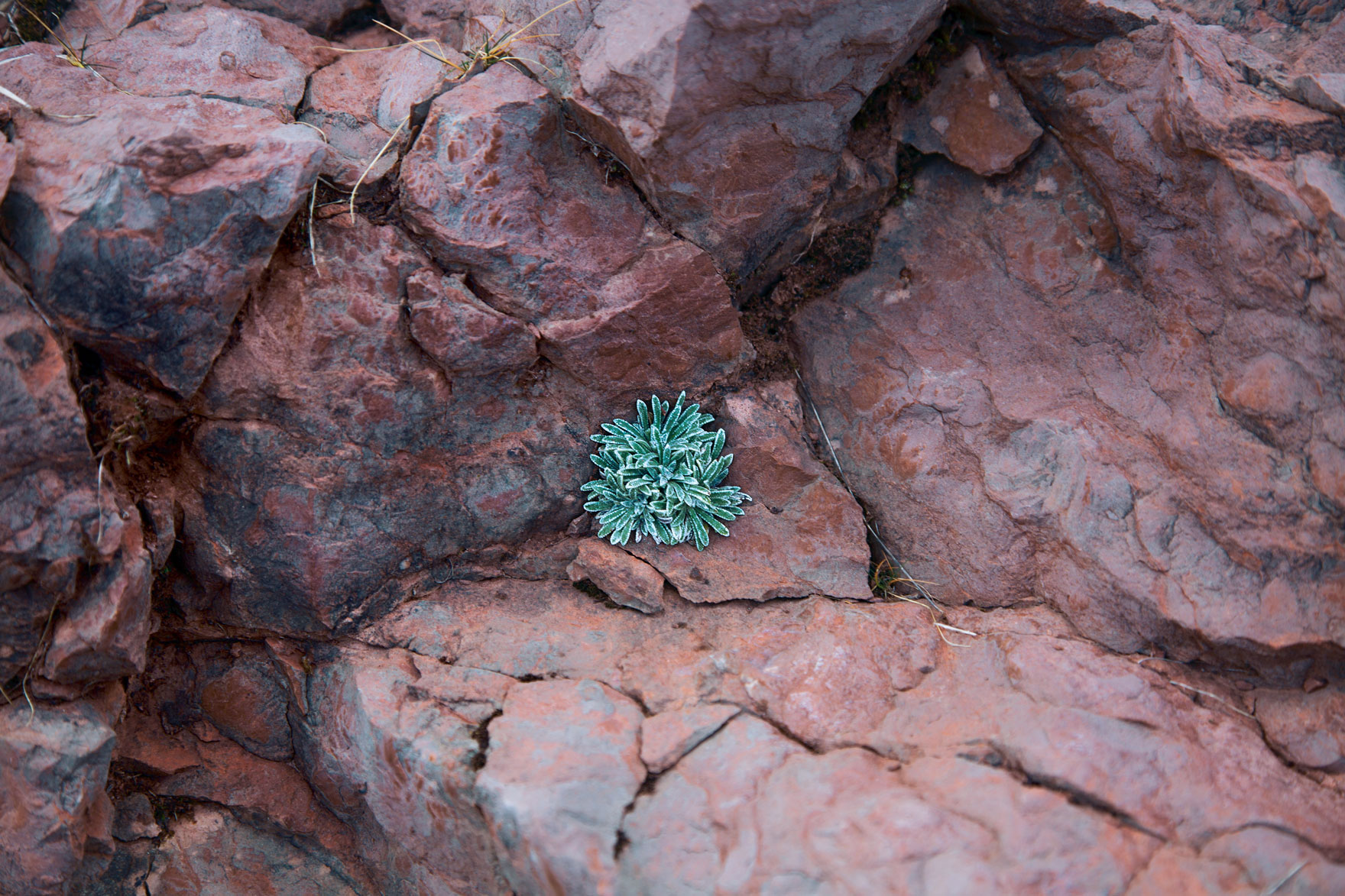
Attuned to Ridolfo’s quixotic sensibility, Sooley quietly records this intuitive and synaesthetic working process, weaving visual cues and ethereal references into narratives that reveal Ridolfo’s search for meaning through colour and his ability to extract it from the fleeting and the ephemeral – from plants, stones, water, food, music or street life.
Within these travelogues in the book, we also encounter Ridolfo’s web of friends and collaborators, and there's also a highly eclectic A–Z of colour at the back of the book that ranges far and wide, playing on music and synaesthesia, horticulture, history, chemistry, geology, psychology, pop and gastronomy, alchemy and sorcery.
And who couldn't do with a little more colour to brighten their lives right now? Learn more about Materialising Colour in the store now.
