What should we expect from the new Wes Anderson and Steven Spielberg films?
Annie Atkins has worked on The French Dispatch and West Side Story. Here’s how she engages with each director
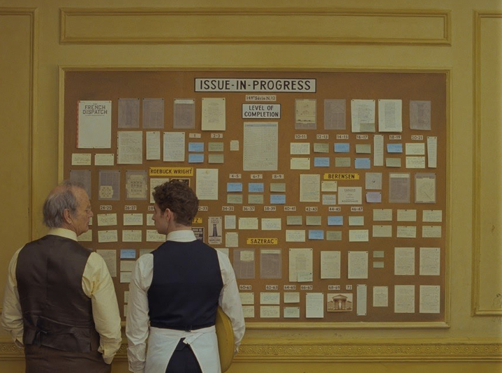
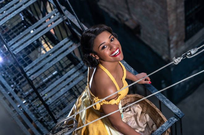
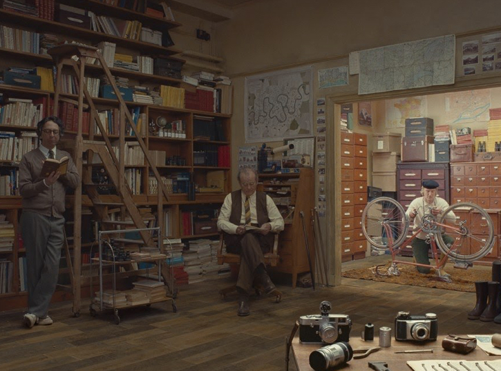
The cinematic graphic prop designer Annie Atkins has had the good fortune to develop working relationships with not one, but two of the world’s most successful film directors: Steven Spielberg and Wes Anderson. In July, Searchlight Pictures will release Wes Anderson’s latest movie, The French Dispatch, while 20th Century Studios will put out Spielberg’s remake of West Side Story, just before Christmas.
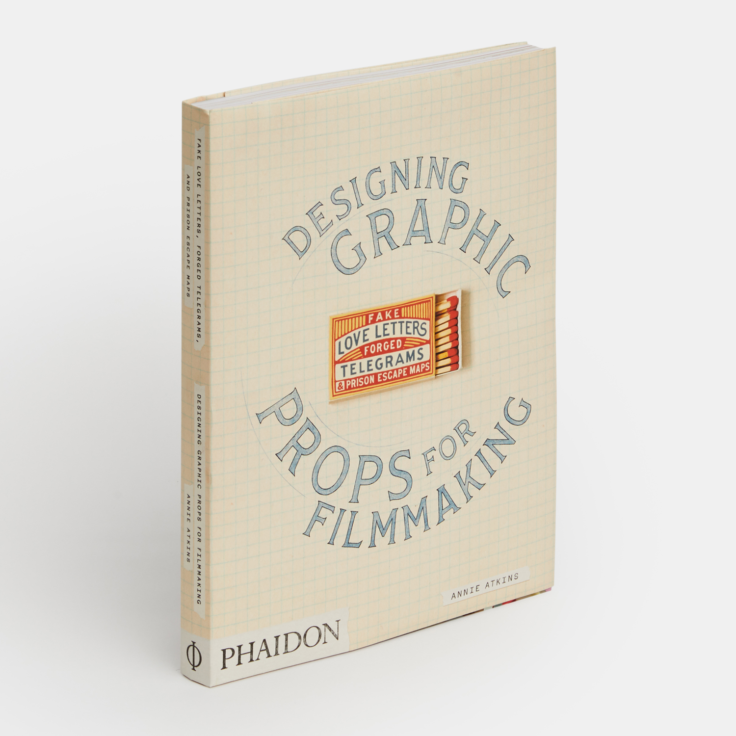
Atkins worked on both films, as well as on previous Anderson and Spielberg productions. As she explains in her new book, Fake Love Letters, Forged Telegrams, and Prison Escape Maps: Designing Graphic Props for Filmmaking, she has a strong appreciation of the work of both directors.

"Spielberg’s movies shaped my childhood—Jaws, E.T., Raiders of the Lost Ark, Jurassic Park, along with all the other family adventure films that he had pioneered,” Atkins says. However, it was only when she came to produce graphic props for the director’s 2015 film, that she realised it was the films' plausible sense of domesticity – combined with flights of fantasy – that made them so powerful. “If it were Spielberg’s action sequences that we’d played out as children,” she writes, “then it was his scenes of our everyday domestic life that had us hooked in the first place. Here was a chance, I thought, as I read the Bridge of Spies script, to make this world as real for this director as he’d made his worlds for us as kids.”
Both films include dramatic sequences set in late 1950s New York; and, while international espionage (Bridge of Spies) might seem worlds away from tales of love and gang violence (West Side Story), you can be sure Atkins devotion to plausible domesticity will give the new movie as much dramatic power as Atkins’ props lent the 2015 production.
Atkins’ work on Anderson’s films is equally exacting, though in different ways. In the book, she recalls her first assignment for the director, work on The Grand Budapest Hotel. “While every prop started out with a reference from history, each had to be developed to suit the camera, the story, and his visual style,” she writes. “He experimented with every piece we made for him, and we would amend each design until it was just the right balance of historical Eastern Europe and the amplified, make-believe Zubrowka.”

The French Dispatch, which is set in a fictional French down during the mid 20th century, might, if anything, require a greater degree of fine-tuning, given that France is, after all, a real country. However, you might want to pay attention to how logos for institutions in the new film might vary, according to their media.

“In modern commercial design, it’s common practice to keep any given business identity consistent,” explains Atkins. “Shop logos look exactly the same on their storefronts as they do on their websites as they do on their paper bags—it’s the matching luggage of graphic design. It wasn’t always this way, though. In the early 1900s, the style of an establishment’s lettering was dictated by the material: the name on the iron gates was designed by a blacksmith, while the font on the stationery was chosen by the printer. It’s unlikely that these two craftsmen would ever have laid eyes on each other, let alone swapped style notes.”

Watch The Grand Budapest Hotel, and you’ll notice that the styling of the hotel’s name varies, looking quite different on its notepaper, when compared with the sign set into the building’s upper reaches. Perhaps this stylistic tic will be carried across to the French Dispatch too.
To find out more about Atkins’ work with Anderson and Spielberg, and to see many more of her designs, order a copy of Fake Love Letters, Forged Telegrams, and Prison Escape Maps: Designing Graphic Props for Filmmaking here.