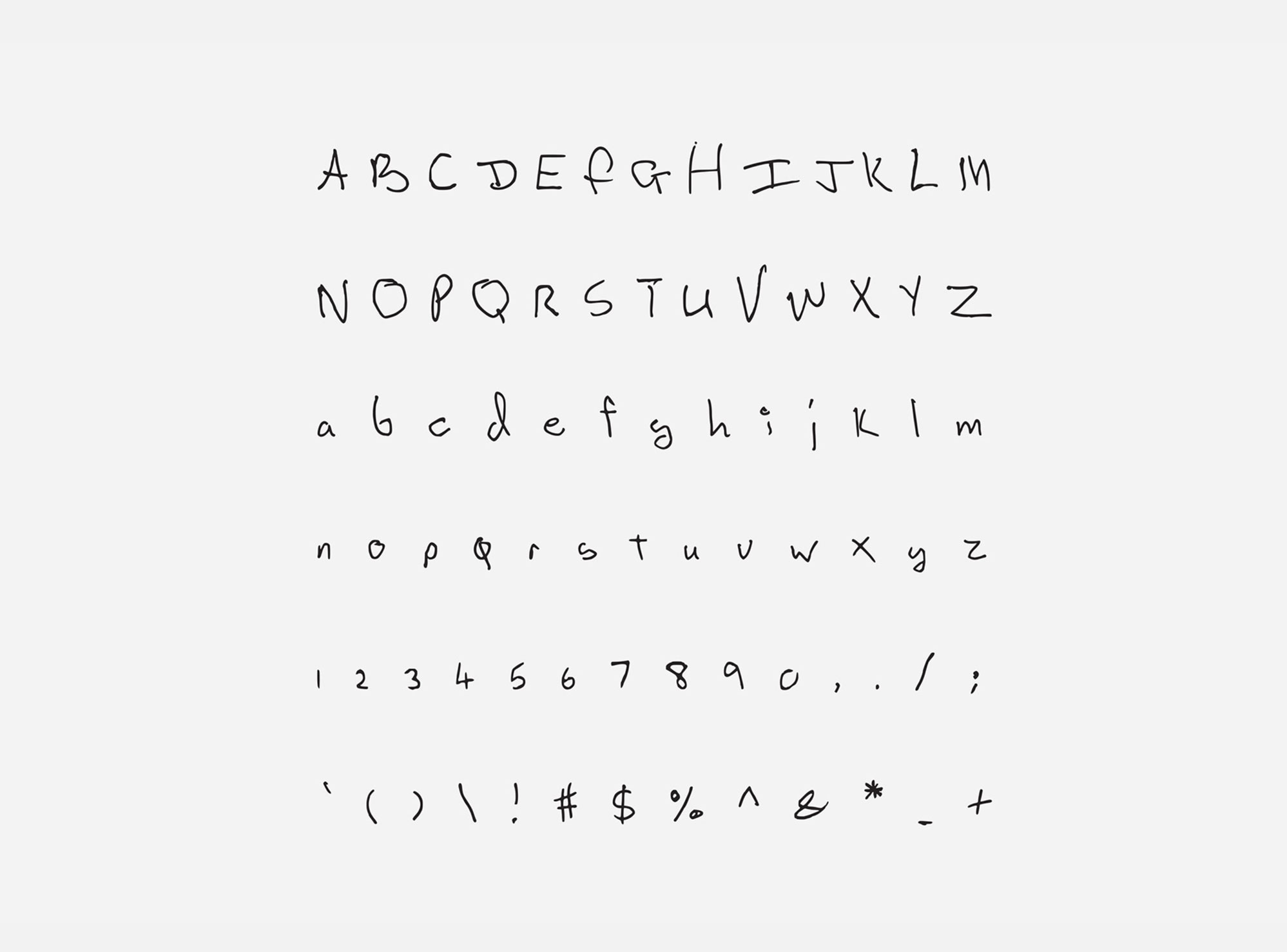
Bowie, Cobain and Cohen get their own typefaces
You may not be able to write like your heroes but your writing can look like theirs with these rock star fonts
Tired of typing in Arial? Comic Sans not quite giving your presentation the gravitas you think it deserves? Helvetica Neue Bold Condensed causing your audience to throw eggs? Rock stars to the rescue!
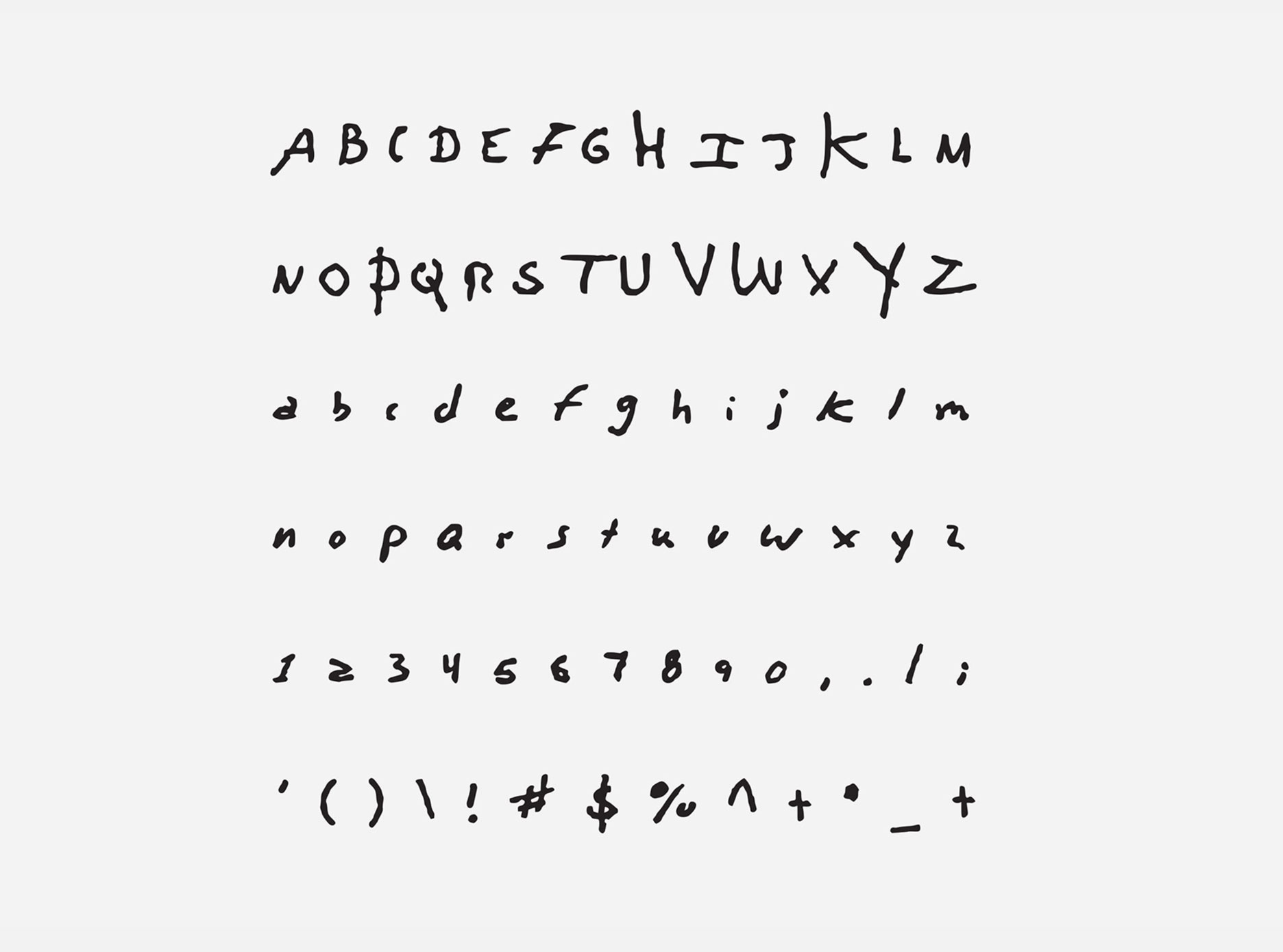
Graphic designers Julien Sens and Nicolas Damiens have transformed the handwriting of David Bowie, John Lennon, Kurt Cobain, Leonard Cohen, Serge Gainsbourg and others, into free-to-use rock star fonts and typefaces.
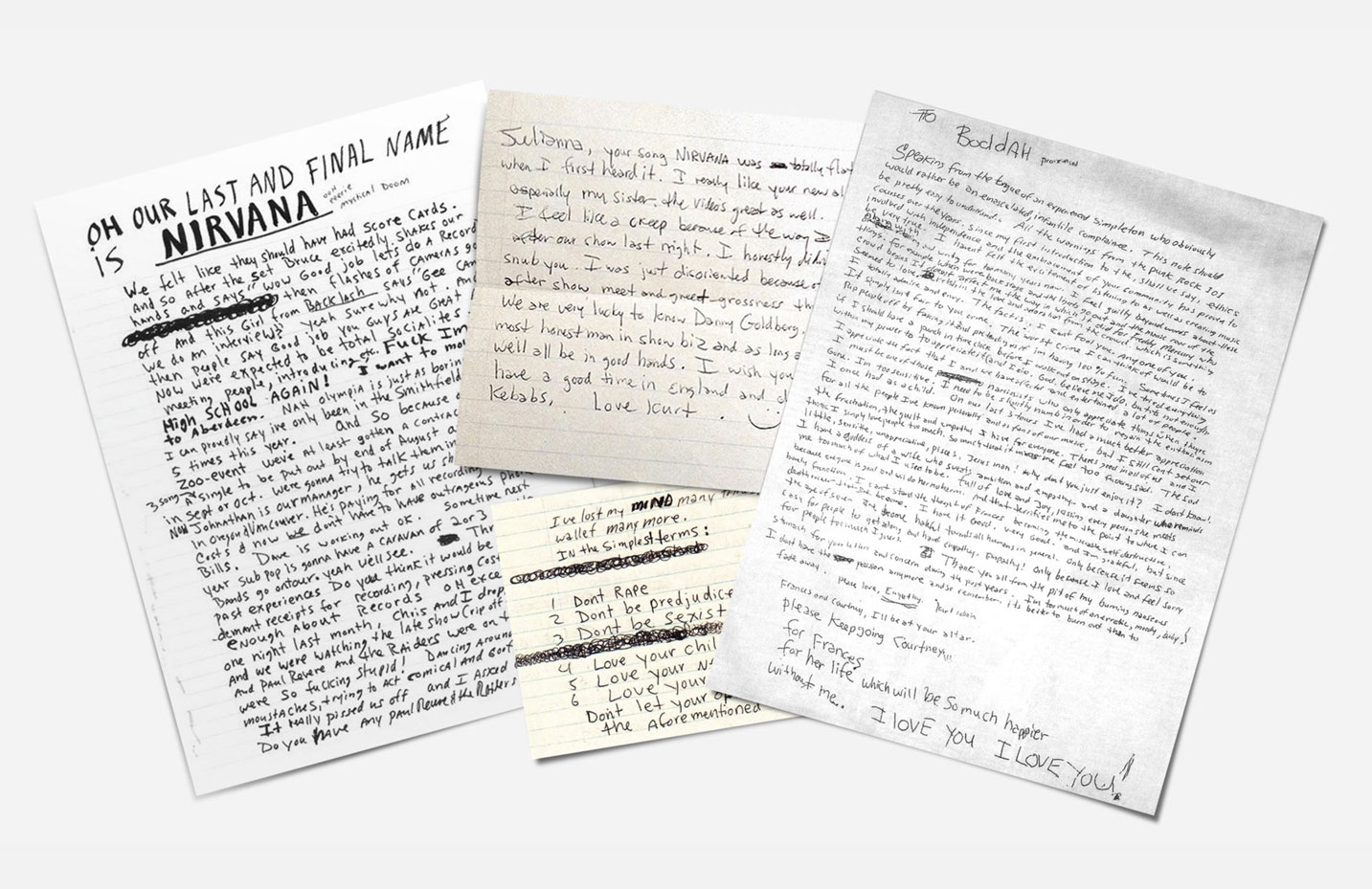
The pair drew upon handwritten letters and notes penned by Kurt and co to develop the new typefaces. Called Songwriter Fonts, the typefaces were intended to inspire songwriters - though fans and creatives alike will want to download and use them.
"We developed the songwriter fonts with the idea that it could help a songwriter's imagination to develop by writing in the handwriting on legendary musicians – it's like playing on John Lennon's piano or Kurt Cobain's guitar," says Damiens.
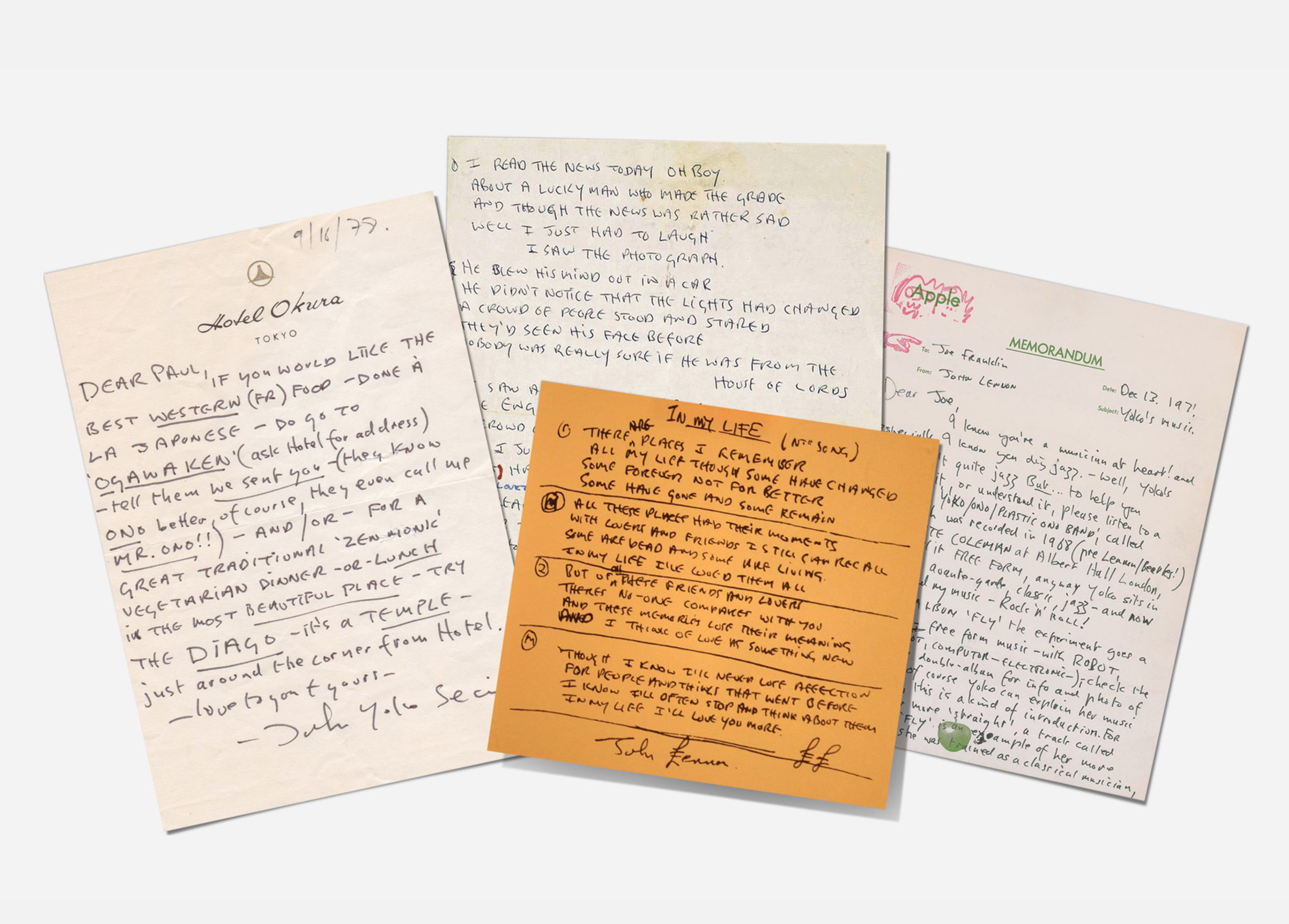
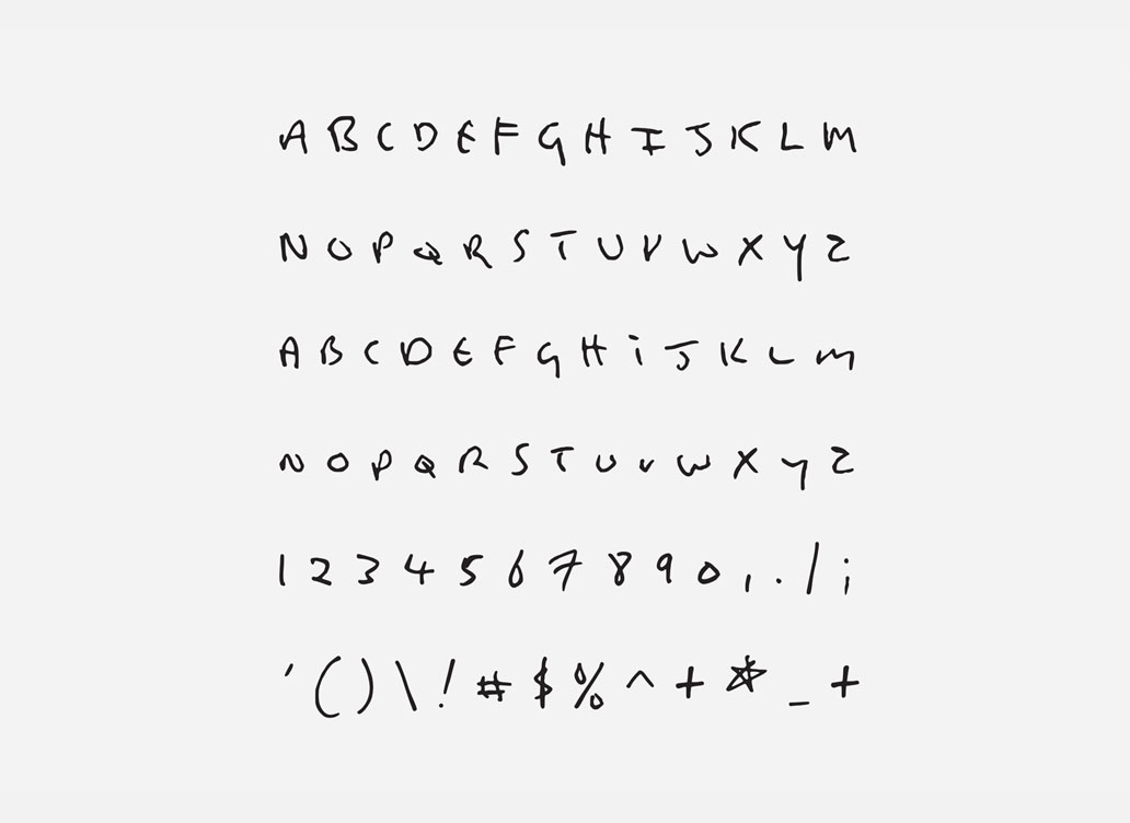
After locating as many handwritten documents as they could the pair set about reproducing them using a font software. “It doesn't mean that you would be able to play like them, but it will probably put you in a special mood and you will probably play in a different way thinking about them," Sens adds.
Hopefully the letters culled from Kurt’s infamous suicide note, in which he quoted a Neil Young lyric: "it’s better to burn out than fade away', will not inspire any correspondingly dark ideas.
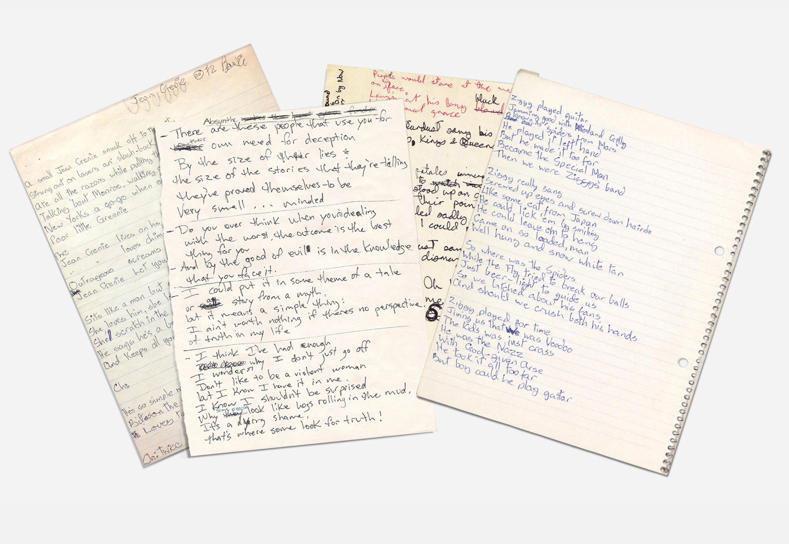
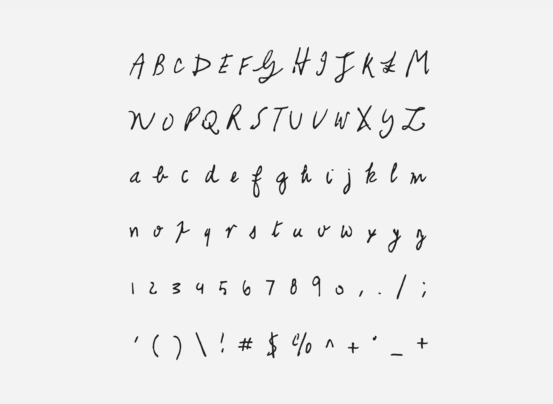
"The most difficult ones to work on were Leonard Cohen and Serge Gainsbourg, because it took time to shape every letter so that they can link to each other," the pair explain. They're working on more typefaces including The Notorious B.I.G. and Janis Joplin that will be released next month.
For more typographical coolness check out Graphic 500 Designs That Matter in the store alongside Damn Good Advice, Visual Impact, and Smile in the Mind.