Paula Scher paints info-maps of the USA
The masterful graphic designer calls her painterly take on digital maps abstract-expressionist information
We are all cartographers now. As John Hessler, one of the US government’s foremost cartographic experts, explains in the introduction to our book, Map: Exploring the World, the growth of mapping software and accompanying GPS technology allows any runner, walker or driver to generate his or her own map. Add in huge, readily available data, and the layering of fairly esoteric meteorological, demographic or economic information over a given territory can be done with a few keystrokes.
However some of us are a little better at representing this information than others. Today Paula Scher is best known for her brilliant graphic design work at Pentagram, one of the world’s leading visual communications agency, where she has worked on widely recognised logos for such companies as Shake Shack, the Museum of Modern Art and Microsoft. However, Scher also likes to paint, and has, over the past few years, been creating her own idiosyncratic style of map.

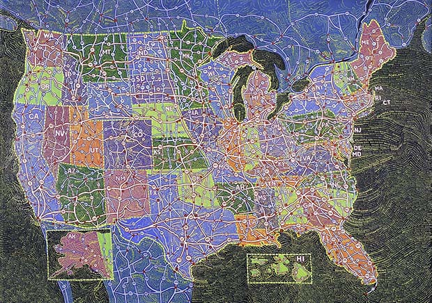
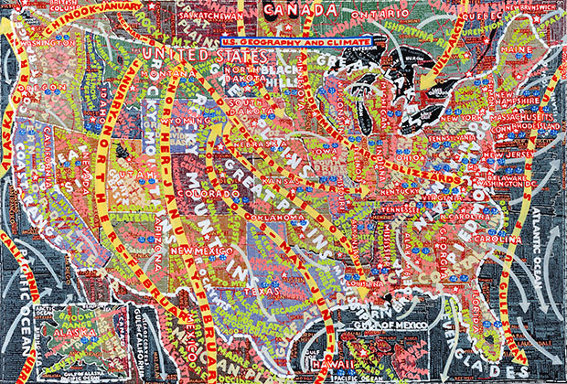
A selection of these works will go on show tomorrow at Bryce Wolkowitz Gallery, on West 24th Street beside the High Line in Manhattan. The show, U.S.A., will display a number of large-scale acrylic depictions of the United States, overlaid with discrete sets of data, from population, to demographics, to transportation flows and climatic differences.
As the gallery explains, Paula Scher’s father was a civil engineer for the United States Geological Survey who specialized in photographic survey techniques, so some lingering interest in map making is understandable. However, no one would mistake one of these works for a weather girl’s prop. Instead, the painter points to the gestural patterns and moods evoked by each wash of information. “There’s nothing scientific about it,” Scher told Slate.com. “It’s all emotional and has been since the first series of maps.”
The artist dubs her style “abstract-expressionist information,” which she uses, she says, "in painting versus digital form to create a sense rather than trying to be accurate.”

While we wouldn’t want to plan a road trip using her painting of car journey times, we do get a sense of US life on the open road. For more on the show go here; for greater insight into creative cartography get Map.