Pentagram gives Shakespeare a makeover
The agency has reworked its Shakespeare in the Park designs into something rich and strange for the 2015 season
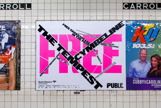
“Nothing of him that doth fade, but doth suffer a sea-change, into something rich and strange,” says Ariel in Shakespeare's The Tempest (quite possibly the first time we've begun a phaidon.com story quotiing the bard). The spirit is addressing Ferdinand, who thinks his father has died in a shipwreck, yet the lines could be applied to Pentagram’s 2015 reworking of New York Public Theater designs for this summer’s Shakespeare in the Park, which features performances of The Tempest and Cymbeline.
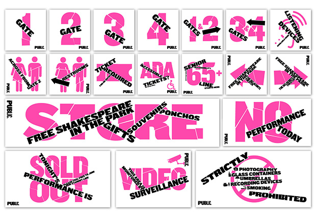
The agency’s principal, Paula Scher, designed the theatre’s original identity back in 1994, as well as a refresh in 2008. This latest reworking, which Scher oversaw with fellow Pentagram designer Jeff Close in conjunction with the theatre’s own team, slices and splices the Public Theater's signature font, Knockout, into a lively, disjointed new look.

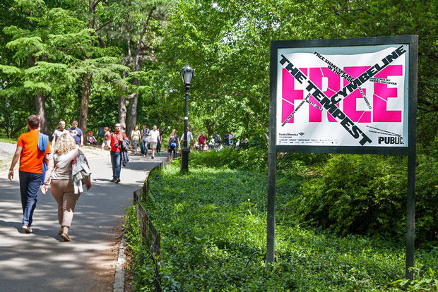
The initial designs were carried out by hand rather than digitally, though they function equally well in print and electronic media, as well as on the signs in and around the open-air Delacorte Theater in Central Park. They serve as “a full visual personality in graphics that appear on posters, the season brochure, print advertisements, the redesigned website, and banners for the restored façade,” Pentagram says, which should remain on show in New York until the season ends on 23 August. It’s another fine, subtle design from Scher and co. or, as Imogen puts it in act three, scene four of Cymbeline, “no act of common passage, but a strain of rareness.” Find out more here, and for more on Pentagram take a look at our books on the company's co-founder, Alan Fletcher.
