Festival design that lets the music do the branding
Swiss designer Alexandre Pietra's treatment for this summer's For Noise festival puts the headliners centre stage
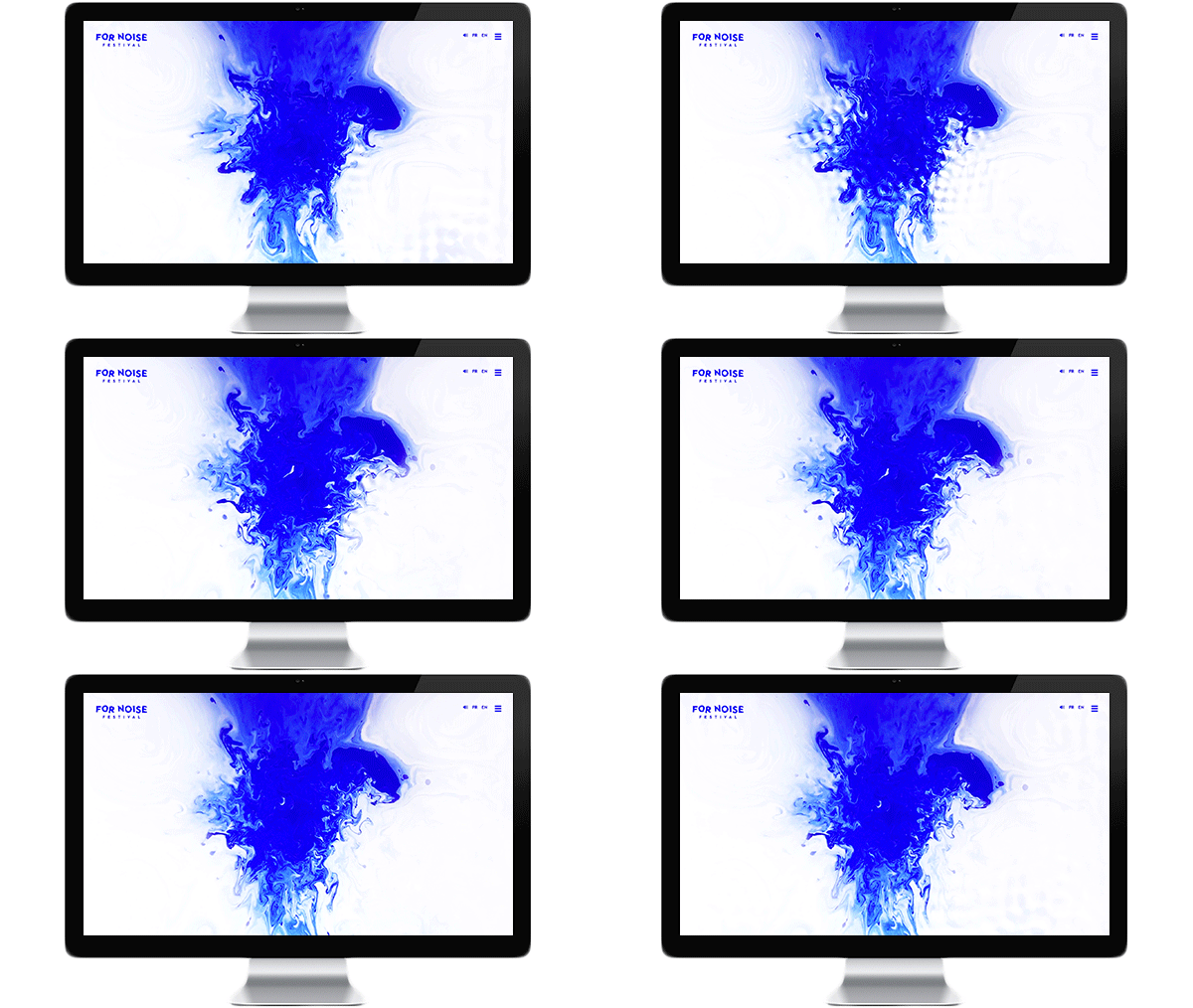
How do you capture a diverse festival line-up in a simple graphic identity? The young Swiss designer Alexandre Pietra turned to the music itself when she came up with this new look for the 2015 For Noise festival near Lausanne in Switzerland.
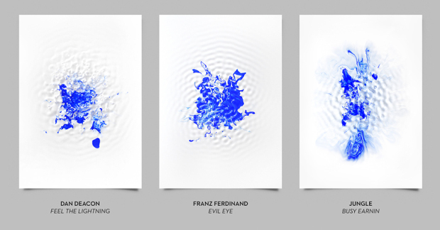
Pietra mixed white and blue paint in a container, then set that container on a loud speaker, through which she played songs by the festival's better-known acts, creating these abstract expressionist-style splodges. Dan Deacon's 2015 single Feel the Lightning dissipated the colours into a wriggling mess; Jungle's 2014 hit Busy Earnin' drew the paint out into a slimmer shape; while Franz Ferdinand's 2013 song Evil Eye conjured up a Rorschach blot.
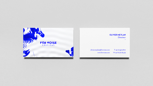
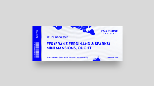
Pietra says this fun graphic treatment solves a serious problem; For Noise began back in the early 1990s as a rock festival, though over the years, its line-up has grown more diverse. By allowing the songs to dictate the visual treatment, she's letting the music speak for itself.

The choice of a pigment quite close to International Klein Blue is a nice nod to earlier European artistic endevours too. You can see Pietra's full branding treatment here; you can learn more about great graphic design from the advent of the Guttenberg Press right up until the present day in The Phaidon Archive of Graphic Design; and for more on abstract painting you absolutely must get Painting Abstraction.
