Latitude festival rebrands with slick new image
We talk to Form co-founder Paul West about his and Paula Benson's work on that most Phaidon of UK festivals
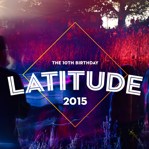
The wildly successful summer festival Latitude which played host to Damon Albarn, The Black Keys and Bombay Bicycle Club last month celebrates its tenth anniversary next year with a new identity. The upscale Suffolk music, arts and literature gathering has a reinvented look by graphics studio Form in London. So out goes its 1970s-inspired Art Nouveau logo with its ornate serifs, heavy shading and floral border in favour of something more contemporary.
Form was commissioned by the event’s operators, Festival Republic, which also runs Reading and Leeds Festivals, both of which have been rebranded by Form in recent years. Studio founders Paul West and Paula Benson, have introduced a simple, open, white and clean typeface, set in Neutraface Inline. Like the old wordmark, this one is also uppercase and is on a slight curve to make it more lyrical. Behind the word Latitude is the outline in red of a diamond, intended to represent a simplified compass and hence refer to the meaning of the festival’s name. (Though the connection may well be lost on festival-goers). Form is a huge and well-respected name in music branding so we sat West down this morning and asked him some questions about the design.

Was the idea to refer to the festival's name in the graphic design an immediate one, if so why? Yes it was, but in a very subtle way. We had had meetings with Festival Republic and the idea of some visual hook/underline to "Latitude" was discussed. We felt that a logotype per se wasn't enough for the brand collateral, which needed a simple mark to add a structure to the image-led nature of the rebrand. The "diamond" solution was intentionally the most simplistic interpretation of a compass. Too literal would have detracted from the beauty of the photographic route. We love the fusing of two very different components.
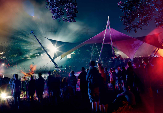
You commissioned photographer Peter Beavis to shoot the festival and spent a week there soaking up the atmosphere. What surprised you? We've been fans of Latitude for a long time, and wanted to portray the experience of an environment that changes constantly from morning to late night. We wanted to highlight the excitement, 'wonder' and even the magic of an experience through the forests, lake and children's area. Latitude is a unique experience for all ages and tastes, and we shot to accommodate all these personalities.
On a personal level I've always wanted to see a festival going up before the festival-goers arrive and it felt a privilege to be walking around while stages were going up, people were really relaxed and this helped our frame of the event. We were told where key events would be staged and made sure we captured those moments.
What's the one music rebrand you'd love to get your hands on? There's a question. I'm tempted to say Led Zeppelin, but that's daft because they are untouchable, so I'd go for Burial as his world is so much darker, beautiful and expansive than his covers portray. I'd love to work with him on creating some filmic or scenic interpretation to his music. Have you heard Rival Dealer driving over the Westway at night? Goosebumps!
Music fans will find plenty of iconic and lesser known related graphic designs in our book in a box, The Phaidon Archive of Graphic Design including sleeve designs for Spiritualized and Pet Shop Boys as well as a host of Sixties legends. The Design Book also features great stories behind some much loved music-playing industrial designs (among them Bryon Vega and Apple and for a look at the music players that influenced Apple's Jonthan Ive check out the new iBook of Dieter Rams: As Little Design as Possible.