Bauhaus gets its first ever corporate identity
At the grand old age of 64 the influential design school gets a makeover courtesy of Stuttgart studio L2M3
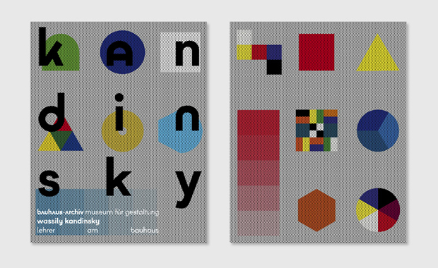
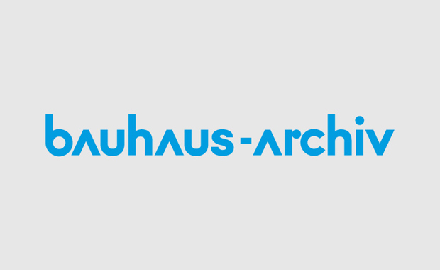
Surprisingly, the world-renowned and highly influential Bauhaus school’s archive museum has had no single corporate identity since it opened in 1960. Perhaps with all that stunning graphic design produced by its teachers and students, it was a struggle to pin down a single look.Well-respected and prolific Stuttgart graphic design studio L2M3 has attempted to put that right, with this new marque, commissioned by the Bauhaus-Archive Museum fur Gestaltung.
It includes L2M3’s new typeface, which makes reference to the Universal typeface launched in 1925 by the school’s director of printing and advertising Herbert Bayer. The new one, called Bayer Next, updates Bayer’s geometrical sans serif font and like his work, eschews capital letters for the actual corporate marque.

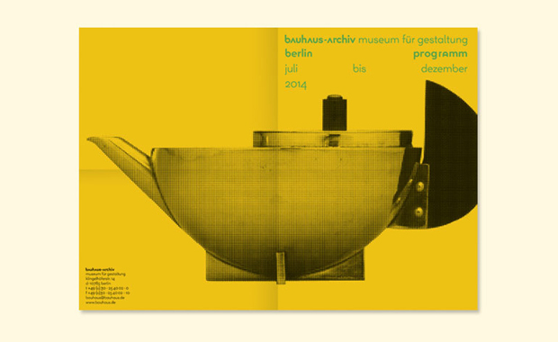
Bayer Next has a range of versions, allowing it to morph for different executions. L2M3 will be applying their creation to exhibition catalogues and the bi-annual programme magazine as well as stationery and other printed materials. The studio, which was founded by Sascha Lobe in 1999 and includes among its clients Adidas, Daimler and Hugo Boss, has also revised the organisation’s website.
Berliners have been treated to a glimpse of the new identity since the middle of July, when a poster campaign went live in the metropolitan area. And come 2019, it will adorn the archive’s new building, being constructed to accommodate its materials and to give it more exhibition space and a bigger shop.

No doubt L2M3 are hoping that Bauhaus legends such as László Moholy-Nagy, Wassily Kandinsky, Marcel Breuer, Mies van der Rohe and Walter Gropius would approve. Incidentally, you can see many of the original Bauhaus designs in Phaidon's Archive of Graphic Design, available at a special new price here. And for some beautiful Bauhaus product designs check out The Design Book.