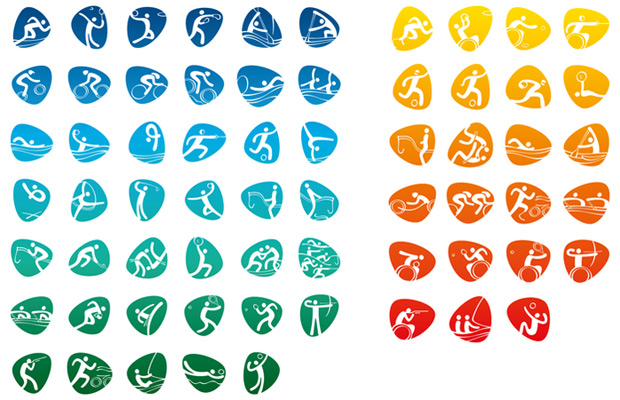
Rio's Olympic Games pictograms are a winner
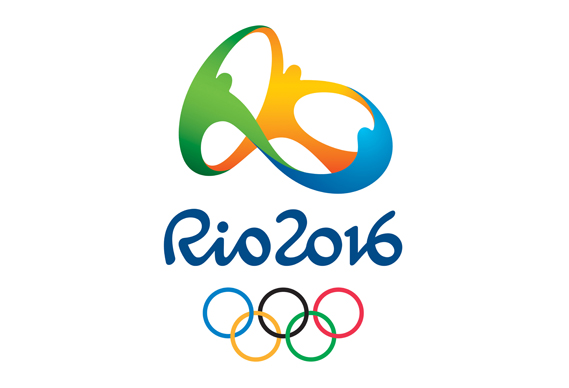
These designs were inspired by the official Rio 2016 logo developed by UK/Brazil firm Dalton Maag
If Google can come up with a novel reworking of its logo every day, then it shouldn't be so difficult to re-imagine sports pictograms for the Olympic Games every four years.
The difference is, of course, there are 64 sports to depict for the Olympics and the Paralympics. And while Google is answerable only to itself, pictogram designers need to spend around five months getting approval from 42 different international sporting federations.
Rio's in-house team drew from the 2016 Games' logo for its inspiration. That image, which comes with an accompaying typeface, was designed by UK and Brazil studio Dalton Maag, and resembles a loop of three athletes.
The pictograms themselves have a ribbon-like quality to them, with thicker strokes for the figures and thinner ones for their sporting equipment. And 'strokes' is the right word, as they were hand-drawn, before being recreated on computer.
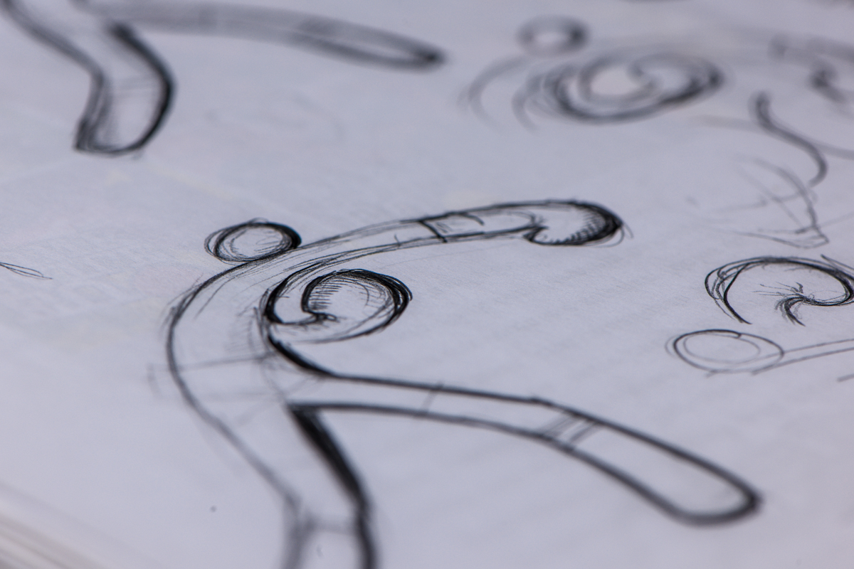
"The athlete bodies and sports equipment were built from the characters, or part of them, in a continuous stroke, with variations in thickness in order to give the impression of depth," say the Rio team.
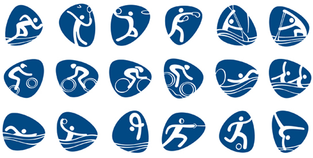
These fluid images seem to flow across the curved triangular blue backgrounds. The designers call these backgrounds pebbles, and explain: "The pebbles, which are a feature of the visual language of 2016, support the designs and alter its shape according to the different movements of athletes."
It took the team 16 months to create the 41 Olympic and 23 Paralympic images - time well spent, we think. We're already taken to them, particularly the ones with a now-you-see-it-now-you-don't quality, like Equestrian Jumping.

For more on this, go here. For greater insight into graphic designs past and present, take a look at our incredibly comprehensive Archive of Graphic Design, which covers centuries of 2D creativity in 500 designs. Buy it from the people who made it, here and at a special new price.