The story behind the branding of dOCUMENTA (13)
Leftloft's Francesca Cianfarini on the truly wonderful graphic identity for the Kassel art exhibition
In June this year, at the 13th edition of the monolithic art exhibition dOCUMENTA, 860,000 visiting art lovers were treated to monumental works of art by Theaster Gates, Pierre Huyghe and Lawrence Weiner, among hundreds of others. Organised by respected curator Carolyn Christov-Bakargiev, the extensive programme inspired, intrigued and infuriated in equal measure, but the art wasn't the only thing people were talking about.
dOCUMENTA (13)'s identity, a flexible grammatical structure designed over a three year period by the Italian agency Leftloft, turned heads too, prompting many to celebrate the branding as the exhibition's best ever. We talked to Leftloft's Francesca Cianfarini to find out more.
How did the project come about? We were asked to attend an invitation-only competition – we'd met Carolyn Christov-Bakargieve on another project – and we ended up working very closely with her and later with all the staff on developing our concept. We were honoured to be part of the design process throughout the project, working on a huge amount material, responding to the needs not only of the staff at dOCUMENTA, but department managers and corporate sponsors, too.

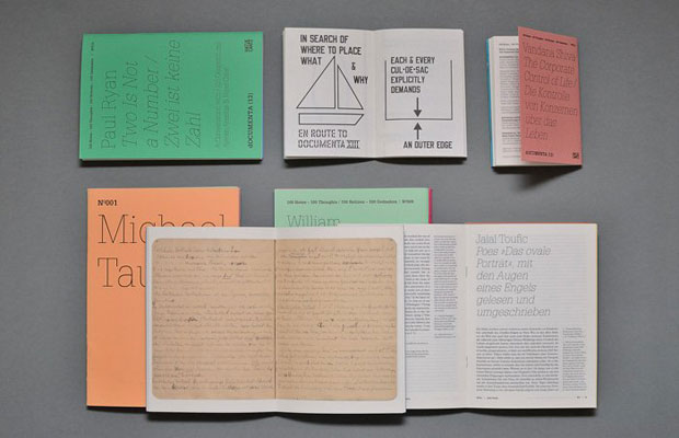
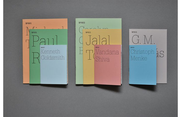
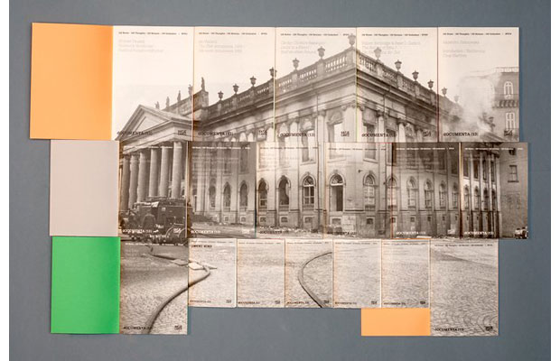
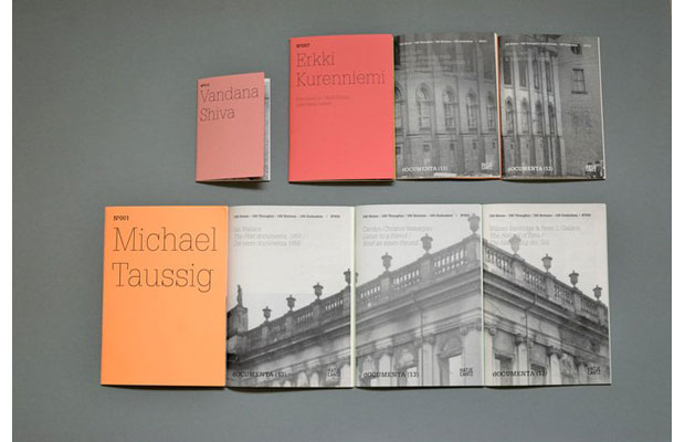
What was the concept behind the identity? The notebooks were designed to represent the cultural background of dOCUMENTA (13) and to prepare the public for the art at the event. Referencing the fact the exhibition is usually open for 100 days, we came up with the idea to ask 100 participants – contributors from art but also from science, philosophy, anthropology, literature studies and poetry – to provide original notes and sketches that represented the spirit of the exhibition. In order to strengthen the concept, we used the same cover design for each notebook, and included segments of a larger picture on the frontispieces that, when arranged together, collectively produced a range of images from Kassel and previous exhibitions.

You were provided with a wealth of extremely varied content. How did you manage to retain consistency? Complexity was the real challenge, and it educated our design process. The main idea of the identity was that it be a grammatical structure rather than a static logo, which we could then develop across all of the material we produced. The most important thing was to keep the message consistent, and of course to explain to visitors what dOCUMENTA actually is – an art exhibition.

Should all big exhibitions and art fairs approach content in a similar way? In some ways yes. But let's clarify that dOCUMENTA, unlike Frieze, is an exhibition, not an art fair. Artworks are not for sale at dOCUMENTA, and no fee is requested to be featured. That actually made things easier for us – we had to think about the project only from the participants' and the public's perspectives, not from the buyers' point of view.
Leftloft's dOCUMENTA (13) identity is the last entry in The Phaidon Archive of Graphic Design, the go-to resource for contemporary designers. Read more about the archive now.