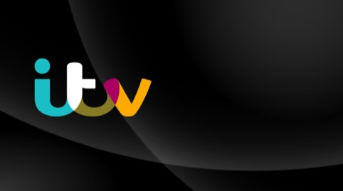
ITV's new logo unveiled
UK broadcaster employs a colourful twist to its new online and offline identity
It’s not unusual for broadcasters to go in for mutating identities. Theirs is the world of moving images, after all – hence BBC2’s playful and ever-changing digit, and those in-perspective-out-of-perspective scenes for Channel 4’s 4.
ITV has been reconsidering its brand for a while, including the dropping of the numeral in ITV1, as we reported in September. And now the channel has unveiled its new look, with – hey presto – a changing colour palette. The actual logo has been redrawn to appear as neat joined up handwriting, a bit like a friendly, personalised version of its current lower-case logo.
The idea is that a wash of five colours will pick the letters out. So when the marque appears on a coloured background “it will adapt and change according to the background colour… shifting tone along with the content, reflecting and blending with the mood of different shows,” according to ITV. The look, which was developed by the broadcaster itself with the help of moving image designers Rudd Studio – will be applied to all channels – that’s ITV2, ITV3, ITV4 and CiTV – its online operations and studios and buildings.
If you're interested in logos and branding we have two great books. The first is Michael Johnson's Problem Solved different to most graphics or branding books in that it isn't merely a collection of iconic images but also a collection of well thought out theories putting forward some unique ways of overcoming common branding hurdles. And don't forget the Phaidon Archive of Graphic Design which has the imagery and the stories behind 500 of the most iconic and culturally relevant pieces of graphic design in history. It won't exactly fit under the tree but it will look great beside it this coming holiday season.