Designers on Design: Andy Stevens
The Graphic Thought Facility co-founder on why a well-designed 80s thesaurus is 'the Led Zep of reference books'
We've waxed lyrical about London's Graphic Thought Facility on Phaidon.com before, and rightly so. The design team at GTF, founded in 1980 by RCA graduates Paule Neale and Andy Stevens, have spent more than two decades at the forefront of their industry, creating consistently innovative work that eschews trends and instead focusses on clarity, simplicity and conviction. GTF has inspired reams of younger designers, but what first inspired them? We asked Andy Stevens to talk us through the designs that influenced him early on.

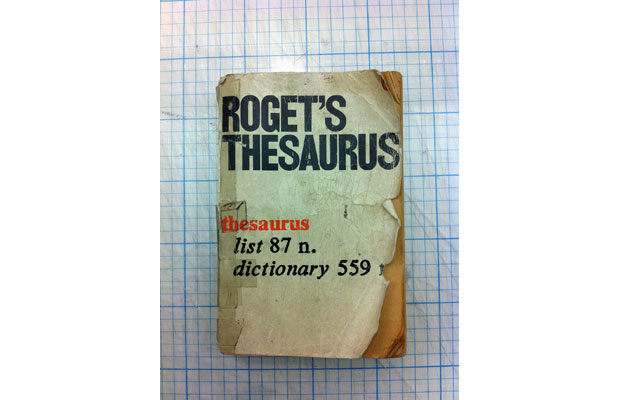
"I'm not much of a collector but there are two books I've owned since school that I've always loved. One is a paperback Penguin thesaurus with a cover by Derek Birdsall, part of a series of Penguin reference books and study aids that all have very graphic covers, mostly black and white with an accent of red. I remember it looking both striking and clean amongst all of my other dreadful text books, and it had a clever idea that impressed itself on me greatly. At GTF we've always been interested in playing with the notion of cliche – how it can be still used in a fresh and appropriate way – and this use of the "dictionary definition device" is one of the best examples. It's good and it's non–ironic. A classic. The Led Zeppelin of reference books.

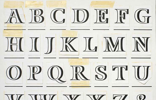
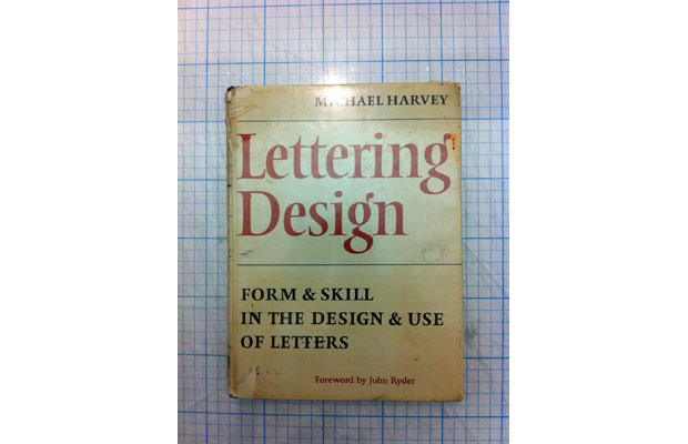
"The second book I came across at this time was "Lettering Design" by Michael Harvey, the wonderful draughtsman, book jacket designer and letter carver. He provided me with the link to also find the work of [poet] Ian Hamilton Finlay. An introduction to the form and skill of lettering, the book is modest, clear and beautifully crafted. My copy is full of indents and pencil marks from my tracing of the letters for school and early college projects. It's still something I refer back to often for the great quality of line in Michael's drawings. The craft and skill is what makes it as relevant now as it was when first printed."
Neither of the above books made it to the final cut of The Phaidon Archive of Graphic Design. Do you think they should have? Let us know your thoughts via Twitter.