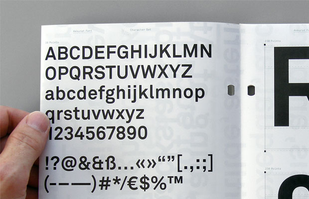
Design of the Week: Akkurat
Cult designer Laurenz Brunner on the most popular Swiss typeface of the last decade
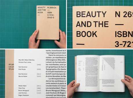
The sans-serif typeface Akkurat, designed by the talented Swiss designer Laurenz Brunner and released in 2004 by the font foundary Lineto, features heavily in The Phaidon Archive of Graphic Design. It has its own page, for one, which incorporates an insightful text celebrating the functional font's clean and crisp character. But it also features within entries for Baseline Magazine (a typographic journal that employs Akkurat as one of its primary faces), Julia Born's 2004 publication "Beauty and the Book" (a wonderful project that sets its content in Brunner's font), and Joost Grootens' 2005 "Metropolitan Word Atlas" (a beautifully designed compendium of complex mapping information). Like Helvetica before it, Akkurat has all but taken over the graphic design world. We asked Brunner, now based in Berlin, to shed some light.
Akkurat was first released in 2004 and almost immediately became widely used. What made you draw it in the first place? I started the design process in London in 2002, in a graphic design environment that was driven by illustration and saturated with expressive fonts. My typeface was an anti-thesis to that context – a utilitarian typographic notion that, looking back, I was only able to embrace by living a healthy distance from Switzerland, my home country, famed for its modernist heritage.
For a long time I never considered releasing the font – I thought of it as my own personal writing tool. But, encouraged by [graphic designer] Cornel Windlin, the font was completed for release in 2004 and published by Lineto. It actually took several weeks for the first license to leave the shop, and it wasn't until two or three years later that designers started becoming more interested in an 'objective' typographic style, reanimating a lot of classic (Swiss) design values. Akkurat became something of a mascot for this movement.
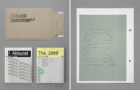
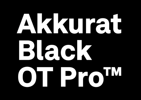
You're currently working on a revision of the set. Why is that? And how will it differ from the original release? Three reasons why: type technology has made some big leaps in the last decade, the typography market has globalized and the European Union has expanded. That meant that new linguistic regions had to be covered. The character set of Akkurat has grown from 256 letters to 875 characters, enabling text setting in over 150 different languages. A black weight has been added to the family and a number of new features and stylistic alternates have been added. This revision provides new shoes for a reliable workhorse.
You're not specifically a type designer. How does Akkurat relate to the rest of your work? The slow and monochromatic nature of the type design process and the engagement with anachronistic shapes creates an interesting contrast to many processes of our high-paced design culture. I've always considered that letters, the smallest unit of visual communication, were an essential real estate within my work, a hinge between language and form. I've drawn over 100 typefaces, most of them strictly used for one project only. The concept of Akkurat was to shape a more universal tool, which I felt in the end could only go full circle by marooning it into in a broader context. Since the release of Akkurat nearly 10 years ago, the font has developed its own life out there, far away from home, and has had some very successful and some very ugly relationships. Once published you lose all control over how it's used – time is the only judge. But I'm always pleased to see meaningful work being done with it, in areas none of us could have predicted.
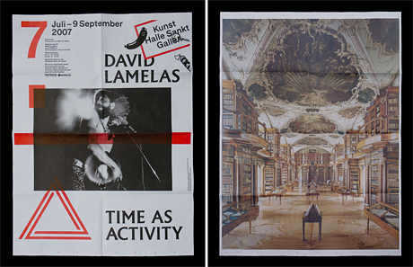
How would you explain your practice? I'm interested in the equilibrium of high and low culture, concept and improvisation, historical awareness and progressive technology. My studio is based in Berlin, where we work with commissioners and collaborators in the cultural field within Europe and the US. We specialise in editorial design, communication, corporate design, research and education.
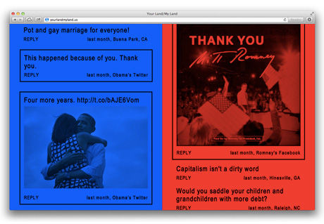
What projects are you currently working on? We just completed a project for Offprint Paris, an Art Publishing Fair at the Beaux-Arts Paris. We're currently working on a publication for Fashion in Film, London; a catalogue for Jonathan Horowitz; and a number of projects for Gavin Brown's enterprise, NYC. We're also pushing two longer term type designs over the finishing line which should surface shortly on lineto.com
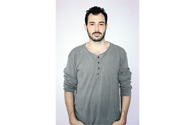
You choose not to present your portfolio online. What is that? My work is about a dialogue with content. Like most graphic design it is inherently time and context specific, and therefore difficult to translate to the web without formalising it. Also, working in a field which is a lot about amplification, promotion, publishing, distribution and exposure I quite enjoy keeping my own profile low-key. Admittedly, I just made my first business card in years, simply because we discovered that there was some space left on the printing sheet of a larger corporate identity job. As I only had two minutes to do it, it didn't turn out great, so I doubt I'll ever use it.
So what does make a piece of graphic design 'great'? Strong content.
Read more about Akkurat in The Phaidon Archive of Graphic Design.