Designers on Design: Esquire's David McKendrick
The UK men's mag's creative director on graphic design and the world of 1980s hatchbacks
The Phaidon Archive of Graphic Design is filled with 500 of the most iconic pieces of branding, editorial, advertising, packaging and information design ever, from Johanes Gutenberg's historic bible to Leftloft's recent identity for dOCUMENTA (13). Inevitably though, as is the case with all compendiums, some legendary works have been left out. There's no place for Robert Indianna's typographic LOVE sculpture, for example, or Andy Warhol's cover design for the Rolling Stones' ninth album Sticky Fingers. And neither is there a place for the Haynes Owner's Workshop Manuals, those intricately detailed, superbly put-together user aids for car-loving mechanic fanatics everywhere.
In the video on the right you can watch Phaidon Editorial Director Emilia Terragni explain how we made the choices for inclusion. And below, UK Esquire's creative director, David McKendrick, reveals his love for the colour-coded books, and argues an impressive case for their inclusion when we release the next set of design cards for the Archive.
McKendrick has won numerous industry awards including the prestigious Designer of the Year (Consumer Magazine category) at the PPA Awards. He previously worked as art editor of the Bespoke department at Wallpaper* magazine and as a Senior Designer at design company, North, whose clients included the Barbican Art Gallery, Arcadia Group and Fourth Floor. He began his career as a designer at Graphic Thought Facility. McKendrick used the Haynes books to provide the visual inspiration behind a witty, stylish self-help series called The Manual which ran in Esquire a few years back.
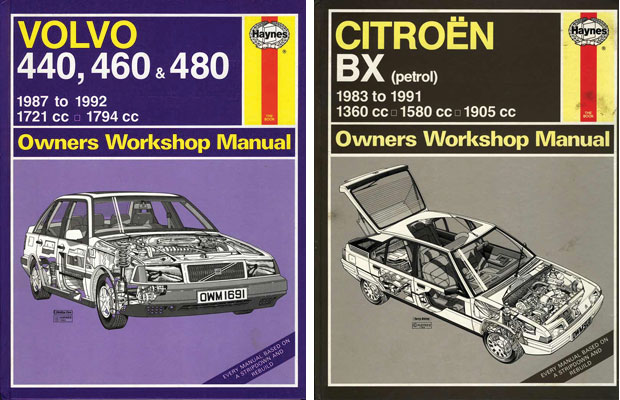
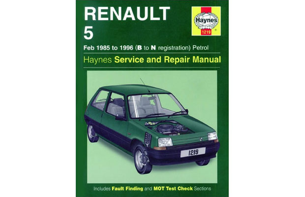
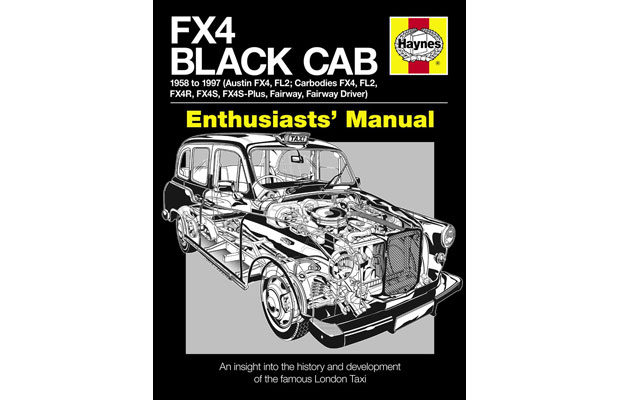
What is your favourite piece of graphic design? I have many (for many different reasons) but I do love the Haynes Owner's Workshop Manuals. They were the first books to make me appreciate graphic design, albeit unconsciously. I liked the cover layout, the bold use of different colours for each car. Back when I was a kid I was too young to understand it was graphic design – I didn't know what about it I appreciated – but looking back I realise the books appealed to my sense of order, to my love of simple, functioning layouts. The covers were so strong, too. They used a working formula for every vehicle, and the classic cut-away graphics were amazing.

When did you first discover it? I grew up in the '80s with two older brothers who loved fast cars and who opened my eyes to the world of temperamental hot hatches. A Haynes Manual was essential for any boy racer, myself included (Renault 5 GT Turbo). My middle brother, who's a genius at fixing things, had a huge collection of Manuals for bedtime reading, so they've been in my life for as long as I can remember.
What makes them so special? They're just so useful, clear and concise – they're designed to be used. I remember a four-page colour section on coated paper that showed you how to repair body work. It was really special, my favourite section by far. It made it all look so simple.

And they still seem fresh now... They still exist in the same format with the classic cut-away illustration on the cover. Good design lasts, although it really annoyed me when they brought out a Haynes Manual for Sex. It makes something precious into something gimmicky.
What makes a piece of graphic design 'great'? Different pieces of graphic design are 'great' for different reasons, but I know a piece of design is truly 'great' when I see it and feel jealous. It's a good measure, when you're sat there looking at something and thinking, "I wish I'd thought of that."
The iconic Haynes Manuals weren't selected for inclusion in The Phaidon Archive of Graphic Design. Should they have been? Let us know your thoughts on Twitter.