Deepen your take on orange – this summer’s hot colour
Gucci, Prada and Proenza Schouler have signed off on this summer’s orange trend. Here’s how to truly appreciate the colour, via Iro The Essence of Colour in Japanese Design
Refinery 29 described it as the season’s most saturated — and must-try — colour trend; Vogue singled Rihanna out as an early adopter; Gucci, Acne Studios, and Prada have been featuring the pigment in their collections, while Proenza Schouler – as if to emphasise the point – placed an orange towel with a picture of oranges on it in their summer edit.
Keen to channel this trend, without coming over too eager? Then add a little sophisticated, East Asian depth via our book Iro. Subtitled The Essence of Colour in Japanese Design, the book's author is Rossella Menegazzo, an Associate Professor of the History of East Asian Art at the University of Milan.
In the book she dives deep into the history and culture of pigmentation in Japan to offer readers a rich, nuanced view of colour that can be enjoyed and then applied to our everyday lives.
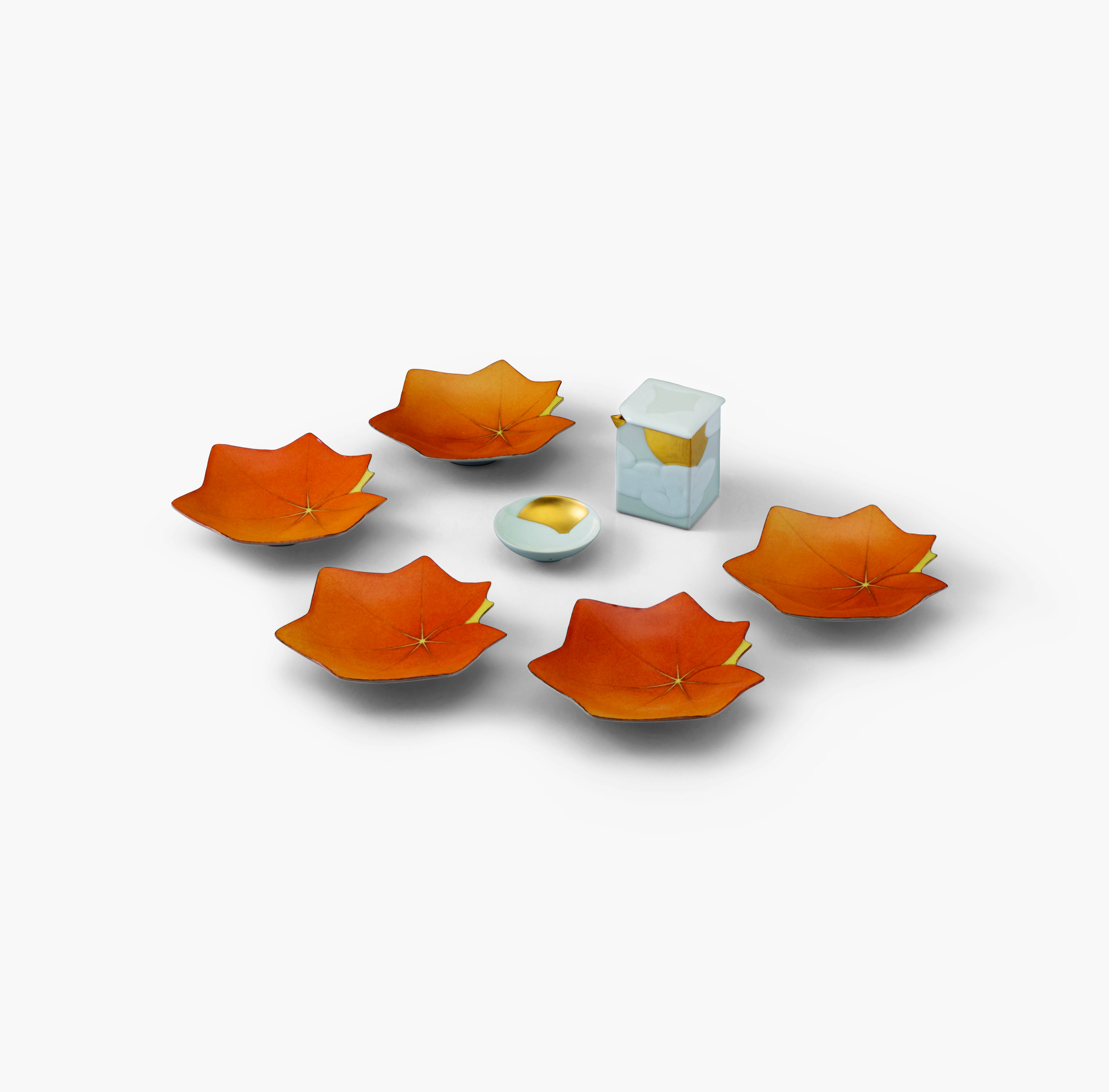
Consider, for example, the dusky shade on these maple-leaf shaped plates, above, made by the Japanese ceramicist Shigemasa Minami in 2020. Their colour is called Mikancha or ‘Orange Tea Brown’ explains Menegazzo. “This colour is named after the hue of the mikan citrus fruit, specifically its skin,” she writes. “In Japanese culture, the shade mikan is not the same as the colour orange, which is considered a distinct hue.
The term first came to reference colour during the Taishō era (1912–26), as evident by the many kimono and kosode (short-sleeved kimono) of the time that favoured this warm yet subtle tone. The addition of the character -cha (tea) as a suffix underscores mikancha’s tendency towards brown and places it among the many fashionable tea-brown shades first established during the Edo period (1603–1868).”

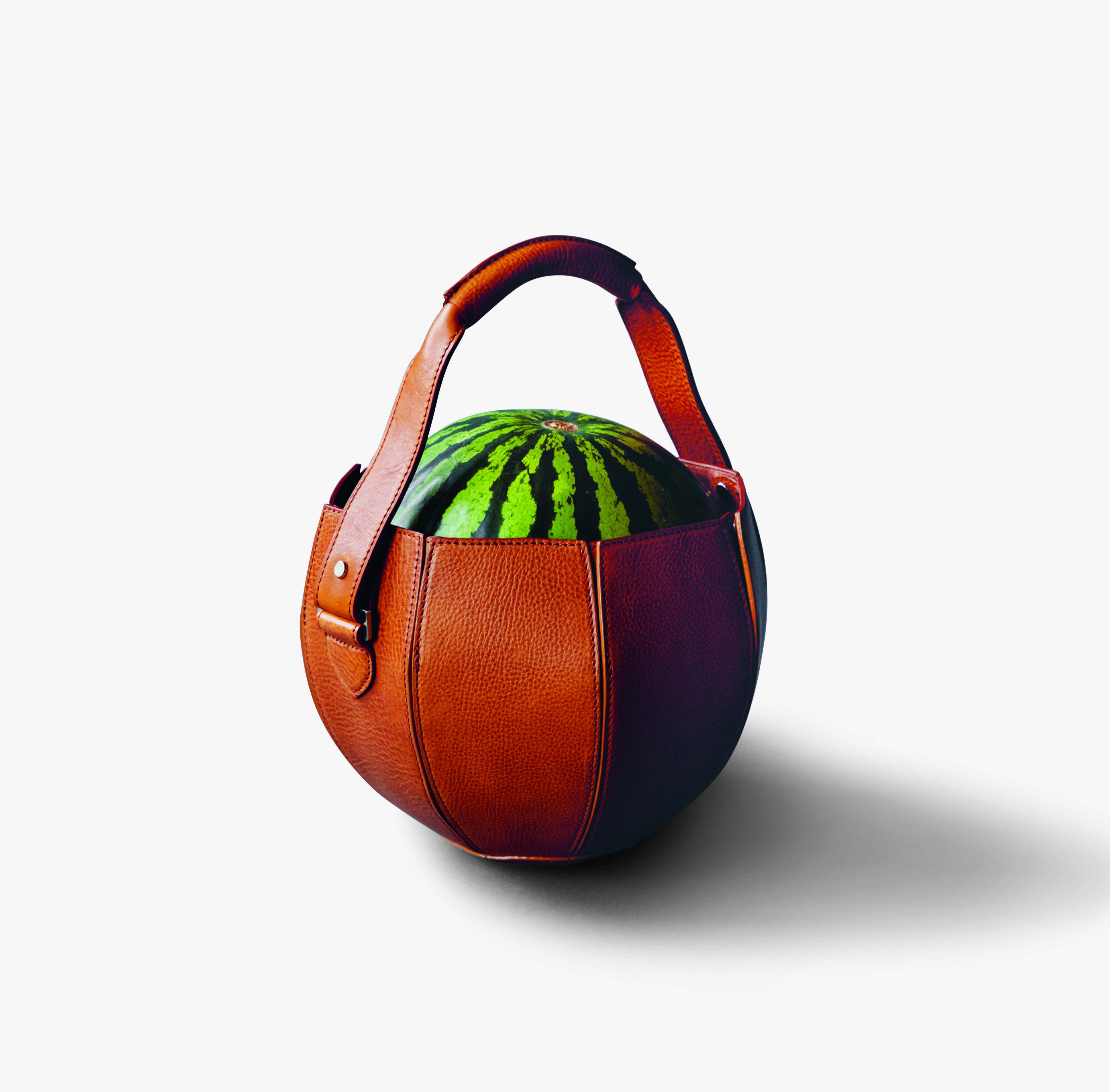
Watermelon Carry Tote, 2020, Yusuke Kadoi. Tsuchiya Kaban. Leather. Photo by Tsuchiya Kaban. Kabairo (Cattail/Bark)
If you like your pigments just a shade darker, you could also consider Kabairo or Cattail/Bark, which is the colour of this charming watermelon carry tote by Japanese designer Yusuke Kadoi.
That distinct shade “can be written in two different ways, referring to its varying origins,” writes Menegazzo. “The first one, which uses the character kama, denotes the bulrush (or cattail), and the colour refers to the shoot of the flowering spike that unfurls in summer.
The second one, which uses the character kaba, refers to the colour of the bark on a kabazakura (a type of mountain cherry tree). It is nonetheless an orangey-brown colour similar to the tones of cha (tea), and therefore is also referred to as kabacha.”

Iro
For more inspiring and distinctive colour inspiration with deep cultural roots and significance, order a copy of Iro here.