What Andy Warhol really thought about Coca-Cola
Coke's new Super Bowl ad might focus on its inclusive side, but Andy also saw it as a way to set himself apart
Andy Warhol is almost as famous for what he said as for what he painted. In his 1975 book, The Philosophy of Andy Warhol: From A to B and Back Again, he wrote, “You can be watching TV and see Coca-Cola, and you know that the President drinks Coke, Liz Taylor drinks Coke, and just think, you can drink Coke, too. A Coke is a Coke and no amount of money can get you a better Coke than the one the bum on the corner is drinking. All the Cokes are the same and all the Cokes are good. Liz Taylor knows it, the President knows it, the bum knows it, and you know it."
It seems that the Coca-Cola company knows that too. Its Super Bowl advertisement for this Sunday’s game appears to focus on Andy’s notion of soft-drink equality, with a cute, all-inclusive appeal to every race and creed in America. “He drinks Coke and she drinks Coke, even though they disagree,” opines the ad, “and while the bottles look alike, you aren’t the same as me.”
That’s a sweet sentiment, but perhaps a little too saccharine for Warhol’s tastes. Andy liked Coca-Cola partly because it allowed him to set himself apart from others in the art world: the Abstract Expressionists.
“The Pop artists did images that anybody walking down Broadway could recognize in a split second,” Warhol once observed, “comics, picnic tables, men’s trousers, celebrities, shower curtains, refrigerators, Coke bottles —all the great modern things that the Abstract Expressionists tried so hard not to notice at all.”

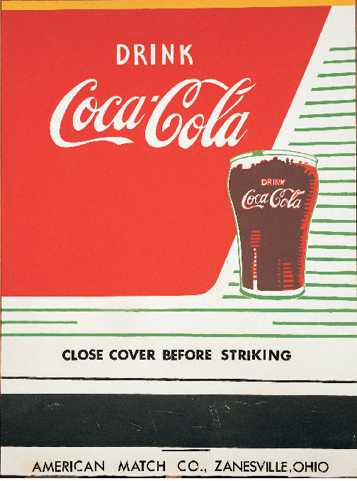
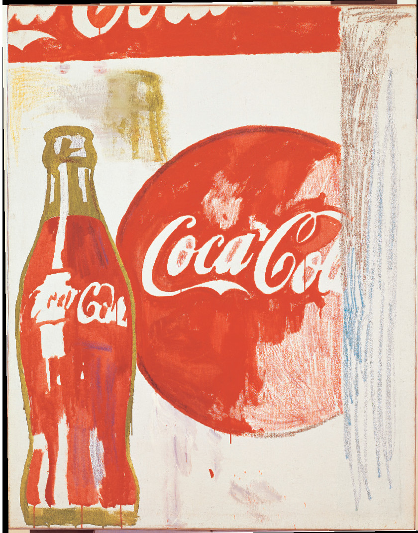
Indeed, the Coke bottle was perhaps Warhol’s earliest piece of pop iconography, as we explain in Andy Warhol Giant Size.
“In 1961, after various attempts at copying ads in newspapers and comic strips, Warhol hit on his first commercial idol: the totemic Coca-Cola bottle, with its trademark cursive script,” writes David Dalton. “Depicted in the graphic style of newspaper ads, the Coke bottle was an American icon so emblematic it could—like Mickey Mouse—stand by itself for the US.”
However, Wahol’s Coke art wasn’t quite as perfect and uniform as the drink itself. “For whatever reason, the Coke bottle did not resonate with the right pop spark,” Dalton writes, “perhaps due to its monochrome coloration, blind form, or ubiquitous presence. In any case, it was with his first Campbell’s Soup Can paintings—done between December 1961 and March 1962— that Warhol began to zero in on his great work.”

With those later paintings, he truly set himself apart from the ab-exers, painting everyday insignias, and closing the gap between high and low art. And while he may have distinguished himself with the Campbell’s cans, really, it all began with a Coke.
For more on Warhol’s life, work and outlook, get a copy of Andy Warhol Giant Size here.