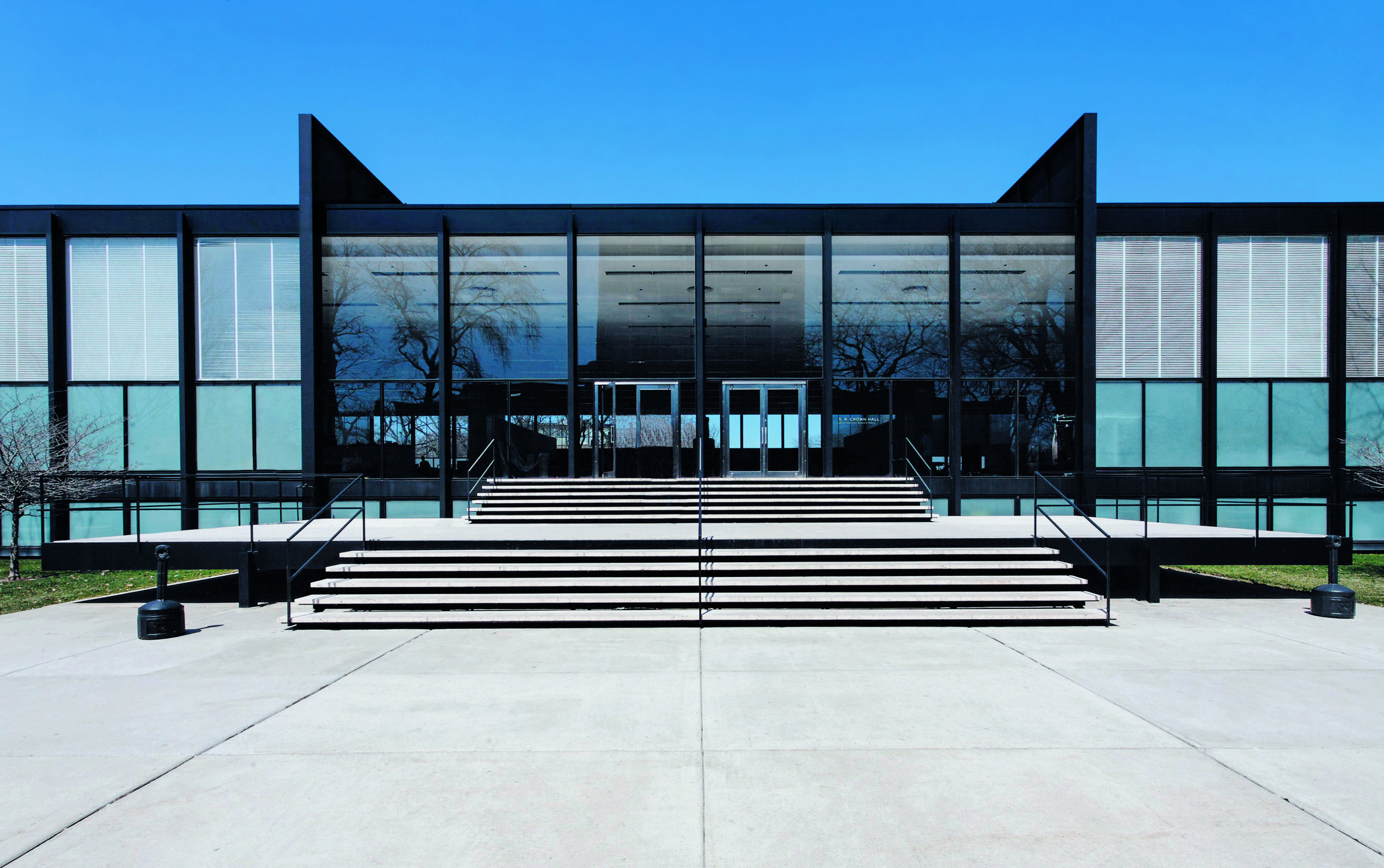
Dominic Bradbury talks us through the Atlas of Mid-Century Modern Masterpieces
Sculptural statements, colourful facades, curvaceous concrete, Mid-Century Modern really was a golden age for architecture
Mid-Century Modern architecture really did define a moment in time. For a short period, boundaries of all kinds seemed to fall away against a backdrop of the post-war consumer boom, the rise in international travel, the space race, and rampant globalisation.
This was the golden age of sculptural statements; towering glass curtains, curvaceous concrete shells and colourful facades, all reproduced on a grand scale, from airport terminals and office blocks to university campuses and embassies.
Our new book Atlas of Mid-Century Modern Masterpieces is a fascinating survey of some of the most glamorous architecture from across the world in this era. The perfect companion to Phaidon’s Atlas of Mid-Century Modern Houses, this continent spanning survey looks beyond the family house, focusing instead on the large-scale projects that truly defined the attitudes of the period.
Masterpieces from some of the most notable architects of the time, such as Welton Becket’s legendary Capitol Records building in Los Angeles, (resembling the stacked records on an old-fashioned, Dansette auto-changer), Ludwig Mies van der Rohe’s statement Seagram skyscraper in New York, Oscar Niemeyer’s presidential palace in Brasilia and Kenzō Tange’s yin-yang-shaped gymnasium built for the Tokyo Olympics in 1964, sit alongside less well-known gems, such as a hospital building in Libreville, an arctic cathedral in Tromsø and an apartment building in Sydney.
Featuring 450 projects, the book is organised geographically by region and includes buildings on every continent. The book opens in the Americas before taking us west, through Europe and the Middle East, south into Africa, and then across to Asia and Australasia. Specially commissioned maps illustrate the reader’s journey across the world.
An introduction by author Dominic Bradbury, who also wrote Atlas of Mid-Century Modern Houses, sets the scene. Each entry is accompanied by a short text giving the reader background on the building. Meanwhile a system of icons provides an easy reference system to determine the type of building, whether it is still being used for its original purpose or has been adapted over time, and what condition the building is in – standing, derelict or demolished.
A mix of colour and black and white photography of each building, including from iconic architectural photographers, such as Julius Shulman and Ezra Stoller, showcases the beauty and verve of these structures built during one of the most glamorous periods of modern history.
We caught up with Dominic Bradbury and asked him about his research for the book, the buildings that were a complete surprise, and why Mid-Century Modern, dynamic, colourful, bold, and rooted in the unparalleled optimism of the 1950s and 60s, has undergone a revival of sorts in recent years at the hands of architects such as Bjarke Ingels and the late Zaha Hadid.
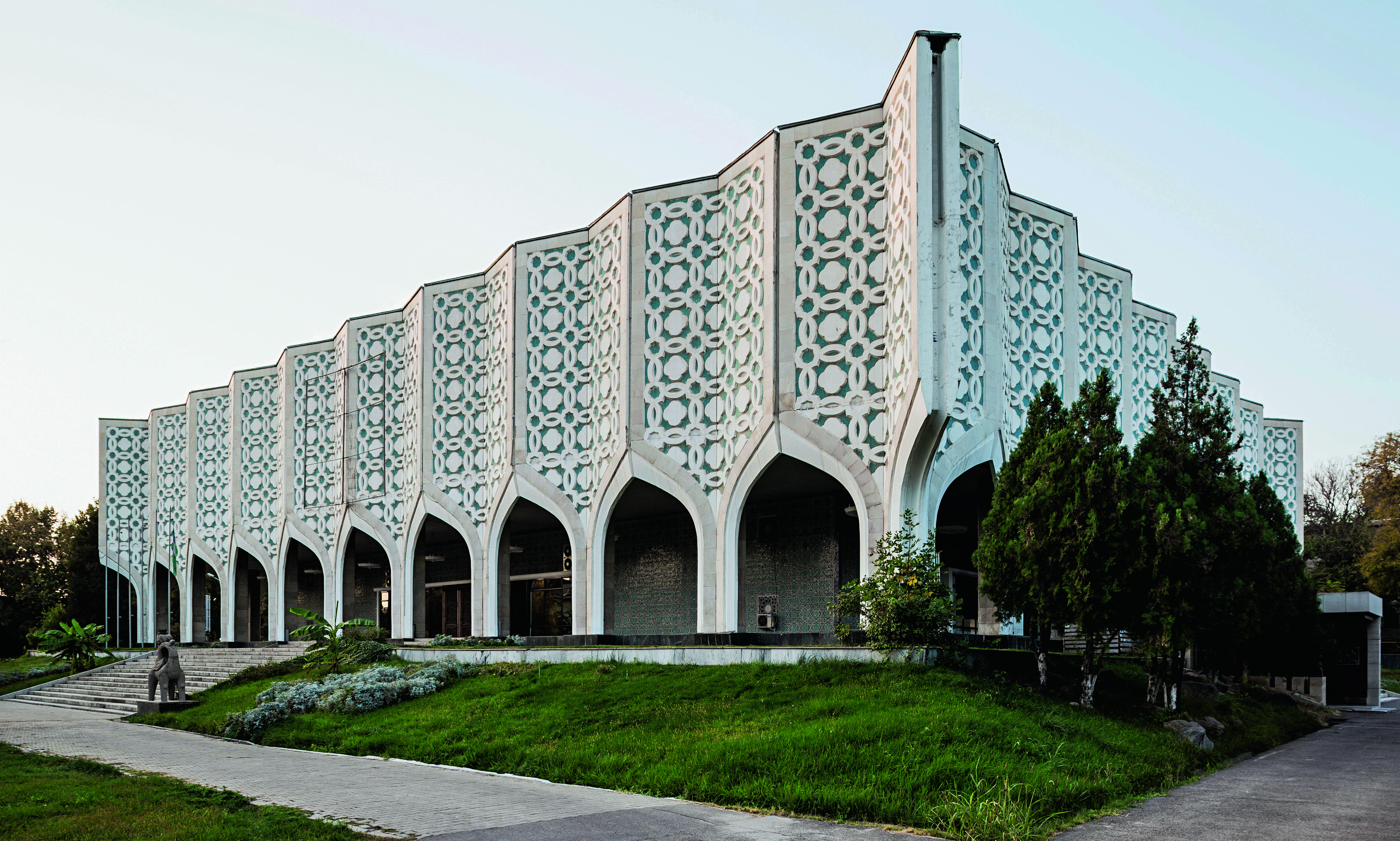 Exhibition Hall of the Uzbek Union of Artists, R. Khayrutdinov and F. Tursunov, Tashkent, Uzbekistan, 1974. Picture credit: © Stefano Perego
What was the research period like for the book? Two to three years in all. It’s a follow up to the Atlas of Mid-Century Modern Houses book. Once we’d done that book we felt there was a bit of unfinished business, as the focus of that book was purely residential and there was so much more to talk about. So the Atlas of Mid-Century Modern Masterpieces covers everything that’s non-residential. You could view the books as a pair and cover the whole spectrum of that kind of architecture.
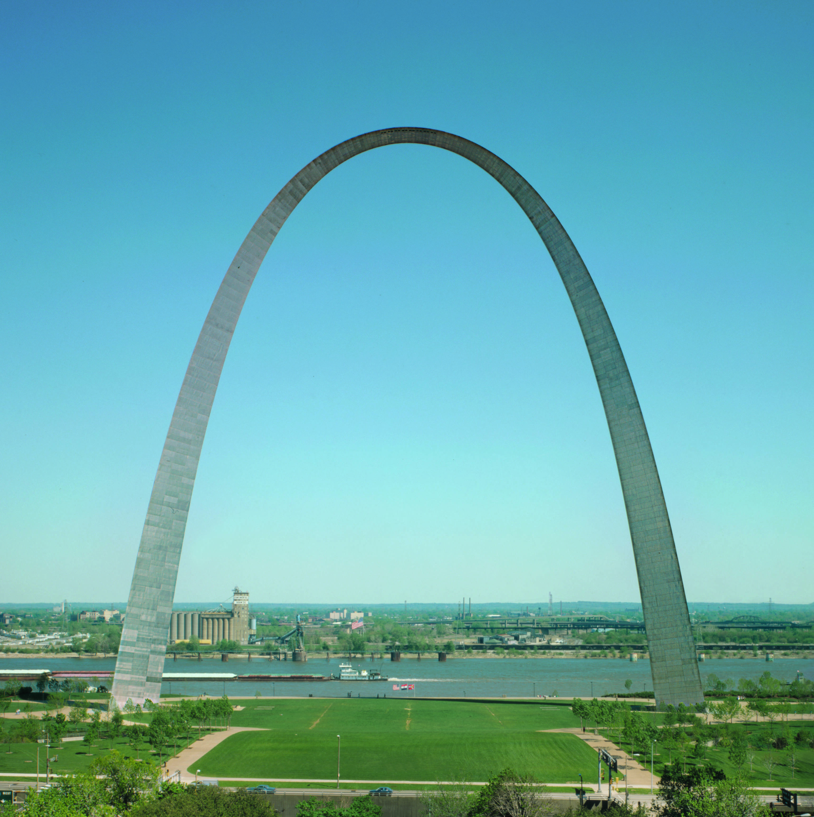 The Gateway Arch, Eero Saarinen, St Louis, Missouri, United States, 1968. Picture credit: Library of Congress
What was your working practice like? A long initial period of research and then, obviously with the atlas format, you focus on a geographical spread. Also we were trying not to repeat material from previous projects. It involves a lot of research, a lot of library time and developing a long list of around 1,000 potential projects. Then there’s a whitling down process down to 500 projects which is one of the most difficult and painful parts of the process.
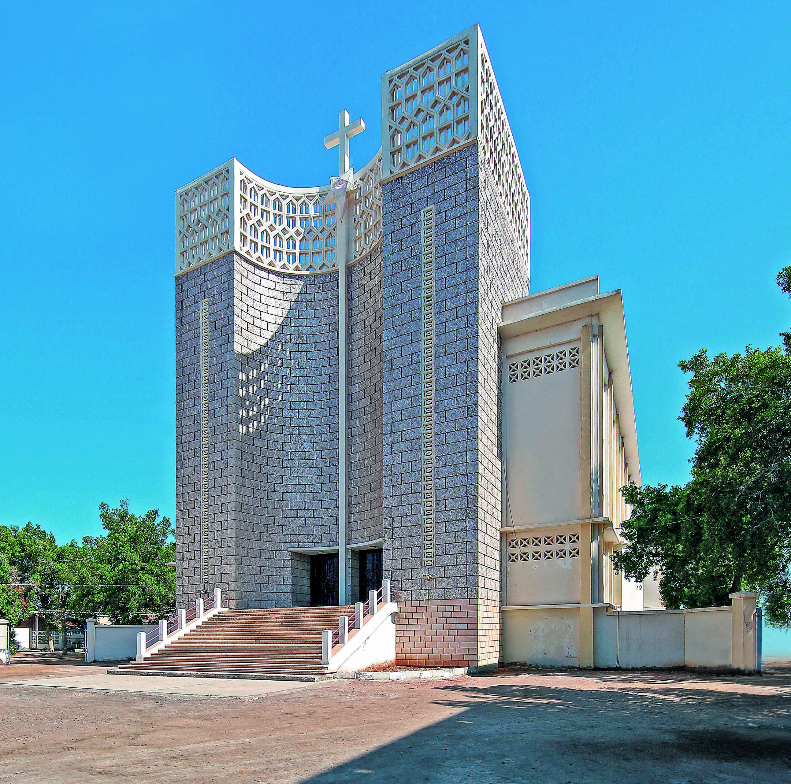 Djibouti Cathedral, Joseph Müller, Djibouti City, Djibouti, 1964. Picture credit: Philipp Meuser
How did you go about finding the buildings? It’s a combination of some online research but a lot of it is old school - going into the RIBA library and hitting the books from the period. Turning to period sources as well books and magazines and journals that would have come out in the post-war period, 50s and 60s.
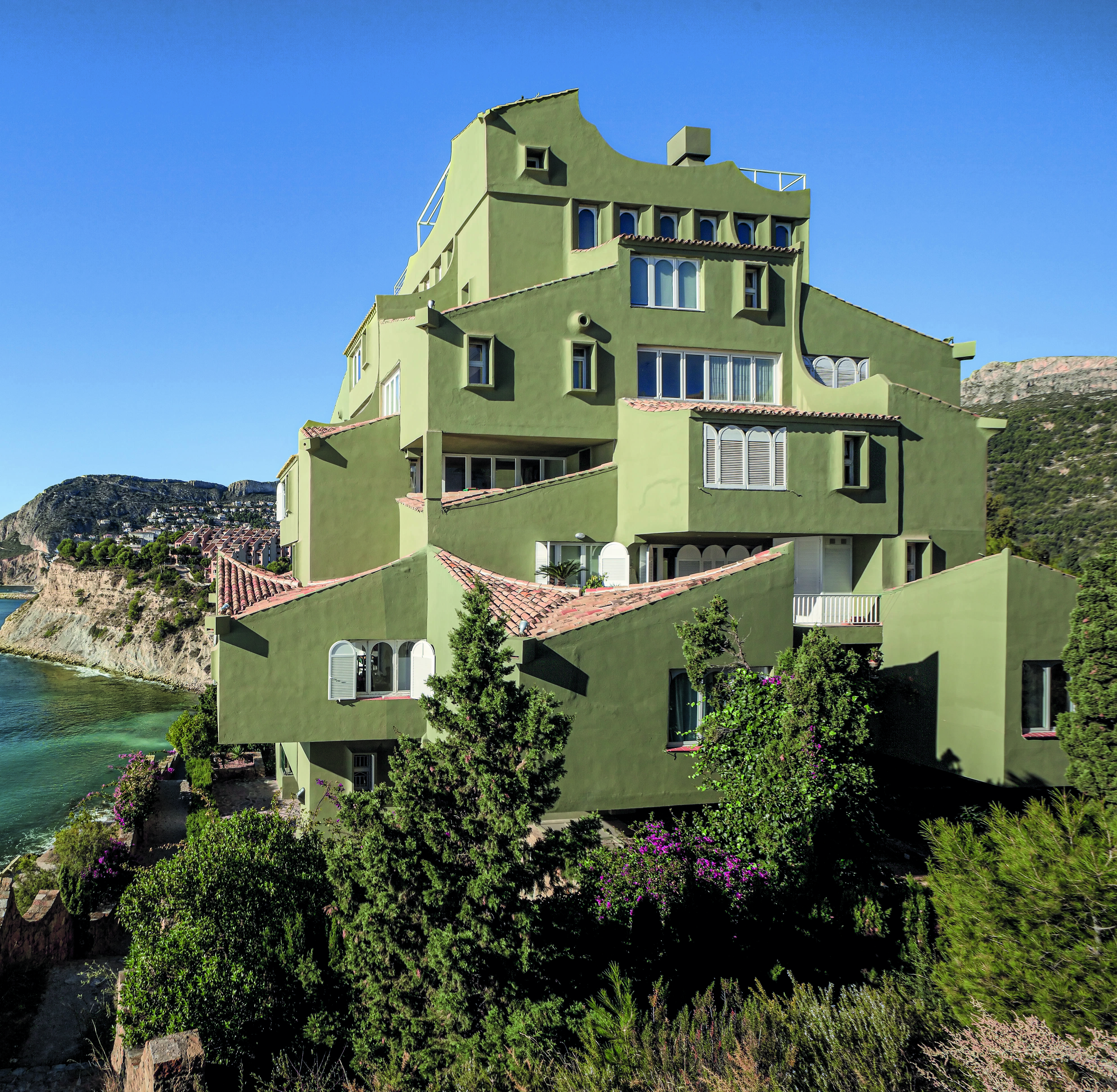 Xanadu, Ricardo Bofill, Calpe, Alicante, Spain, 1971. © Ricardo Bofill Taller de Arquitectura Archive
So not just relying on contemporary sources but going back to the sources of the day, and then doing a lot of trawling, region-by-region, source-by-source, drawing up lists; making sure we weren’t repeating the same architects too many times, trying to ensure a geographical spread. And also ensuring a spread of typologies: museums, hotels, educational buildings, churches, sacred spaces, sports buildings. And then also trying to tell that story of the progression of Mid-Century architecture from the International Style just after the war.
We also really wanted to cover areas that have been under-represented in the past. So, for instance, we wanted to make sure that Africa was well covered, and places that get ignored like Venezuela where there was an oil boom in the ‘50s and ‘60s resulting in lots of amazing buildings going up there - Mexico too.
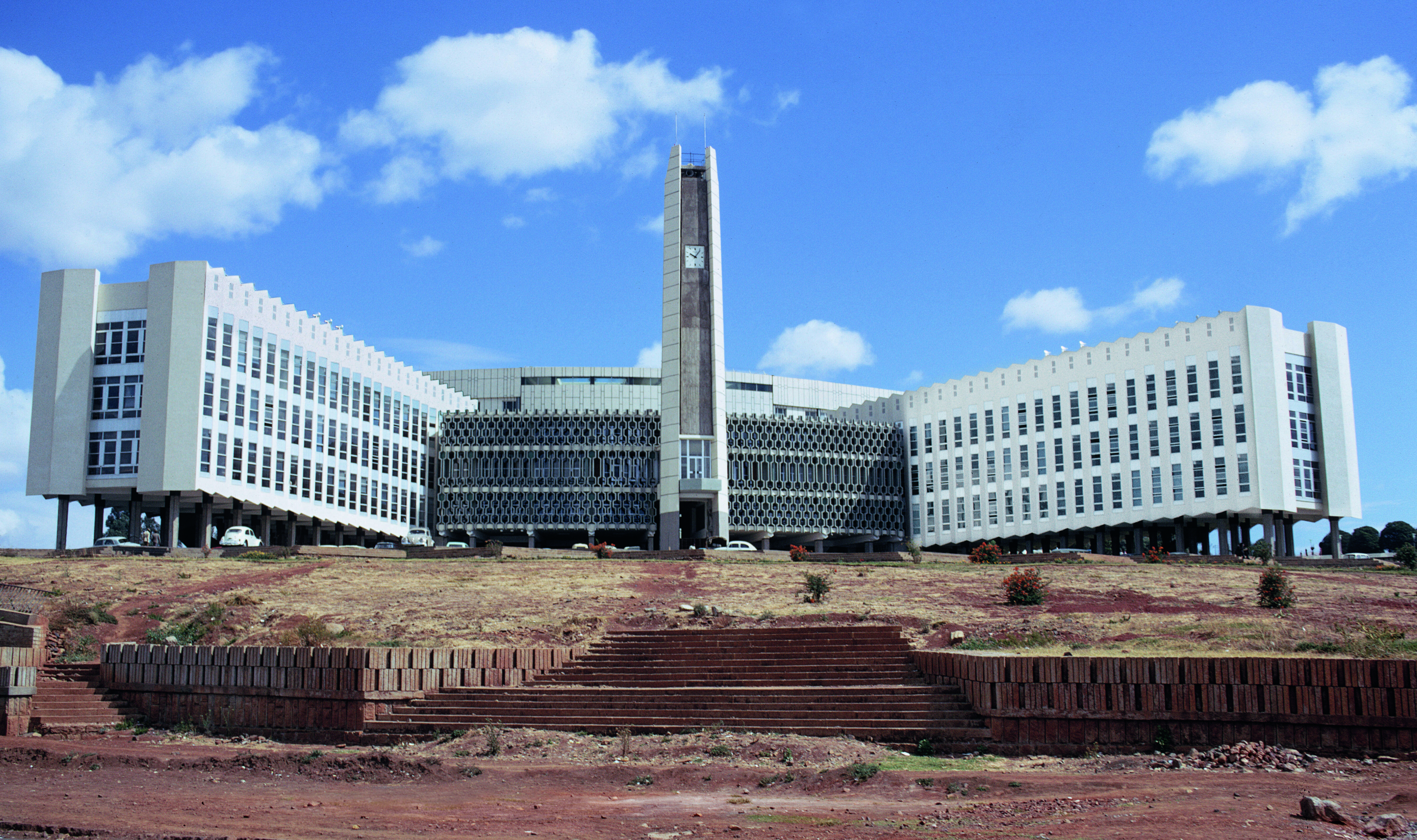 City Hall, Arturo Mezzedimi, Addis Ababa, Ethiopia, 1965. Picture credit: ETH
Which countries were the hardest to research? Africa’s quite tough. But fortunately there has been more research coming out on Africa recently that you can turn to and try and find more information. North America is fairly straightforward. There’s so much material there and that’s more editing and whitling down. Africa and Eastern Europe you might need to just do a lot more research time. And try and make sure they’re well represented.
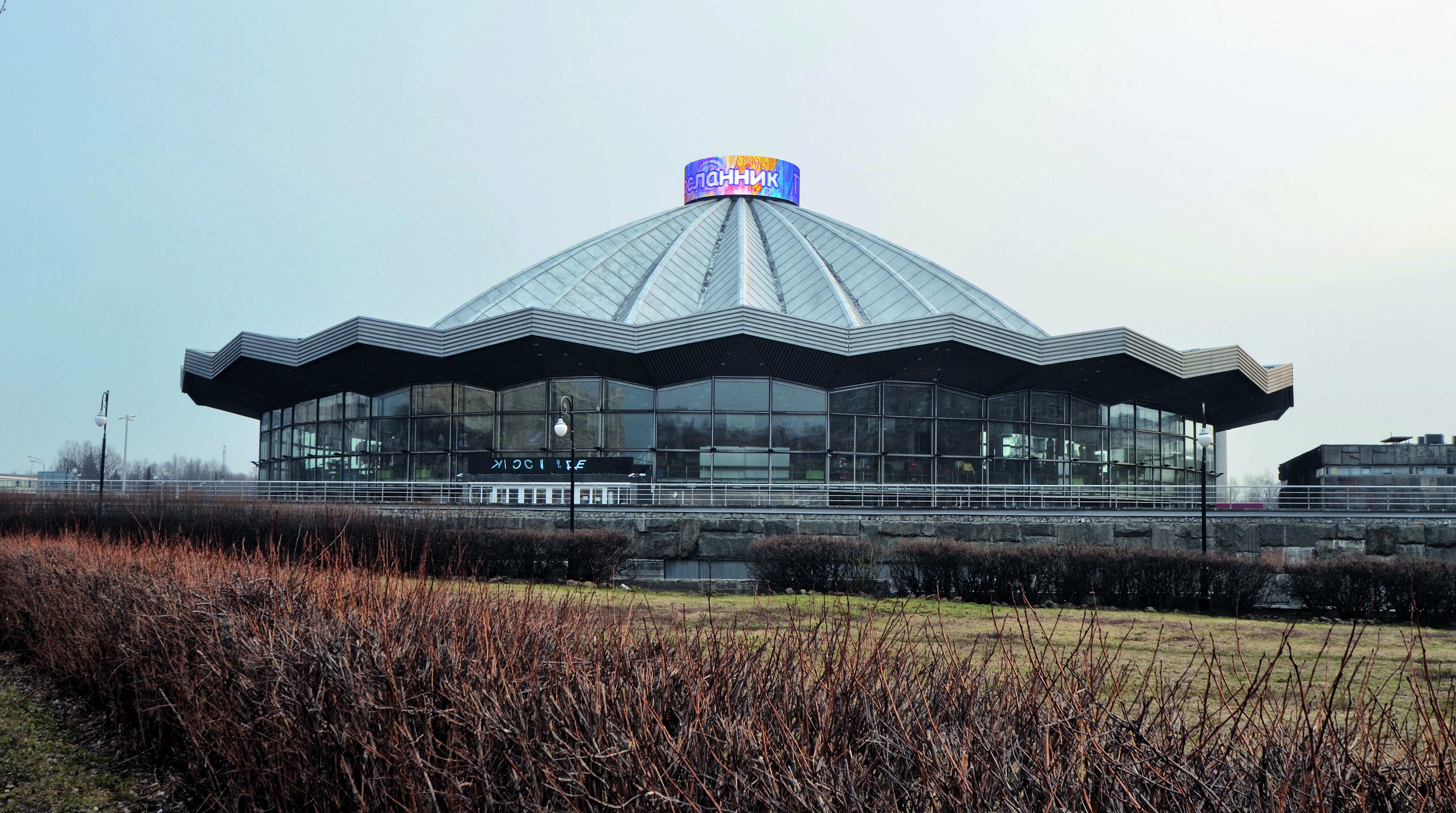 The Great Moscow State Circus, Yakov Belopolsky, Moscow, Russia, 1971. Picture credit: Sam Glover
Does finding one building tend to lead to finding another? There are a lot of threads that sort of carry through. Obviously we’re talking about the period of the global village and the jet age, so architects and designers are travelling much more and there is a lot more cross fertilisation around the world, which is one of the themes of the book.
For instance you’ve got the former Bauhaus masters going to America and then working in America bringing ideas with them, but then, later on, going back to Europe again and working in Europe. Then there are international figures such as Oscar Niemeyer working in France or Italy. So there are lots of threads, lots of connections that are really fascinating. That’s part of the fun. In the research phase you can often get distracted by these narrative threads and going off on these tangents but that’s part of the fun as well.
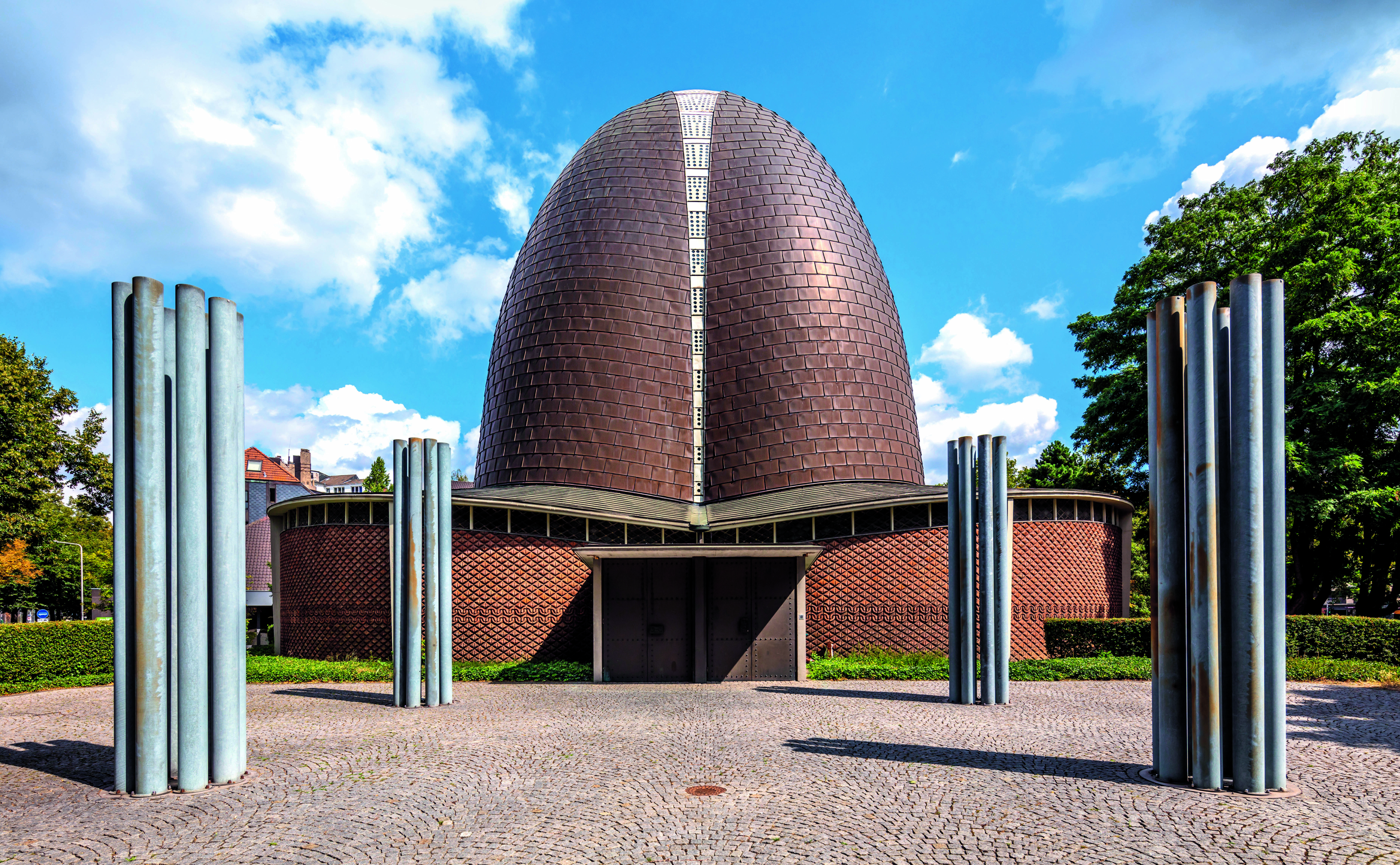 Friedrich-Ebert-Hall, Roland Rainer, Ludwigshafen, Rhineland-Palatinate, Germany, 1965. Picture credit: Stadtarchiv Ludwigshafen
This period was seen as an era of real optimism. What was the mix of things that came together to produce that feel good factor? I think there were three or four ingredients. There was a really strong foundation of early modernism to build on - the 1920s and ‘30s pioneer modernists, some of whom carried over to the post war period. So there was a strong foundation. Then you got post-war reconstruction and revival, so you’ve suddenly got this economic impetus, the need to rebuild. And you also have access to a lot of new materials and ways of making advances in structural engineering or shell structures with concrete and so on. So there’s suddenly access to a broad toolbox for architects and designers.
And then there was also this era of optimism and expression; this period after the war when there was this desire for a fresh beginning. As you go from the international style of the ‘40s and ‘50s into the ‘60s that becomes even more expressive and sculptural and dynamic and exuberant. And also another factor is that there are a lot of polymath designers - a lot of architects who are also designing interiors and furniture. So you tend to get these very cohesive interiors and exteriors. So there are all these things coming together, these various different factors all coming into play.
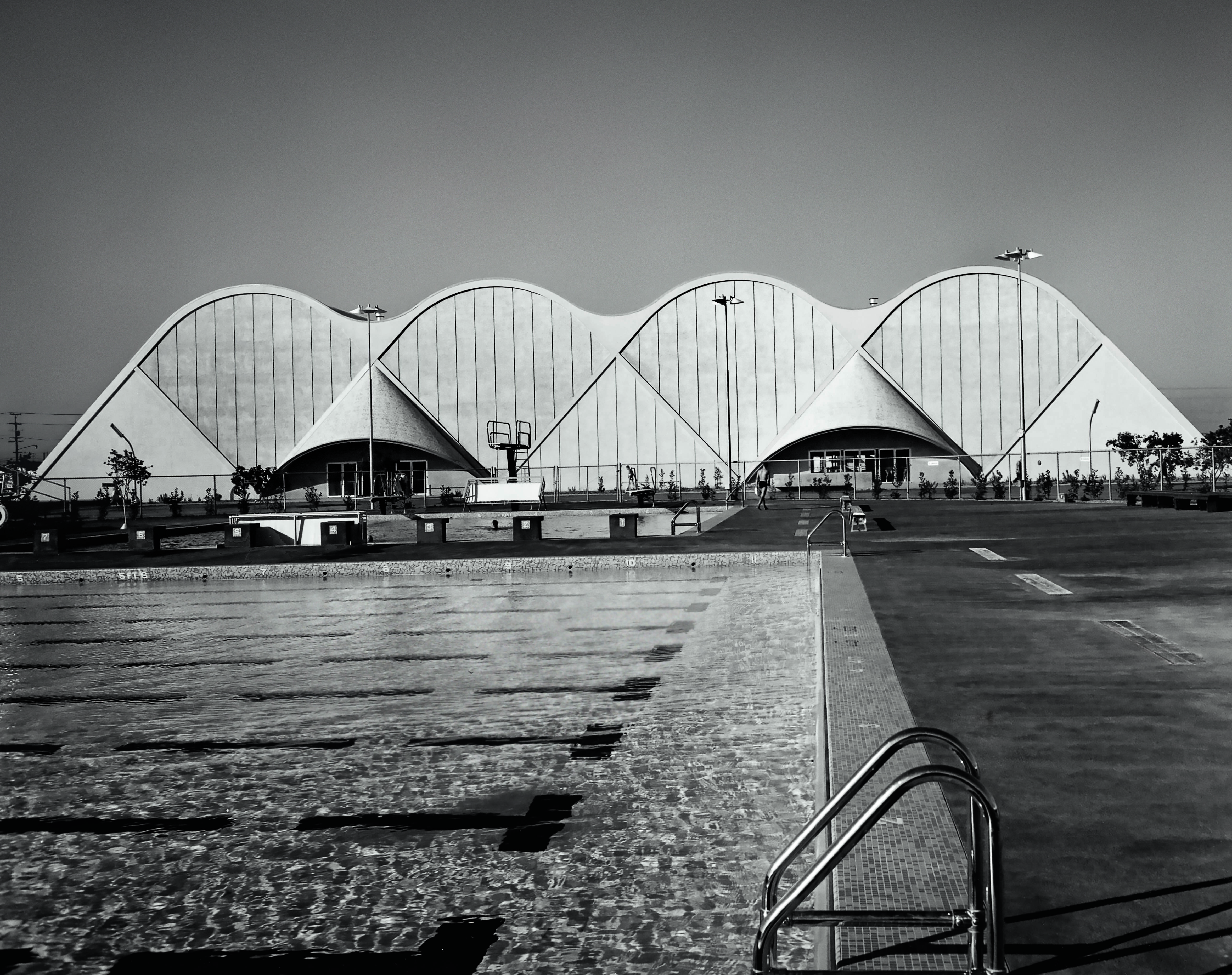 Cerritos College Gymnasium, Kistner, Wright & Wright, Norwalk, Los Angeles, California, United States, 1961. Picture credit: © J. Paul Getty Trust. Getty Research Institute, Los Angeles (2004.R.10)
Who were the architects really knocking it out of the park? Oscar Niemeyer is definitely a figurehead, because he was working in what you’d call plastic forms, these very sculptural forms from quite an early point. If you believe Oscar Niemeyer he actually influenced Corbusier. Corbusier later turned to plastic forms in the Notre-Dame du Haut chapel in Ronchamp and almost turned his back on his earlier work like the Unité d'habitation, Marseille. He turned away from the International Style towards this more expressive approach which Niemeyer helped to pioneer along with people like Félix Candela in Mexico.
And then the Scandinavians, of course, bring something slightly different to the mix, maybe a more organic approach. Architects like Alvar Aalto were incredible polymaths and alongside them you had people like Eero Saarinen who started off in the International Style but then again became increasingly expressive with buildings such as the TWA building at JFK.
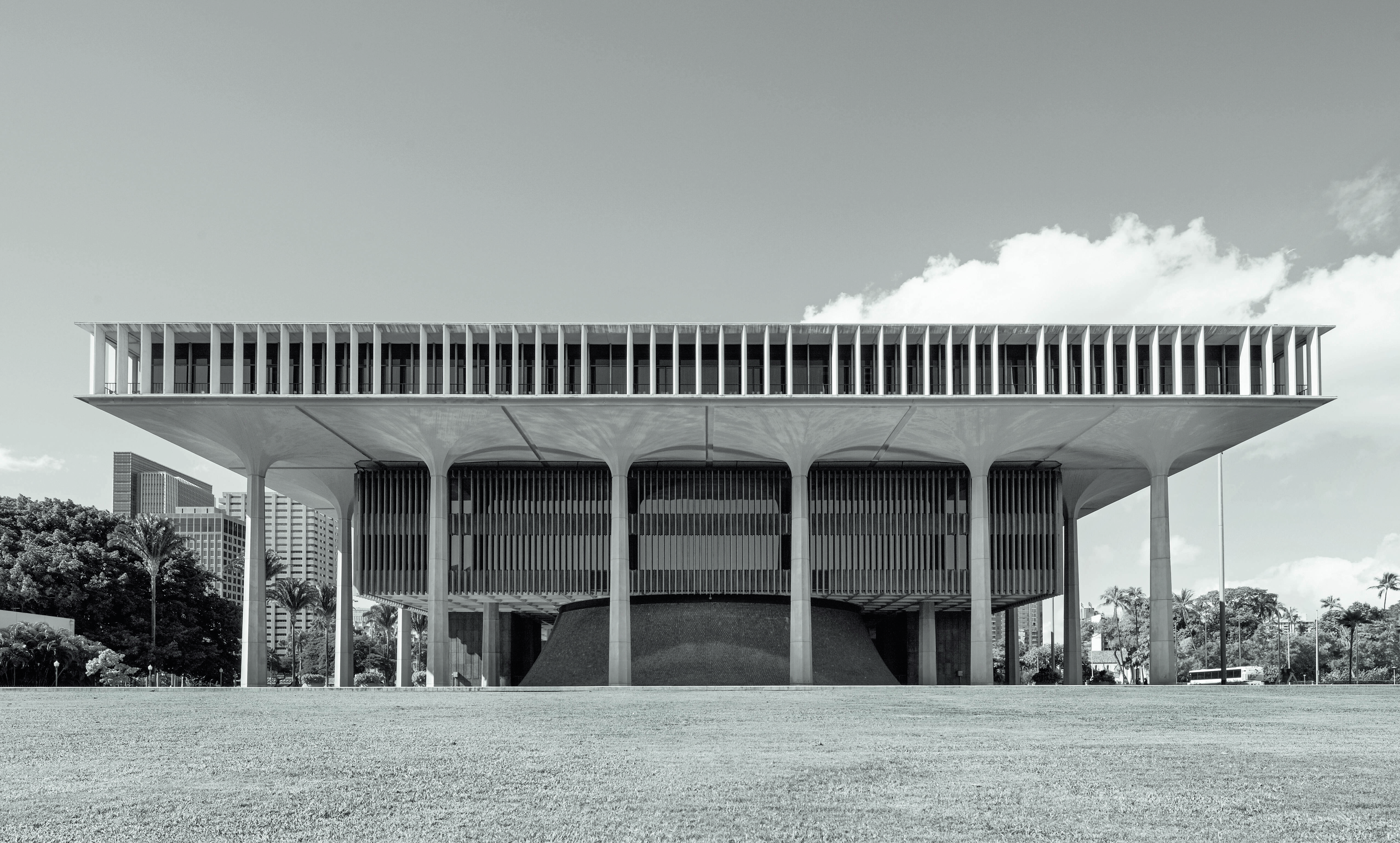 Hawaii State Capitol, John Carl Warnecke and Belt, Lemon & Lo, Honolulu, Hawaii, United States, 1969. Picture credit: Peter Clarke
They were almost viewed as artists as much as architects. . . There was a particularly strong relationship between art and architecture in that period. I think it’s one of themes of this period.
And abstract art was particularly to the fore at the time, how did that feed into the architecture of the day? Increasing abstraction, yeah. Architects looking at art and sculpture. Like Corbusier, for instance; crossing those forms, being a painter, muralist and sculptor himself as well as an architect. I think there are other examples of mid-century designers who were working across different mediums that included art and sculpture and architects treating buildings like sculpture, moulding them like Niemeyer - almost like pieces of plasticine or maquettes, very sculptural forms.
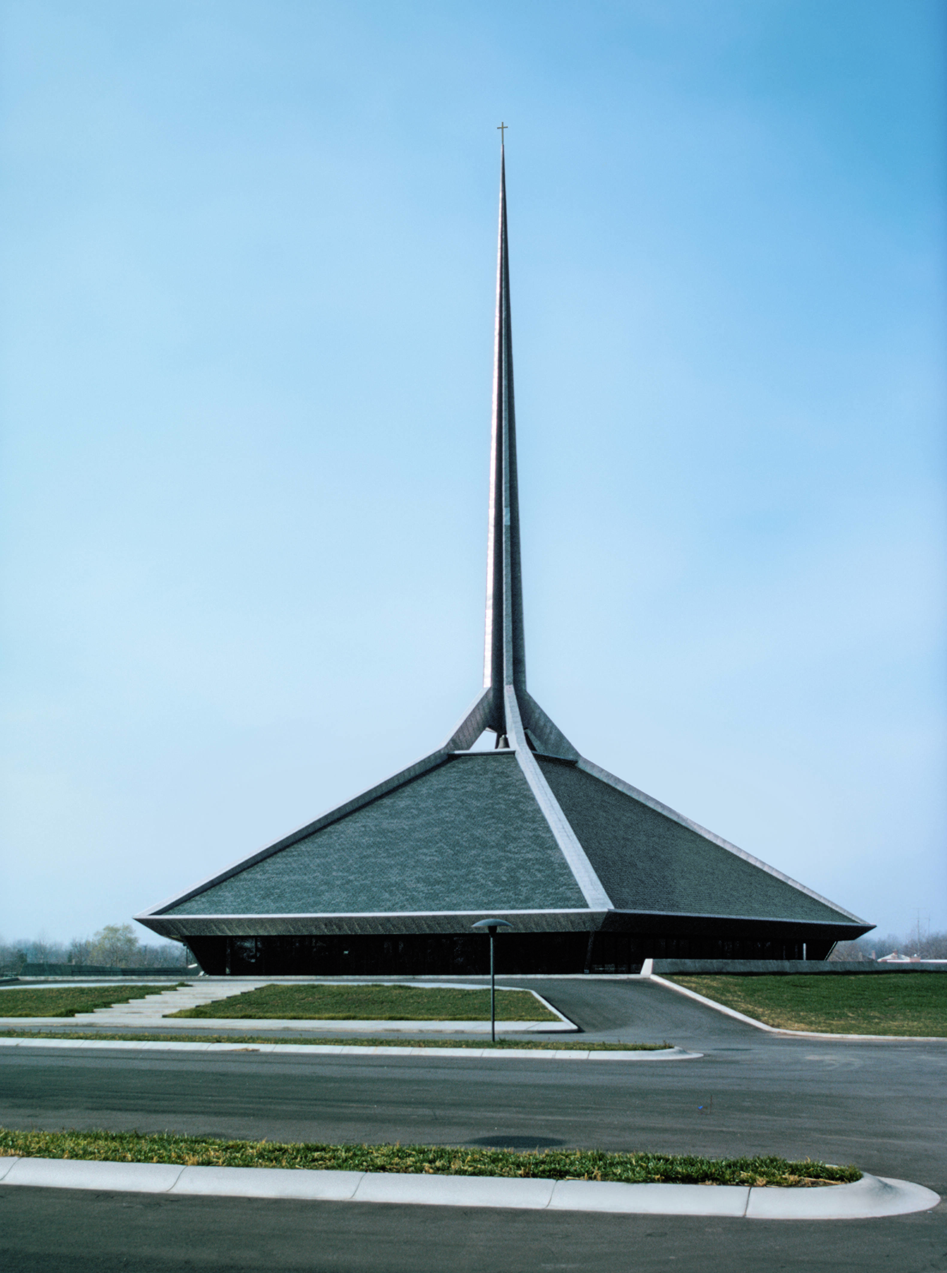 North Christian Church, Eero Saarinen, Columbus, Indiana, United States, 1964. Picture credit: Library of Congress
The book is called the Atlas of Mid-Century Masterpieces, what makes a building a masterpiece in your estimation? I think it’s probably a building that has a resonance that carries through time and beyond its original intention. If you look at the TWA terminal you know it was designed as a flight centre. It was designed to encapsulate the dynamism of travel and flight. But it also had this incredibly sculptural form and has now become this rather wonderful airport hotel. I think it’s a building that’s inspirational, that is extraordinarily creative, but that has also carried through time and has been given a fresh interpretation and fresh purpose. So it still feels very contemporary somehow.
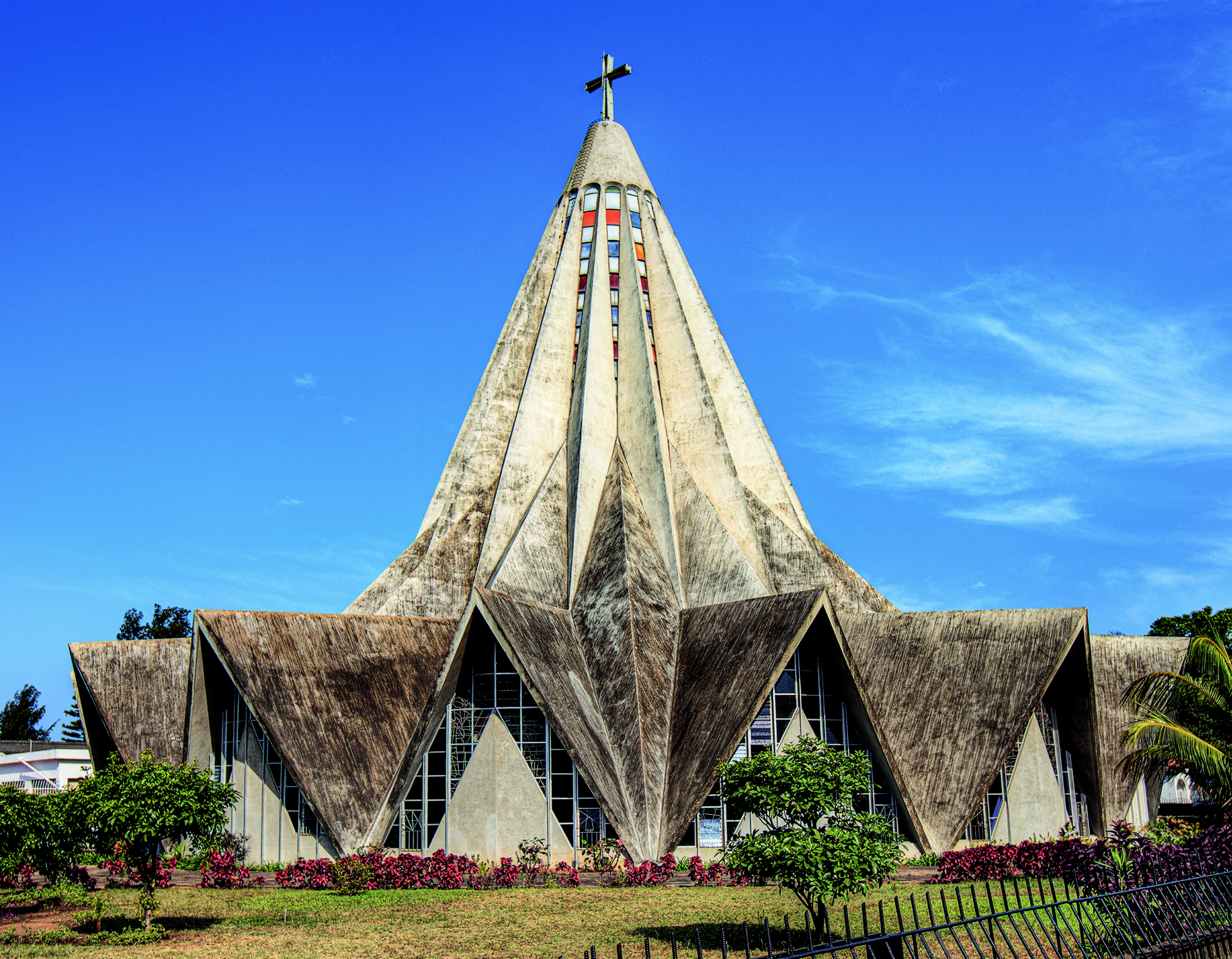 Church of St Anthony of Polana, Nuno Craveiro Lopes, Maputo, Mozambique, 1962. Picture credit: Artie Photography (Artie Ng)
And then I think there are other buildings that have those kinds of qualities, but they become reference points in the story of architecture. They have this iconic status to some extent, although there are other projects in the book that were not as well known for various reasons that might have been a little bit more forgotten or neglected.
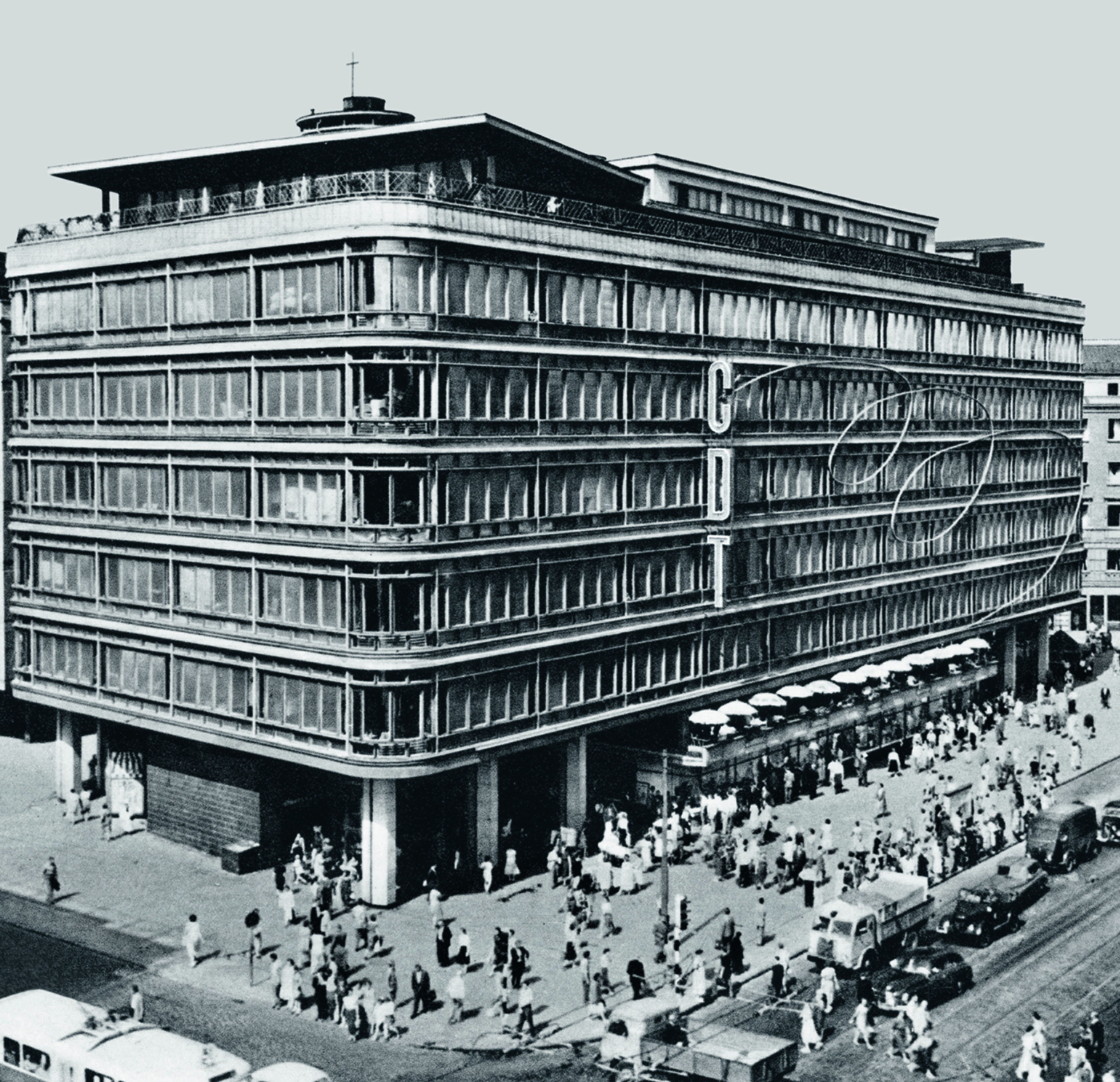 Central Department Store, Zbigniew Ihnatowicz and Jerzy Romański, Warsaw, Poland, 1950. Picture credit: Edmund Kupieck
What did different countries do differently? Were there specific geographic vernaculars that played into mid-century modern, and what were they driven by? That’s actually another interesting theme of the period. You’ve got this global village and you’ve got the International Style, but you’ve also got some strong regional voices who are taking mid-century style and giving it their own interpretation, which I think is one of the big themes of the book. There are a lot of reasons for that.
In Africa, as well as those things you mentioned, there was a very strong post war independence movement, so you find a rejection of colonialism on the one hand and this sort of newfound encapsulation of statehood through architecture which takes very modern forms on the other hand. So in Ethiopia you find these extraordinary buildings and in Ghana too and in other parts of Africa that assume a sort of heightened importance during this post-colonial phase. It's a fascinating theme.
But then you get the tropical modern theme where obviously you’re having to respond to climate in various parts of the world so that includes not only Africa but central America, Mexico, the southern states of America and right down to Brazil and South America. So climate is then another driver of those different expressions.
 City Hall, Arturo Mezzedimi, Addis Ababa, Ethiopia, 1965. Picture credit: ETH
What were the countries you were surprised to find had a mid-century modern tradition? I think Ethiopia was a bit of a revelation. Addis Ababa. There was an Italian architect called Arturo Mezzedimi who was working quite closely with the emperor. There was a whole phase of commissions coming through, including City Hall which is an extraordinary building. And also Venezuela too. I thought I knew Mexico, having visited before, but I think just the depth of the work in Mexico was amazing; the university and again the relationship with art and the muralists and so on. There was so much, really.
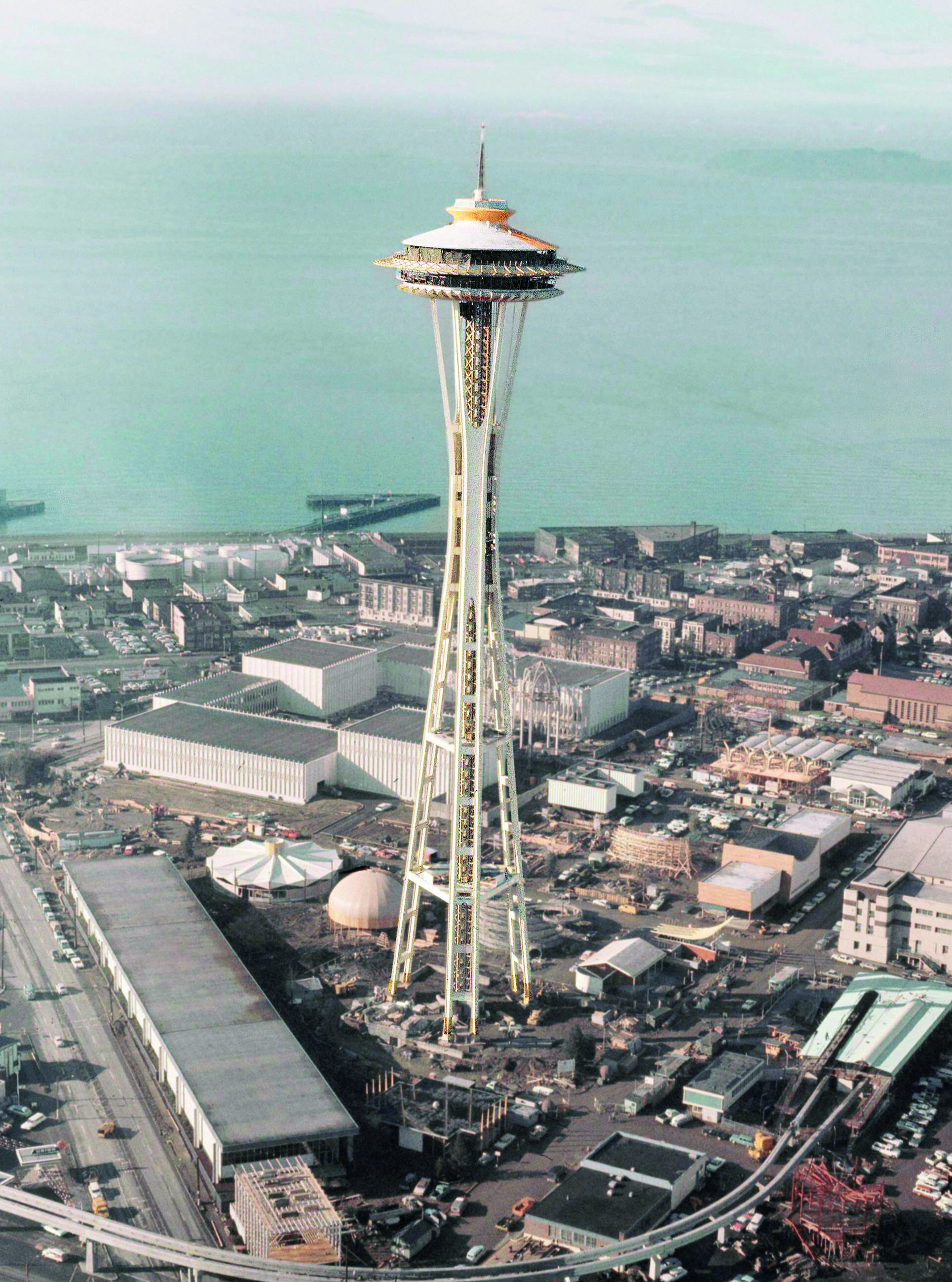 Space Needle, John Graham Jr and Victor Steinbrueck, Seattle, Washington, United States, 1962. Picture credit: Courtesy of the Seattle Municipal Archives
Most people find it easier to like Mid-Century Modern than Brutalist architecture but is there a kind of uncelebrated link between the two? There’s a sort of intriguing relationship between mid-century architecture and brutalism – sometimes it does overlap quite well, say with Dennis Lasdyn or Richard Seiffert.
Brutalism has obviously been through a revival of its own, but mid-century obviously has a softer edge to it. It is more expressive, colour is not a problem, pattern is not a problem. Brutalism can be sculptural but it’s very uncompromising, whereas I think with a lot of expressive mid-century architecture, you have these other layers coming in, and so there’s perhaps a closer relationship with art. It feels quite friendly I think, quite accessible, quite warm, whereas at times, brutalism can seem pretty uncompromising.
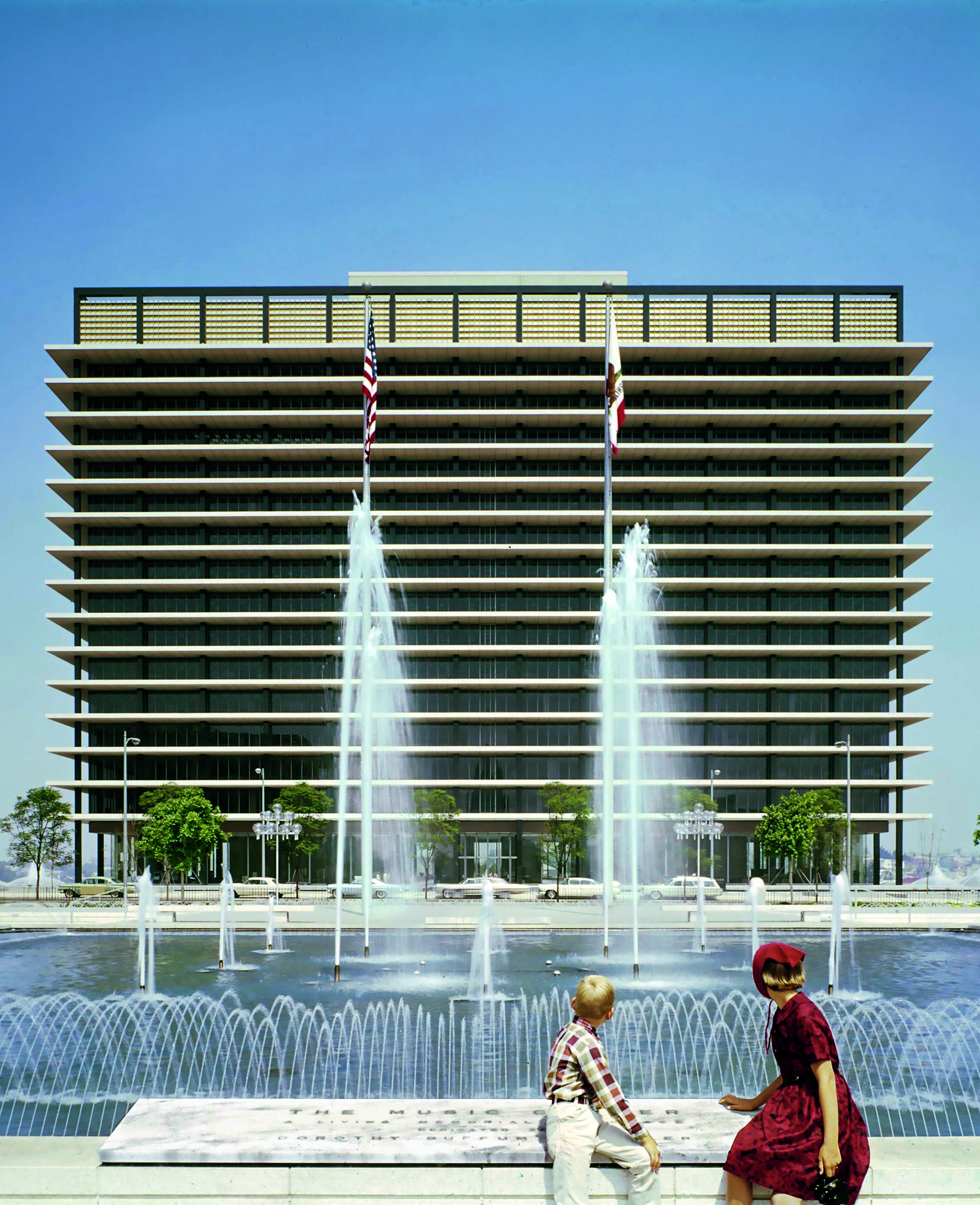 Los Angeles Department of Water and Power, A. C. Martin and Associates, Bunker Hill, Los Angeles, California, United States, 1965. Picture credit: © J. Paul Getty Trust. Getty Research Institute, Los Angeles (2004.R.10)
Do you detect a revival of any sort for Mid-Century Modern? There’s obviously a huge revival of interest in the period generally. I see it wherever I go – on the high street. You walk into a department store and see mid-century influences in the furniture and in the colours.
In architecture now you’re starting to see references coming back to mid-century ideas. I think it’s seen really in the idea of form giving, architects being more adventurous and creating more dynamic, exciting, and energetic buildings, rather than falling back into square rectangles. That minimalism characteristic of the 1980s and ‘90s is beginning to fade.
Bjark Ingels in terms of form giving is certainly doing that. Zaha Hadid was doing that in her era; she was slightly ahead of the curve, actually. And also architects are less afraid of introducing texture and pattern. I think during the era of minimalism there was a nervousness about those things, and I think that’s starting to slip away now. Architects are rediscovering the joyfulness of those elements that were also very apparent during the mid-century.
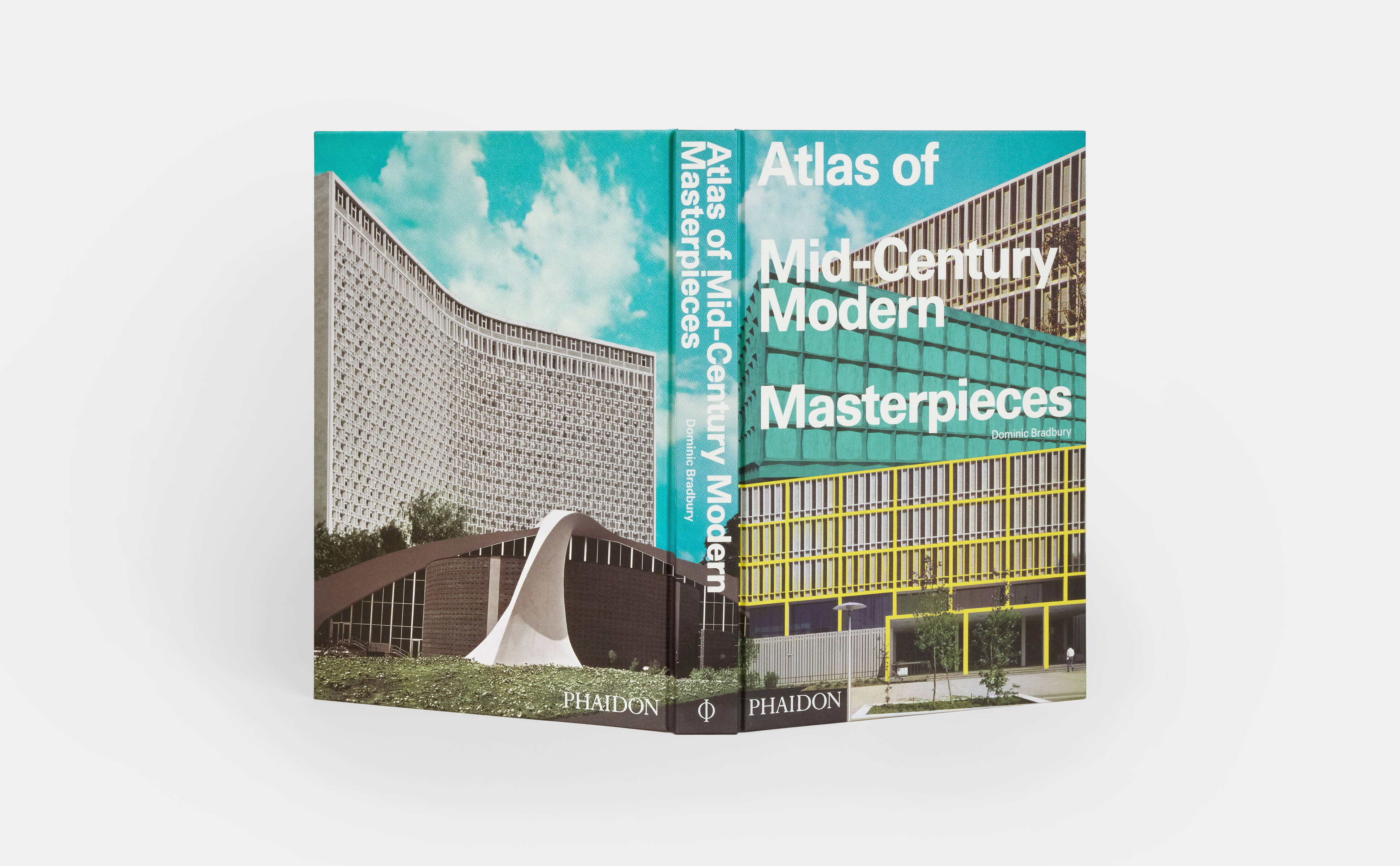
Take a look at Atlas of Mid-Century Modern Masterpieces in the store.